The network for creativity
Join 1.25M professional creatives like you
Connect with clients, get discovered, and run your business 100% commission-free
Creatives on Contra have earned over $150M and we are just getting started
Back to feedPost

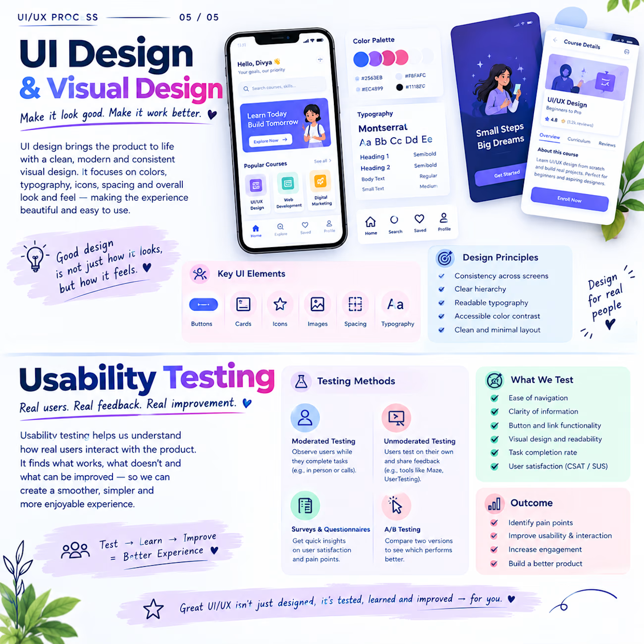
🎨 UI Design & Usability Testing
UI design brings ideas to life through colors, typography, spacing, icons, and visual consistency.
But great design doesn’t stop at looking good. I use usability testing and feedback to understand what works, identify pain points, and continuously improve the experience.
Design → Test → Learn → Improve. ✨
The network for creativity
Join 1.25M professional creatives like you
Connect with clients, get discovered, and run your business 100% commission-free
Creatives on Contra have earned over $150M and we are just getting started





Related posts

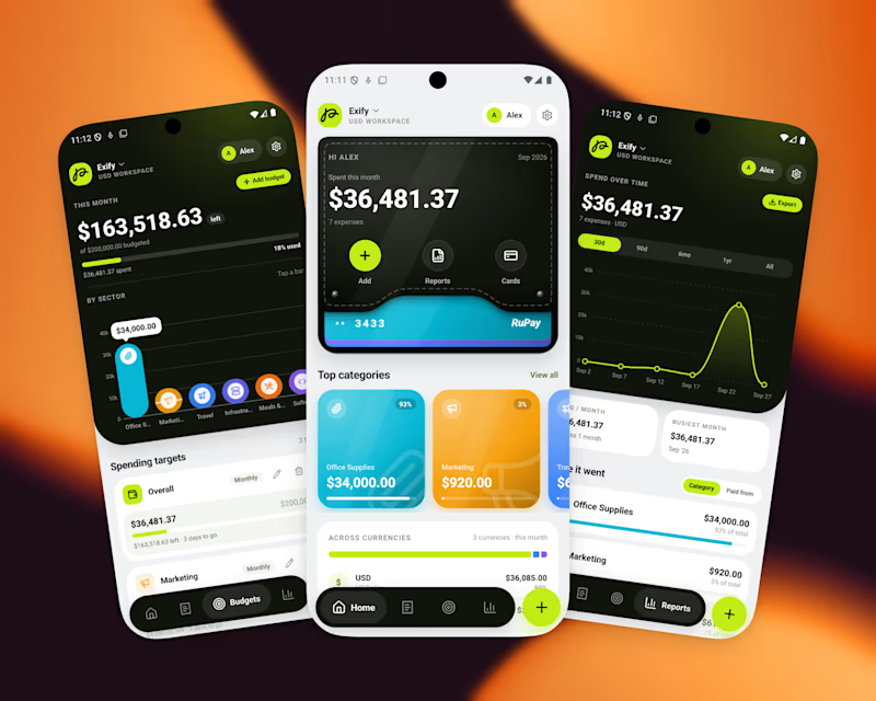
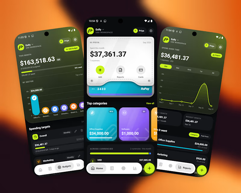
A great app should not just function, It should feel visually distinct
When the market is full of similar-looking products, design becomes part of the product’s well identity
For this finance project, we focused on a sleek UI, intuitive UX, and a visual language that doesn’t feel generic
Both dark and light modes were designed to feel equally intentional.
Which one do you prefer?

10 voted
56%
8 voted
44%
18 votes
Closed

I’d go with Light Mode. 👌 It feels fresh, clean, and the UI elements stand out beautifully against the background. Both are strong, though! 🔥


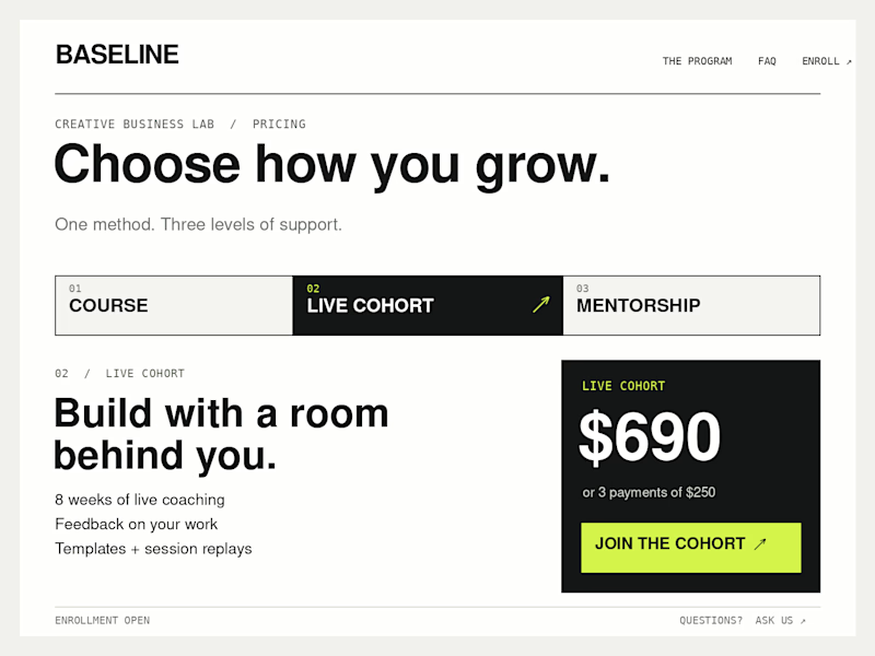
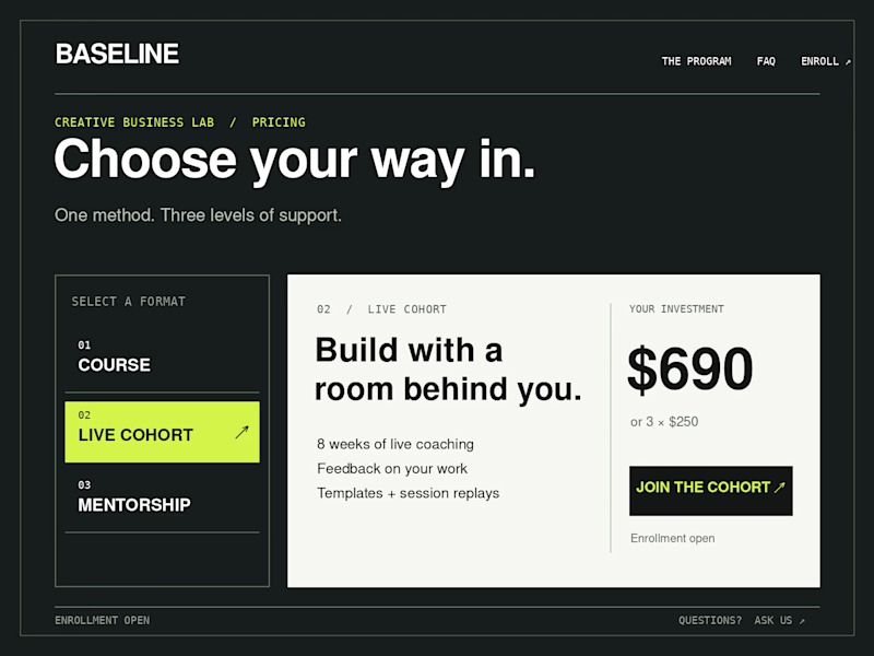
Which Kajabi pricing section would you ship?
Creative Business Lab has three paths: Course, Live Cohort, and Mentorship. Both designs show the same $690 Live Cohort with the same benefits. Only the presentation changes.
Vote Horizontal tabs or Side tabs, then tell me the one thing you’d improve before launch. Have a stronger third approach? Show it in the replies.

21 voted
50%
21 voted
50%
42 votes
Closed

Horizontal. side tabs read as nav, people skip them. though the stronger third option is no tabs at all, three cards side by side. both of these hide two prices behind a click and comparison is the one job a pricing section has.

Hi Contra Community! I'm new here, what do you think about this design? I'll love to have your feedback.

Welcome to the Contra Community Juan!


