The network for creativity
Join 1.25M professional creatives like you
Connect with clients, get discovered, and run your business 100% commission-free
Creatives on Contra have earned over $150M and we are just getting started
Back to feedPost

Everyone : Garba with their soulmate 💃❤️
Me : Garba with my laptop, building my hotel booking system. 💻😭

The network for creativity
Join 1.25M professional creatives like you
Connect with clients, get discovered, and run your business 100% commission-free
Creatives on Contra have earned over $150M and we are just getting started

Related posts

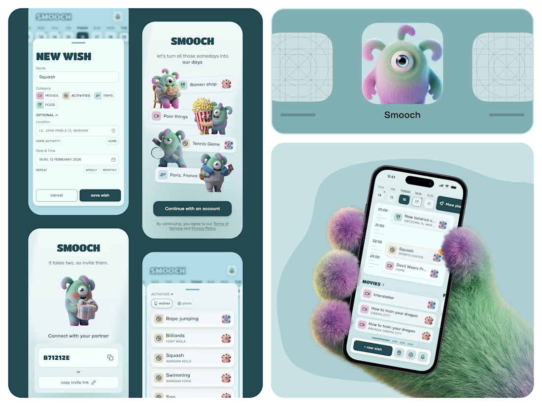
Smooch is live on the App Store 🥹
It started in January. My partner and I were planning trips for March and May, and suddenly realised we’d forgotten a movie we wanted to watch and a new Korean place we wanted to try. Big plans: fine. Small ones: gone.
So I built us a shared space for all those “we should try this someday” ideas. You save them together, drag one onto a day, and it becomes an actual plan.
I made it on my own: product, design, the build with Lovable, the website and the blog - Framer. 60 builds, a few App Store rejections, and one timezone bug that sent us to squash at 2am instead of 2pm xD
And there are no photos inside, just Smooches characters. Because who calls their person by their actual name anyway? (or it's just me there, huh)
The whole story is in the case study 🦄

That furry hand holding the phone is a scroll-stopper. These characters would be so fun animated, even just a little wiggle when a wish turns into a plan. Huge congrats on the launch.

I turned my own portfolio into a free Framer template: meet Visualfolio.
For the last few weeks I’ve been rebuilding my product designer portfolio in Framer. Along the way I kept making decisions I wished someone had made for me: how to present case studies, how to make an About section feel human, and how to keep a portfolio calm without it looking empty.
So I packaged it up. Visualfolio is a minimal portfolio template for product designers, UX/UI designers and freelancers who work with SaaS and AI teams.
👉 Get Visualfolio free: https://www.framer.com/marketplace/templates/visualfolio/
👀 Live preview: https://visualfolio.framer.website/
If you use it, send me your version. I’d love to see what you build. And if you’d rather have it customised, or need a product designed and built end to end, that’s what we do at Reyload.

Looks amazing!!


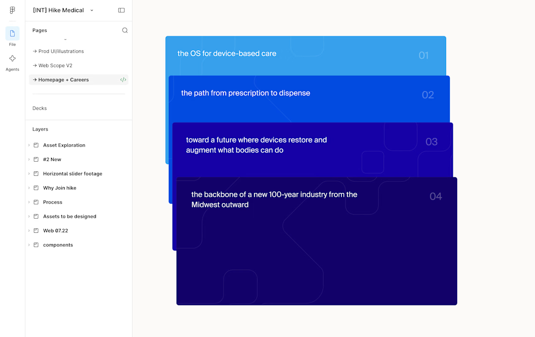
This card stack transition combining the SVG of each card to the sticky position is giving my brain really satisfying scratches 😘👌
--
I've been doing a lot more Framer developments lately where I don't do the design, I think one of the big advantages of having a strong background in design is that I can see the designers vision to translate it into the web obsessing over the details.
I.e. see Figma design screenshot in the comments how each card had the same SVG but in irregular placements, I saw it as an opportunity to perfectly align them on scroll and add a bit of a transparency reveal at the end. It feels way more intentional and ties everything together.
Design by @Iverson developed by me

Figma design handoff


Challenges
View all


