The network for creativity
Join 1.25M professional creatives like you
Connect with clients, get discovered, and run your business 100% commission-free
Creatives on Contra have earned over $150M and we are just getting started
Back to feedPost


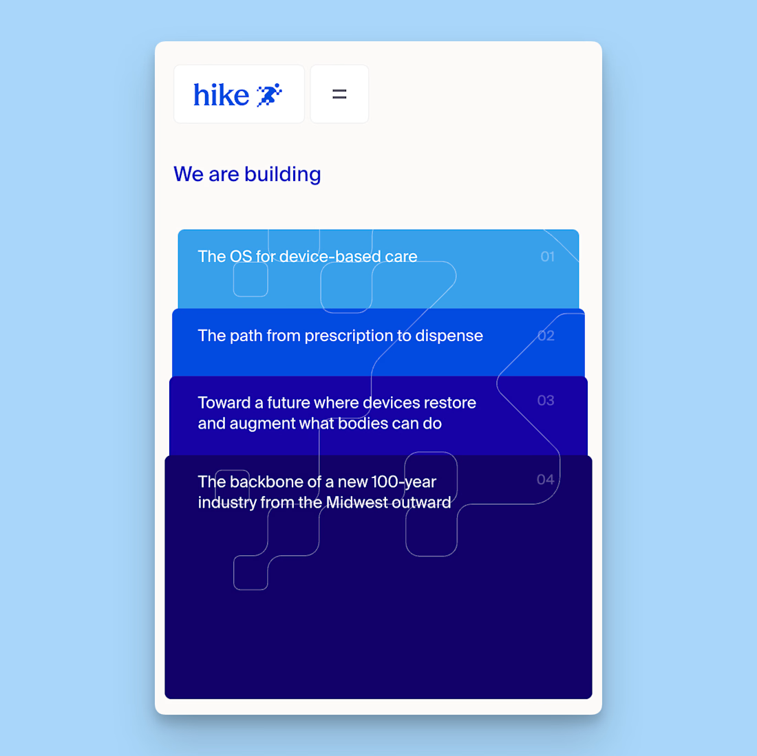
This card stack transition combining the SVG of each card to the sticky position is giving my brain really satisfying scratches 😘👌
--
I've been doing a lot more Framer developments lately where I don't do the design, I think one of the big advantages of having a strong background in design is that I can see the designers vision to translate it into the web obsessing over the details.
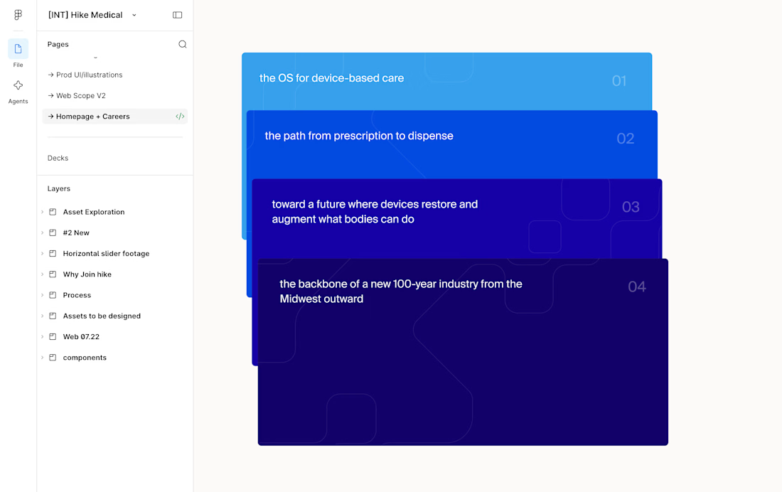
I.e. see Figma design screenshot in the comments how each card had the same SVG but in irregular placements, I saw it as an opportunity to perfectly align them on scroll and add a bit of a transparency reveal at the end. It feels way more intentional and ties everything together.
Design by @Iverson developed by me

Figma design handoff

Really nice work and the final website looks powerful!


Good decision of not putting on same lane and having some margin. Feels thoughtful
thanks i like that gradient effect as well

Creative work

the svg to sticky morph is smooth

This is really creative, welldone.

nice

wow

just native positioning

Love how all the lines connect here!

Excellent Work

Lining up those irregular SVGs on scroll is the kind of detail a dev without a design eye would never spot. How does it hold up on mobile, does the sticky alignment survive or do you swap to a simpler stack?
It's a different stack but the same effect so it had to be recalculated

That card stack transition is so satisfying to watch. Really nice dev work


Awesome work🔥👏👏

Really nice scroll detail

Wow, great design with a nice stacky effect.

Coool!

satisfying


That sky-to-navy blue gradient across the stacked cards, with the circuit line running continuously through them, makes the unstack feel really deliberate.
thanks Arek!

Creative Work : )

Seamless card stack transitions that pin SVG layouts to sticky states add so much tactile polish to modern Framer sites.


love this man 🔥
Thanks brother!

I love the thought process behind this. Adding that transparency at the end shows you didn't just want to make an interaction, but you understand the intention of the designer to the core. And that also made the strip patterns more obvious for anyone who missed it earlier.
thanks man and yeah i love that little touch as well

Cards snapping onto that sticky spot feels really satisfying.
The network for creativity
Join 1.25M professional creatives like you
Connect with clients, get discovered, and run your business 100% commission-free
Creatives on Contra have earned over $150M and we are just getting started



Related posts


New project: a film-first website for Portugal Media Productions, an award-winning film and photography team whose work includes David Beckham for Haig Club. Built in Framer on our Nova Quinn template, with headlines over full-screen footage, a moving client logo strip, and a site the team now edits on their own.
The full case study is on my profile.

Build with Framer?

i built a semi-3D interactive website with @Base44 for a Creative Production Studio, called STORM STUDIO,. that drafts 3D Digital unique experience for Brands.
STROM STUDIO specializes indesign, motion, 3D and Technology, working together to turn ambitious ideas into immersive digital experiences.
At STORM STUDIO, We create 3D visual storytelling and interactive web experiences that help brands stand out.
STORM STUDIO - https://stormstudio.base44.app
also, check it out on mobile, to get the full mobile experience
my walkthrough process will be below in my comment section

my walkthrough process
PS; if you opened the STORM STUDIO website on a Mobile phone, Shaking the phone rattles the rubik cubes like a shaken jar.
and,
on PC/DESKTOP, moving the cursor rattles the rubik cubes, also slowly scroll through the home page to have a full experience of the scroll animate effects, etc.
try it out 😊


Clean! This minimal career section looks super premium. The glassmorphism + hierarchy is perfect. I'm also building career sections in Framer for healthcare products. Inspiring work!

