The network for creativity
Join 1.25M professional creatives like you
Connect with clients, get discovered, and run your business 100% commission-free
Creatives on Contra have earned over $150M and we are just getting started

The network for creativity
Join 1.25M professional creatives like you
Connect with clients, get discovered, and run your business 100% commission-free
Creatives on Contra have earned over $150M and we are just getting started

Related posts

Can AI create a professional-looking logo?
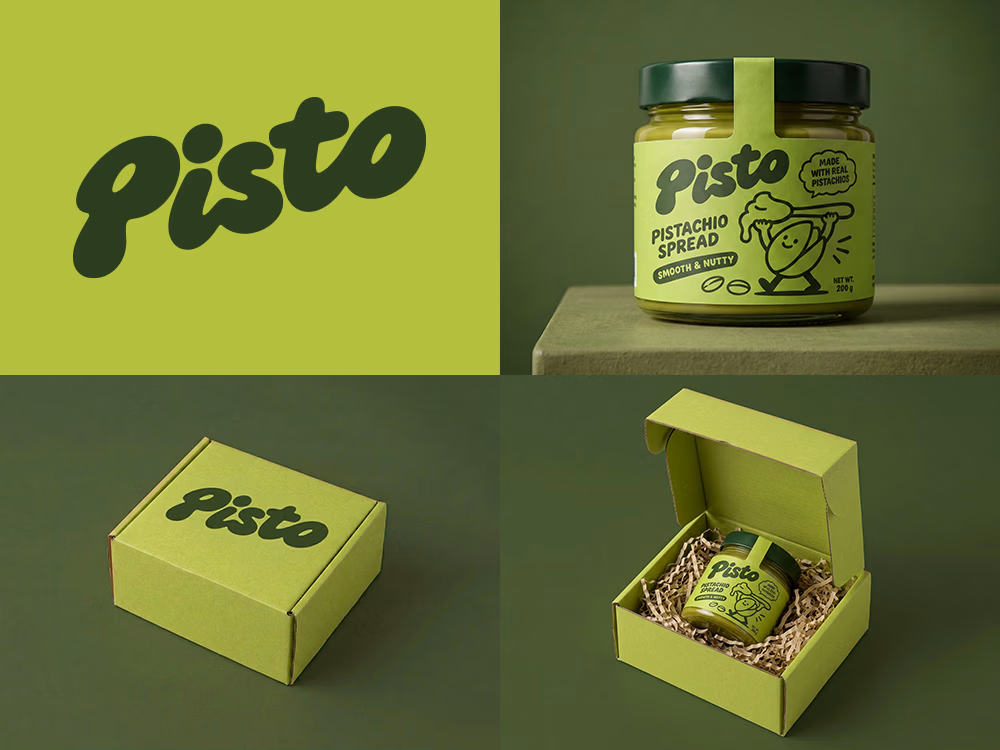
I tried to create a logo concept for a pistachio spread brand using Recraft Logo Maker.
After answering a few questions about the brand and going through several variations, I finally landed on a logo that felt right and captured the fun, fresh personality I had in mind.
But I didn't want to stop at just the logo.
I took it a step further by exploring how the identity could come to life through product packaging and a branded mailer box.
A quick process video is included in the comments.
What do you think?


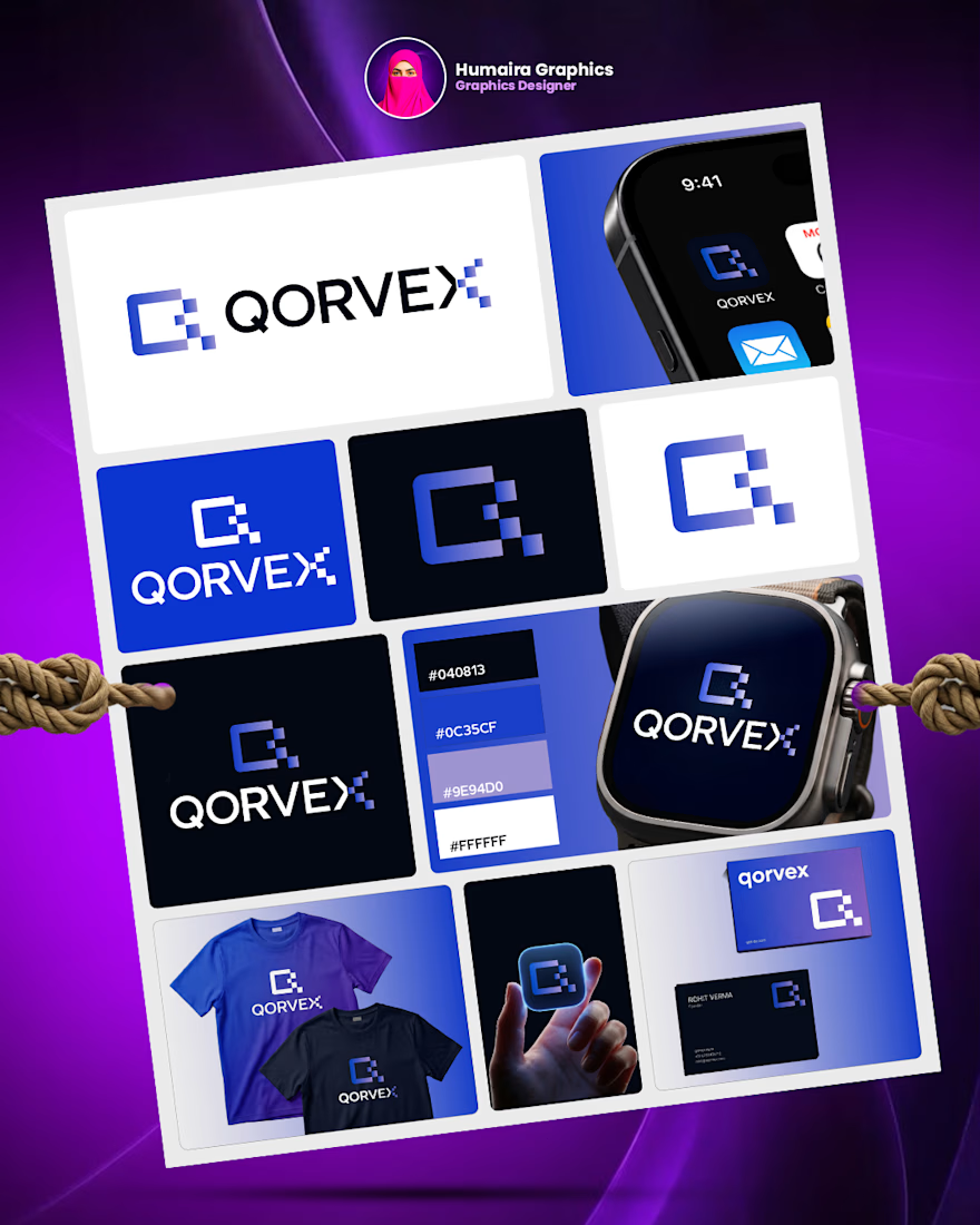
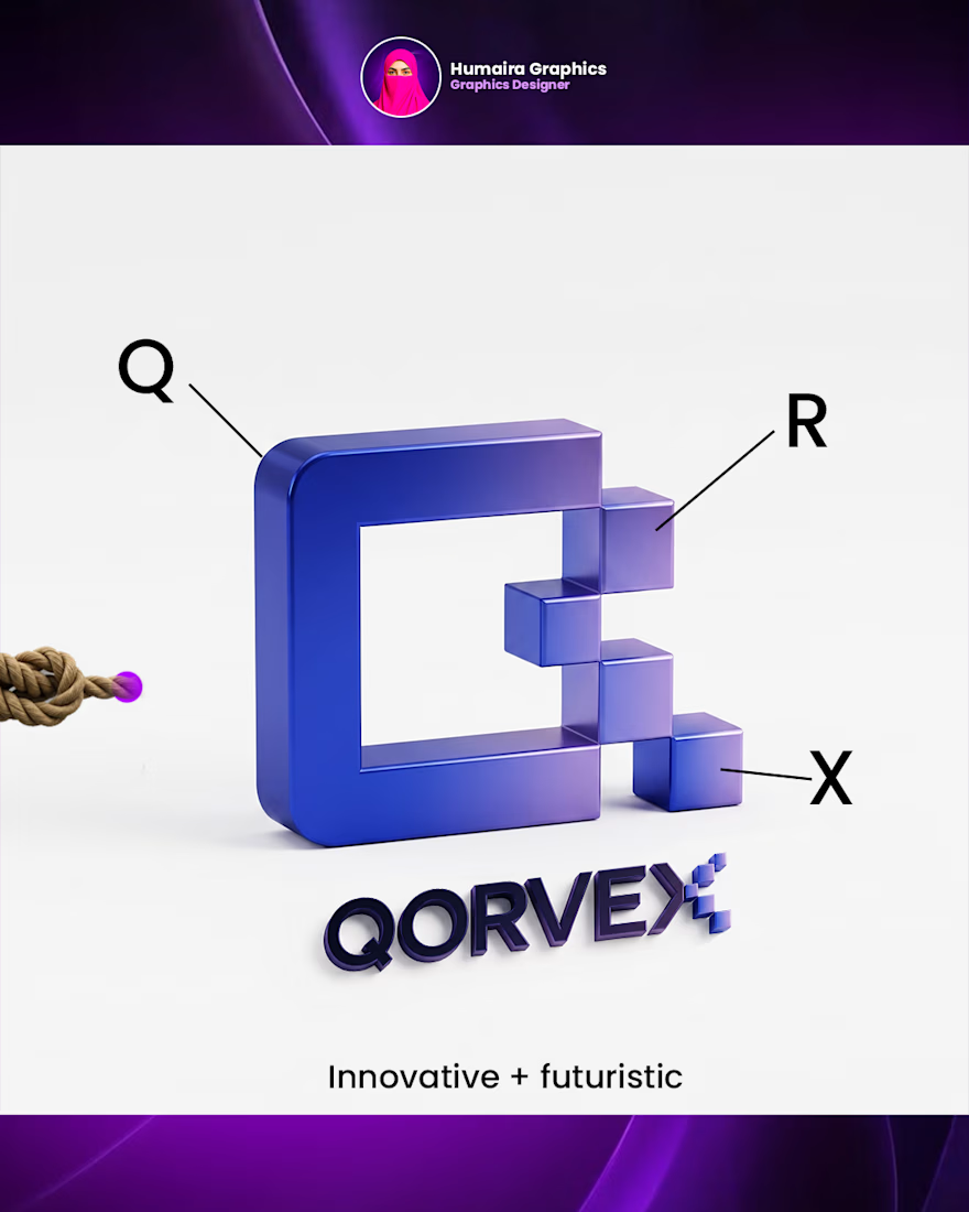
Is logo design really that easy?
Honestly, I used to find logo design really challenging. Coming up with a meaningful concept and turning it into a strong visual identity wasn’t easy for me.
But they say, “Practice makes perfect.”
That’s why I kept practicing, exploring ideas, and learning from every design. And today, I can see how much I’ve improved.
I’m still learning, still experimenting, and always trying to make my next design better than the last.
What was the most challenging part of logo design when you started?
Have a branding project in mind? Let’s connect!

Great concept and a very strong visual direction.