The network for creativity
Join 1.25M professional creatives like you
Connect with clients, get discovered, and run your business 100% commission-free
Creatives on Contra have earned over $150M and we are just getting started
Back to feedPost
A couple screens I have been working on for a home services market place.
The goal was to remove friction and make onboarding / signing up as easy as possible, while building confidence at the same time.
I borrowed from e-commerce best practices like progress indicators, clear CTA's and reassuring confirmation screens to optimize for high completion rates.


Really like the direction here. Reducing friction while building user confidence is always a delicate balance, and the ecommerce patterns you borrowed make a lot of sense. The progress indicators and confirmation states definitely help guide users forward.

Thanks Rishi!
The network for creativity
Join 1.25M professional creatives like you
Connect with clients, get discovered, and run your business 100% commission-free
Creatives on Contra have earned over $150M and we are just getting started
Related posts

If a doctor has to hunt for a patient’s vital signs, the dashboard is getting in the way of care.
Doctors don’t need another dashboard. They need the full patient picture at a glance.
In healthcare, confusing UX isn’t just frustrating. It can delay understanding when every second matters.
DocuVerse brings vital signs, patient metrics, and health trends into one clear view, making complex health data easier to scan and understand.
Less searching. More clarity. Better informed decisions.
That’s what healthcare UX should deliver.
Would you design a healthcare dashboard for more data, or better decisions?


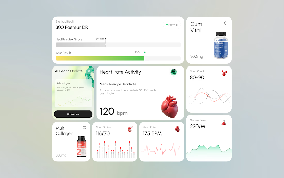
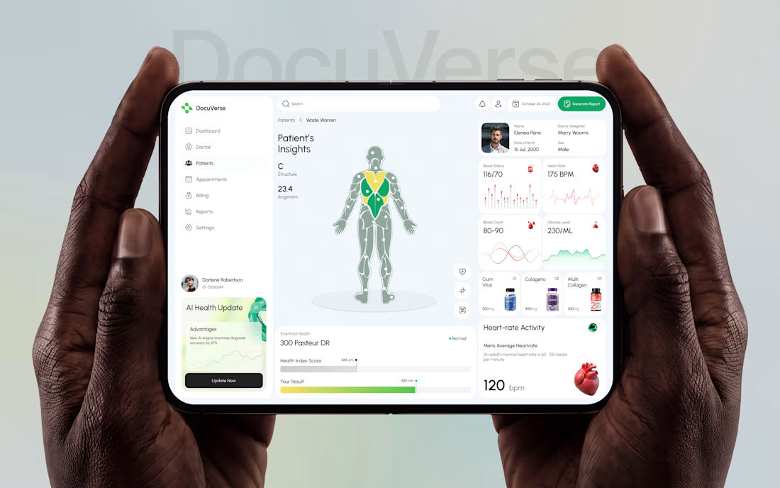

A clearer patient overview can make complex health data feel far less overwhelming. That’s thoughtful UX.


Keeping the Halloween-inspired concepts coming! 🕯️✨
This time, we're sharing Ovelle — a luxury candle e-commerce website with warm tones, elegant typography, and a moody editorial aesthetic. Would love to hear your thoughts! 🎃


