The network for creativity
Join 1.25M professional creatives like you
Connect with clients, get discovered, and run your business 100% commission-free
Creatives on Contra have earned over $150M and we are just getting started
Back to feedPost
Taste Test
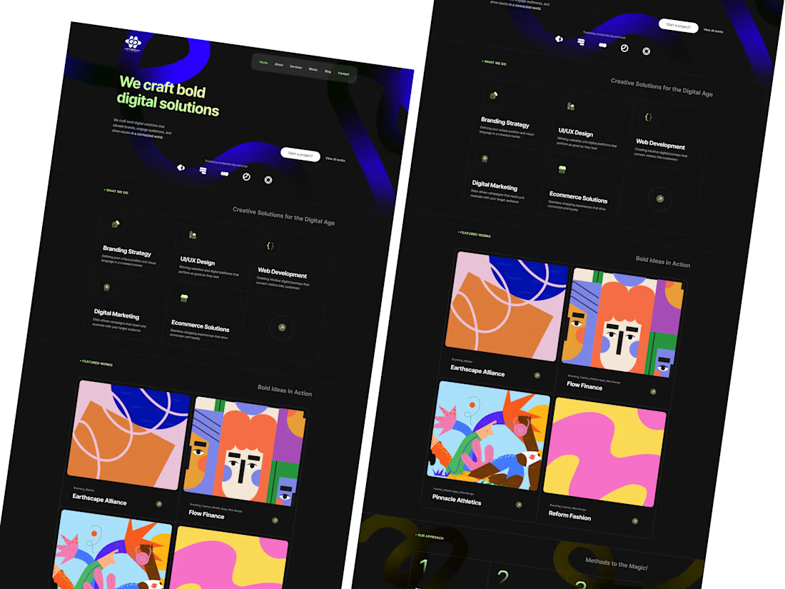
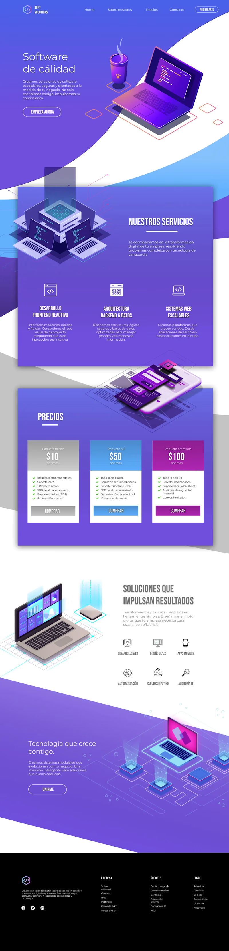
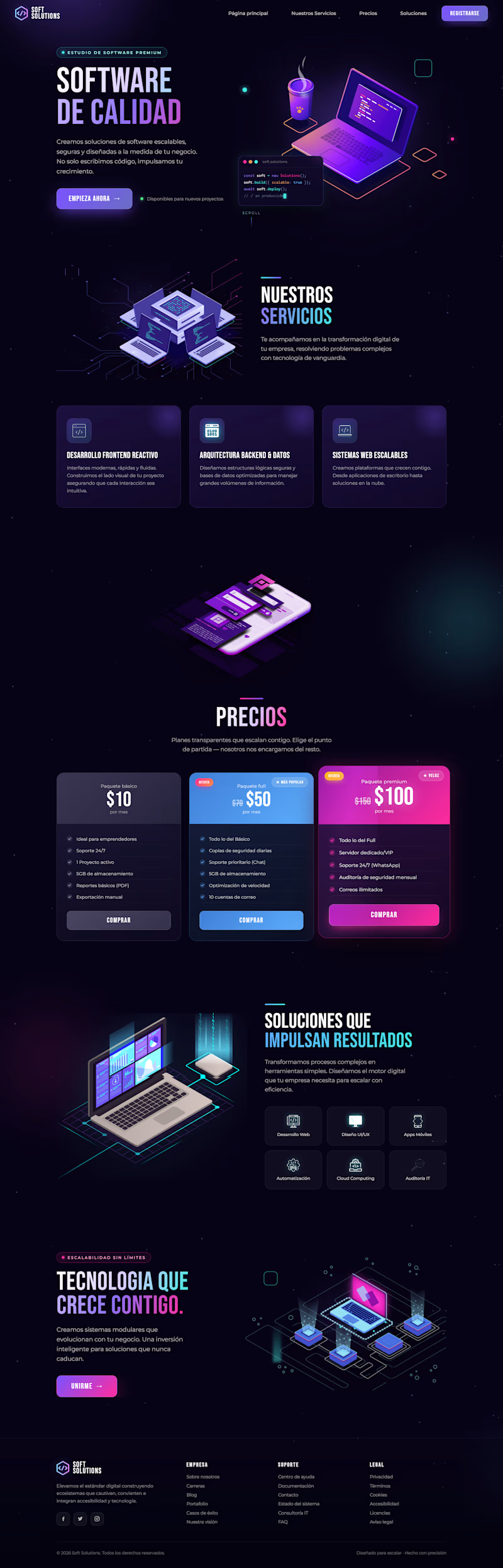
I redesigned the website for this project, keeping its core elements while making it more modern and techy with dark mode by default, eye-catching floating animations, and improved color contrast.
Do you think the redesign I made in Figma is better? Or is the original version better?

19 voted
40%
28 voted
60%
47 votes
Closed

I like the dark mode version more.

The dark mode version feels way more premium honestly, the floating animations add nice depth without being distracting. Did you find the contrast ratios held up okay for accessibility once you switched to dark by default?

The redesign is dark mode only. Thanks a lot!

Grecia, it's hard to choose I’d say both of them. 😉
Right? I also like both!

Original light

The redesign looks much better
you did an amazing job!👍
thank you :)

The new redesigned looks good to me
I also kind of like a little bit more the dark version, it looks modern

The redesign feels more premium to me. Great balance between aesthetics and usability.
thanks a lot :)

Voting for the redesign, the floating animations give it a lot more life and the dark mode reads more premium for this kind of software product. Better contrast makes the text hierarchy easier to scan too.
Thanks! I also like more the redesign version

Redesign dark mode

original light version is good but Redesign dark mode is more impressive

The redesign looks much more premium and, in a way, simpler to process visually. However, in the pricing section, there seems to be a small positioning error with the $100 per month offer. Is that an animation you added when the mouse hovers over it?
I think it may be a mistake because the original version doesnt have animations
Oh, I get what you are talking about! You mean in the redesign version? I made it on purpose. so that package stand out better

Both of them looks nice but I can clearly see a big mistake on the footer the orig light page footer should be white or blue in color. @Grecia Valero that's why everyone's voted on the dark mode
Right, that makes sense
Looking forward to see your top notch creativity in the future!
😊
thank you :)
The network for creativity
Join 1.25M professional creatives like you
Connect with clients, get discovered, and run your business 100% commission-free
Creatives on Contra have earned over $150M and we are just getting started
Related posts

🚀 Creative Digital Agency Website – Modern UI/UX Concept
A strong online presence starts with a great first impression. This website concept is designed for creative agencies, startups, and digital businesses looking to showcase their services with a modern, premium look.
Featuring a bold dark theme, vibrant gradients, clean typography, and a structured layout, the design focuses on both aesthetics and usability. Every section is strategically crafted to guide visitors—from the hero section and services to portfolio, testimonials, and clear call-to-actions—creating a seamless and conversion-focused user experience.
✨ Highlights:
• Modern Dark UI
• Creative Hero Section
• Service Showcase
• Portfolio & Case Studies
• Client Testimonials
• Conversion-Focused CTA
• Responsive Layout
• Clean Visual Hierarchy
• Pixel-Perfect Design
Designed in Figma with scalability, usability, and business goals in mind.

Clean and impressive design! 👏 A strong first impression definitely matters. I'd just add one more layer to long-term success: making sure the website is optimized for search from day one. Great UI/UX attracts visitors, but technical SEO, content strategy, and high-quality...

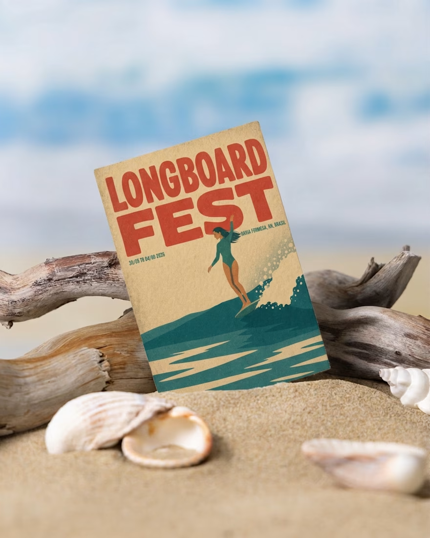
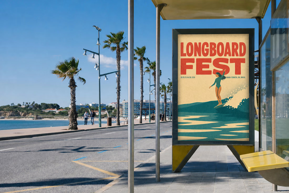
What started as a poster for a local Longboard Fest turned into a creative playground.
I began by generating an illustration from two reference images. After a LOT of iterations, I finally found the direction I was looking for.
Then I experimented with Envato's Style Transfer, exploring different visual styles until one really stood out.
My first idea was simple: place the poster into mockups and animate a flyer falling onto the sand. But once I saw it... it just didn't feel right.
So I changed direction.
While browsing Envato's video templates, I found one with layered posters. Instead of choosing a single design, I decided to animate five different versions of my poster.
That unexpected decision completely transformed the final result, and became my Human by Design moment.
AI helped me explore possibilities, but the creative direction, the decisions, and the final story were entirely human.
Created for the Contra × Envato Human by Design Challenge.
Envato assets used: AI Image Generation | Style Transfer | Mockups | Video Generation | Music | Voice Gen
@envato
envatochallengehumanbydesignenvatoaiAI Agent DesignerAI ArtAI VIsual DesignerAdobe After EffectsEnvatoFigma


I like that you shared the changes in direction instead of just the final result. Those creative pivots are usually where the strongest ideas come from.

need your opinion guys
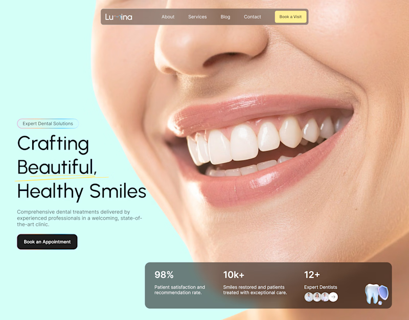
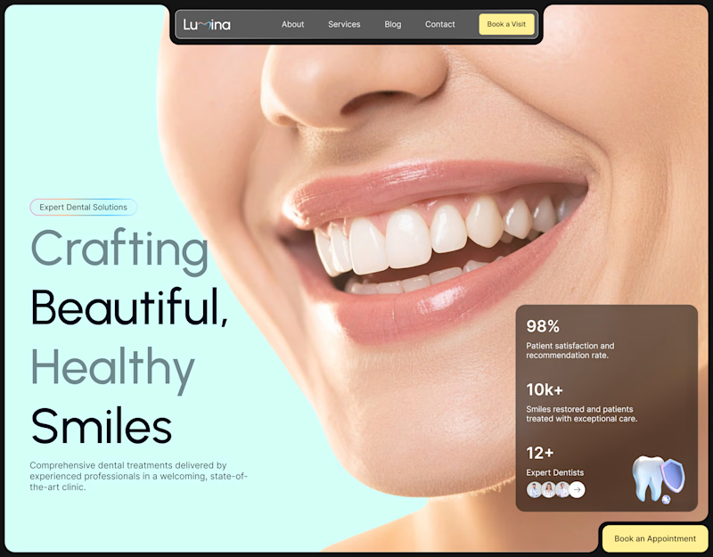
Which home page design do u prefer
A or B?
7 voted
58%
5 voted
42%
12 votes
Closed

tbh, it was very close. both of them are equally as good.







Trending

Claude
Claude has entered the design space. How are you using Claude Design?

Contra University
Learn from expert creatives how to earn more using next-gen AI tools.
creativeaiflow
Creative AI workflows are evolving. What tools do you use, and what are their strengths and weaknesses?
freelancerlife
Freelancer life is wins, pivots, and everything in between. What’s yours right now?