The network for creativity
Join 1.25M professional creatives like you
Connect with clients, get discovered, and run your business 100% commission-free
Creatives on Contra have earned over $150M and we are just getting started
Back to feedPost
Taste Test
Two directions for Saffron & Stone, a candle brand built on warmth, ritual, and quiet luxury. 🕯️
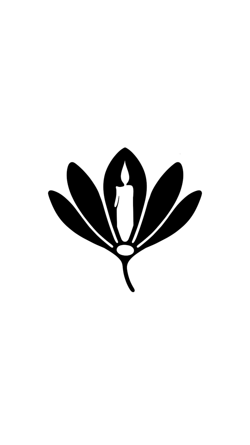
🌸 The Saffron Flame: a saffron flower with a candle flame as its heart. The brand name and the product in one symbol.
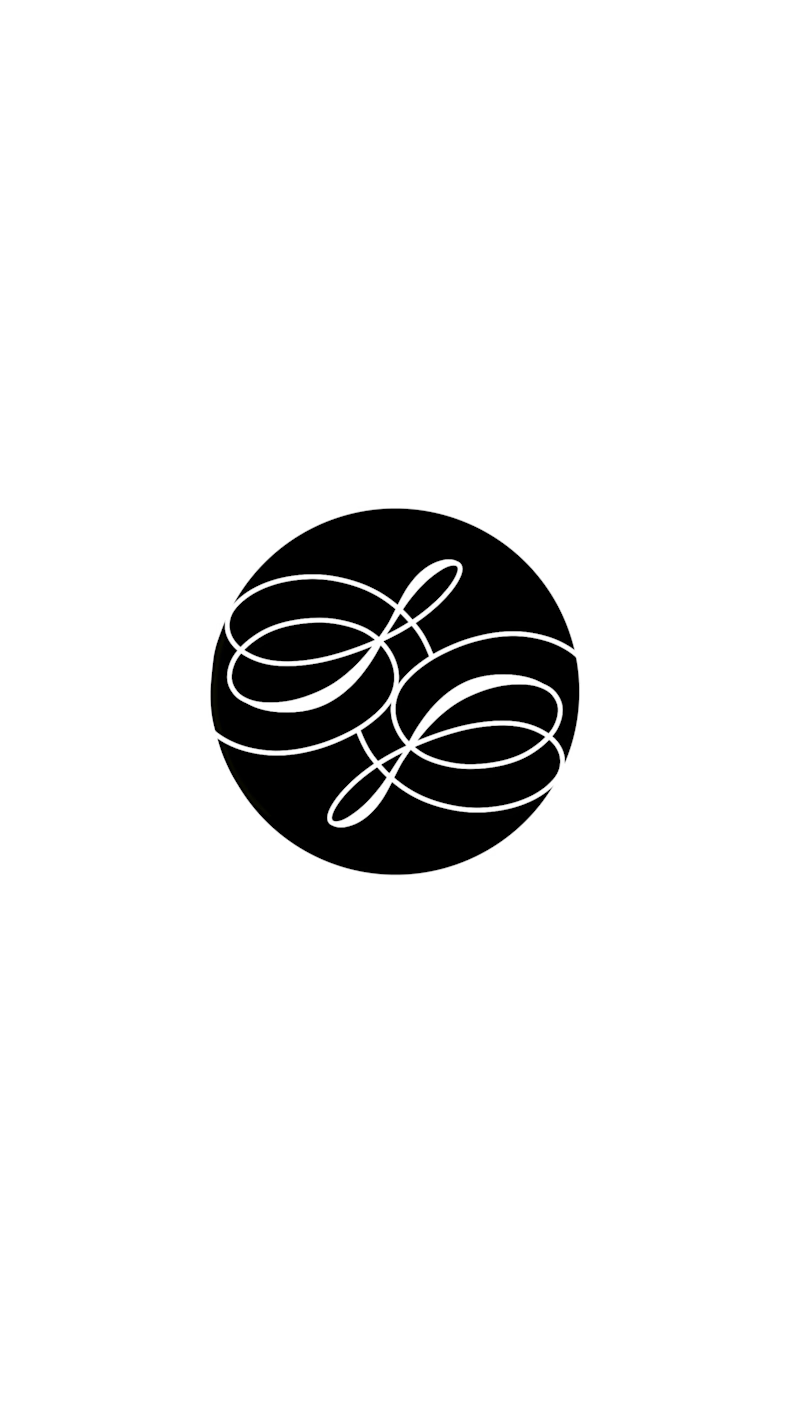
✒️ The Script Seal: a calligraphic monogram in a wax-seal style. Personal, crafted, timeless.
Now I want your honest take 👇
Which one would make you pick the candle off the shelf?
Which would look better embossed on a box or stamped in wax?
Should a candle brand lean on a symbol or on lettering?
Cast your vote in the Taste Test above, then tell me why in the comments. Every opinion helps me refine the final mark.
Need a logo or wordmark with this level of typographic detail for your own brand? Message me or hit “Hire me” on my profile. Let’s build something people remember.
3 votes
Ends in 19h


Thank you so much for your opinion! It’s really gonna help me a lot with figuring out the final logo. Really appreciate it! 🫡
The network for creativity
Join 1.25M professional creatives like you
Connect with clients, get discovered, and run your business 100% commission-free
Creatives on Contra have earned over $150M and we are just getting started


Related posts



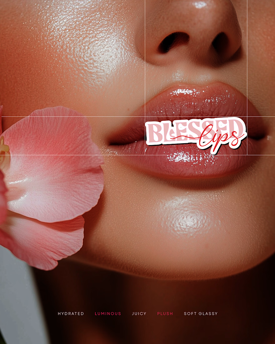
Hydrated, luminous, and made to shine.
Logo design for Blessed Lips, a lip gloss and lipstick brand with a soft, glossy personality.
Playful lettering paired with a delicate script, in rosy tones that feel fresh and warm.


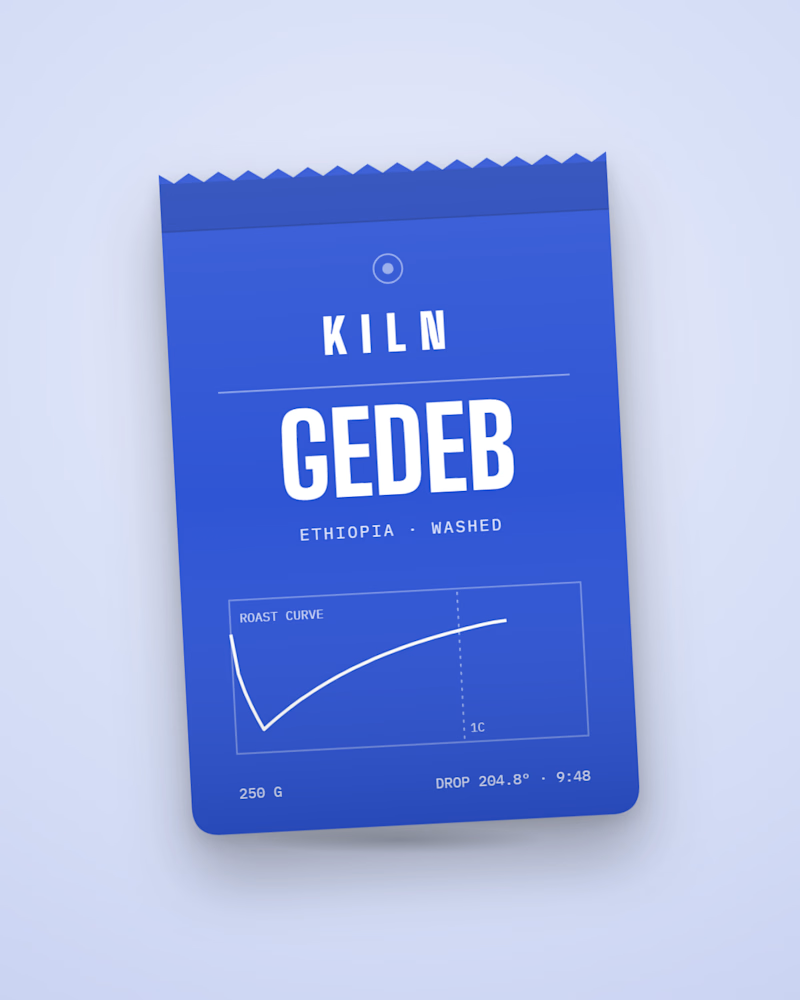
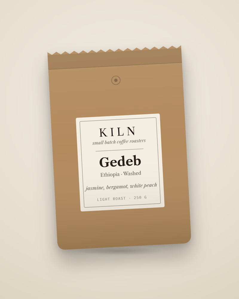
Which bag would make you buy the coffee?
Same coffee, two bags. One prints the real roast curve from its batch: drop temperature, roast time, first crack. The other is the classic kraft label most roasters ship. I built the first into KILN, a Shopify store concept where every bag is generated from its roast data. Which one are you picking up, and why?

8 voted
62%
5 voted
38%
13 votes
Closed

Printing the actual roast curve on the bag is such a good trust move, it turns the data into the packaging. I'd buy that one. Does the curve change with every batch on the print run?