The network for creativity
Join 1.25M professional creatives like you
Connect with clients, get discovered, and run your business 100% commission-free
Creatives on Contra have earned over $150M and we are just getting started
Back to feedPost
Taste Test

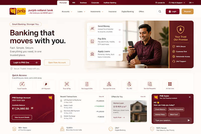
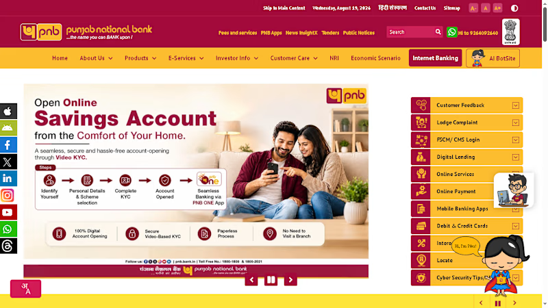
PNB Elevate — Redesigning Banking Around Real User Problems
I redesigned the PNB homepage around real UX issues like navigation, discoverability, complexity, and finding services faster.
The goal: fewer steps, clearer actions, and a simpler banking experience.
I’d love your UX opinion 👇
Which design solves the user's problems better?
What would you improve to make the experience faster and easier to use?
👉 Which design solves the user’s problems better? Vote and tell me why.
Full UI/UX redesign coming soon.
Independent concept project. Not affiliated with or commissioned by PNB.
2 voted
100%
0 voted
0%
2 votes
Closed

The network for creativity
Join 1.25M professional creatives like you
Connect with clients, get discovered, and run your business 100% commission-free
Creatives on Contra have earned over $150M and we are just getting started
Trending
retrofuturism
Share your favorite designs from the past exploring the distant future. Or your own take on the aesthetic 🚀
halftone
Dots. Texture. Grain. Let's see your designs using the halftone technique.

Midjourney
Creatives are showing off what they're making with Midjourney.
colorgrade
Video editors sound off: How do you enhance the mood of your video in color grading?
Related posts


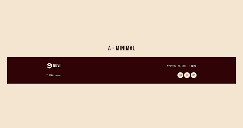
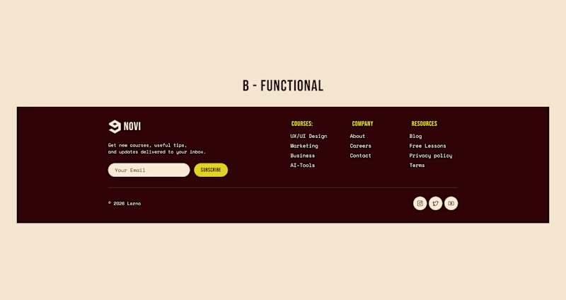
HOW MUCH DOES A FOOTER REALLY NEED?
For this online learning platform, the header is already fixed and always accessible while scrolling.
So I explored two different footer approaches:
A - Minimal. Just the essentials: copyright, legal links & social media.
B - Functional. Course navigation, resources, newsletter & a final CTA.
Which approach would you choose - A or B?
7 voted
15%
41 voted
85%
48 votes
Closed

Minimal looks good

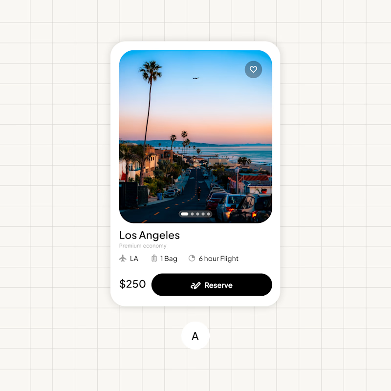
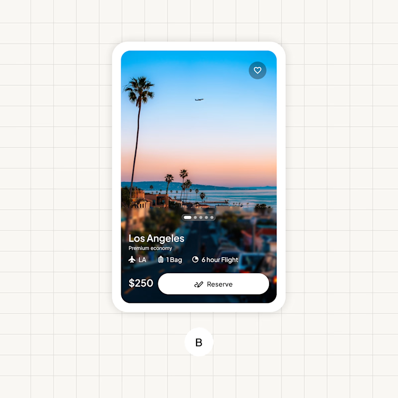
I created these booking cards. Which one do you guys think looks better?
23 voted
64%
13 voted
36%
36 votes
Closed

B is def more premium as long as the images dont complete with the text readability.

This is one of those times when our team in the studio is split 50/50, and we need the community's opinion on which animation and transition is more appealing.
Thanks 🤜🤛

11 voted
34%
21 voted
66%
32 votes
Closed

I think Option 1 looks more modern and polished. The clean typography and minimal composition give it a stronger contemporary feel. ✨