The network for creativity
Join 1.25M professional creatives like you
Connect with clients, get discovered, and run your business 100% commission-free
Creatives on Contra have earned over $150M and we are just getting started
Back to feedPost
Taste Test

This is one of those times when our team in the studio is split 50/50, and we need the community's opinion on which animation and transition is more appealing.
Thanks 🤜🤛

11 voted
34%
21 voted
66%
32 votes
Closed

I think Option 1 looks more modern and polished. The clean typography and minimal composition give it a stronger contemporary feel. ✨
Thank you so much for the detailed feedback 🙌

Option 1 looks super clean!
Thanks a lot, Celia

i like option 2 as it made me want to see whats next. lol if that make sense.
Oh, many thanks, Sabrina

This was a tough one but option 2 has my vote
Thank you, it was important for us too.


option 2 feels smoother to me.
I appreciate it 🙏

Option 2 has it
Thanks, Timothy 🙌

Going with option 2
Going say you thanks 🙌

It is option 1 for me
Caleb, thanks 👍

Great work. love it
The network for creativity
Join 1.25M professional creatives like you
Connect with clients, get discovered, and run your business 100% commission-free
Creatives on Contra have earned over $150M and we are just getting started











Related posts

15 seconds of smooth UI, editorial layouts, and micro-interactions.
Kept the micro-interactions snappy, typography expressive, and transitions buttery smooth.
Rate this UI animation from 1 to 10 in the comments, or tell me what you’d improve! 😉


Solid 10/10 bro! 🔥 Micro-interactions are super snappy and transitions are buttery smooth indeed. Editorial layout game is strong. Keep it up!

Hey everyone! 👋
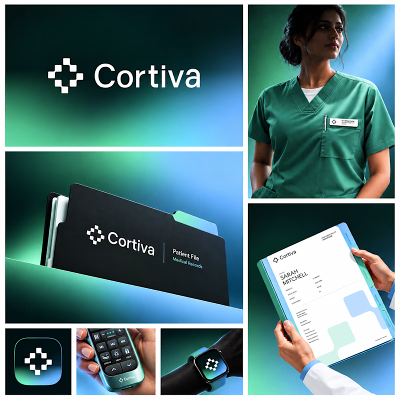
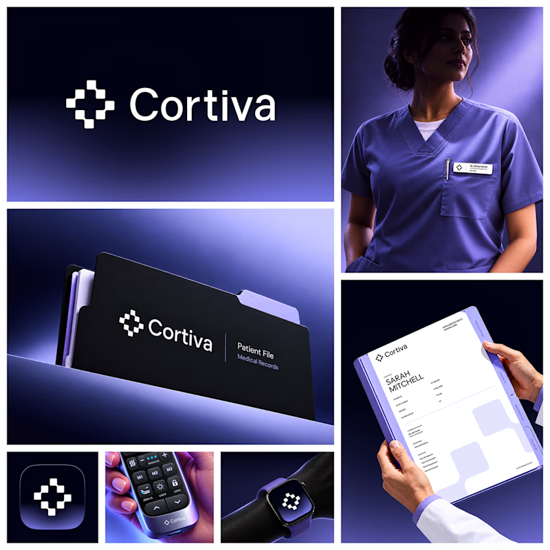
Working on Cortiva, an AI-first hospital branding project.
I've already finalized the color direction, but I thought it would be fun to explore two different moods.
Option 01💚 or Option 02? 💜
Both have their own personality, and I'm curious to see which one you prefer!
Let's see which one wins! 👀
5 voted
33%
10 voted
67%
15 votes
Closed

Both directions are strong, but I'm leaning towards Option 01. The green feels instantly like "care" and trust, which is perfect for a hospital. Option 02 looks more techy and premium. Curious, which mood are you aiming for - clinical and calm, or friendly and modern?


Which Kajabi direction would stop your scroll?
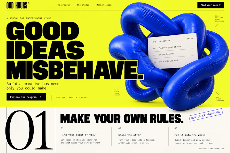
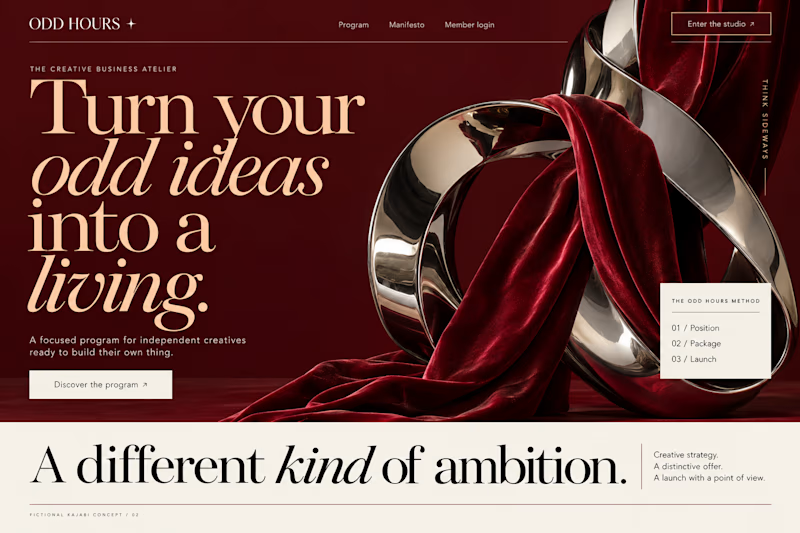
Meet ODD HOURS, a creative-business academy concept.
A / Acid Play: electric yellow, oversized type and a sculptural blue knot.
B / Velvet Rebellion: oxblood, chrome and velvet with fashion-editorial typography.
Two original AI-generated concepts. Same offer. Completely different energy.
Which one pulls you in, and why?

15 voted
65%
8 voted
35%
23 votes
Closed

It's only Acid Play it's unbelievable 🔥🔥🔥🔥
Great job Kraig🎉🎉