The network for creativity
Join 1.25M professional creatives like you
Connect with clients, get discovered, and run your business 100% commission-free
Creatives on Contra have earned over $150M and we are just getting started
Back to feedPost


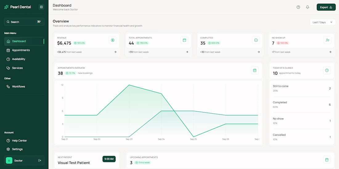
An empty dashboard is the first screen a new account sees.
What changes between the before and after:
1. The headline says what the dashboard is for
2. The sub-headline says what is possible
3. The button names the system to connect
Clear writing means faster time to value

The network for creativity
Join 1.25M professional creatives like you
Connect with clients, get discovered, and run your business 100% commission-free
Creatives on Contra have earned over $150M and we are just getting started







Related posts


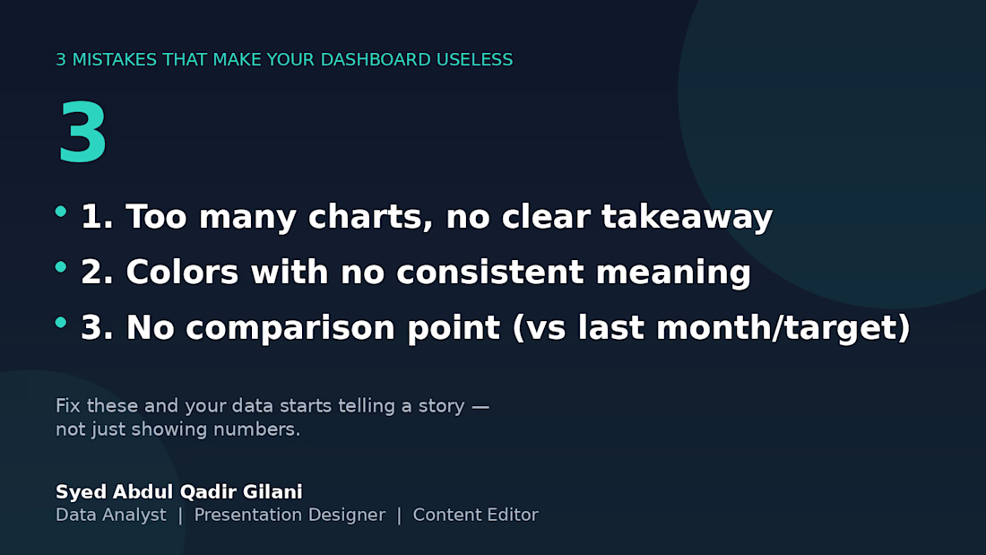
3 mistakes that will eventually make this board useless. 📉
I've reviewed several client dashboards over the years, and the same 3 problems show up over and over:
1️⃣ Too many charts, no clear takeaway — if I can't tell what to do after looking at it, it's decoration, not a dashboard.
2️⃣ Colors with no consistent meaning — red means "unacceptable" on one chart and "category 3" on the next. Pick a system and stick with it.
3️⃣ No comparison point — a number alone means nothing. "Revenue: $12,480" tells you nothing. "Revenue: $12,480 (+18% vs last month)" tells you everything.
Fix these three, and your data stops being numbers on a page — it starts being something people actually use to decide.
What's the most common dashboard mistake you've seen? 👇



Designed an immersive, narrative-driven landing page experience for Elevated Iron that captures the relentless journey of a dedicated athlete. 🏋️
The interface weaves an engaging visual story from raw determination to elite transformation, blending high-contrast aesthetic line-art illustrations with striking dark-mode visuals, seamless gym location discovery, and high-impact social proof.
Scope of work encompasses end-to-end UI/UX architecture, custom visual storytelling, and conversion-focused design built to turn passive visitors into committed community members. Have a powerful story to tell?
Let’s connect and create something iconic! 📩

Outstanding work bro. Keep it up.