The network for creativity
Join 1.25M professional creatives like you
Connect with clients, get discovered, and run your business 100% commission-free
Creatives on Contra have earned over $150M and we are just getting started


The network for creativity
Join 1.25M professional creatives like you
Connect with clients, get discovered, and run your business 100% commission-free
Creatives on Contra have earned over $150M and we are just getting started

Challenges
View all


Related posts


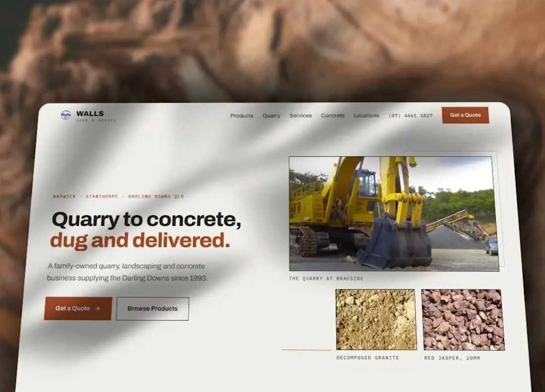
I put this website concept together for Wall’s Sand & Gravel, a local supplier of landscaping and construction materials.
Their existing site already had the basic information customers would need, so the goal wasn’t to completely reinvent it. I mainly wanted to see how the same business could be presented in a cleaner, more modern way with a stronger mobile experience.
I focused on clearer layout, easier scanning, better use of imagery and more obvious contact information, while keeping the site simple and practical.
The build was kept lightweight and responsive, with the idea that customers should be able to quickly understand what the business offers and get in touch without digging through the site.
This was a concept project rather than commissioned client work, but it’s a good example of how I approach redesigns where the existing website is functional, but could benefit from a cleaner and more current presentation.
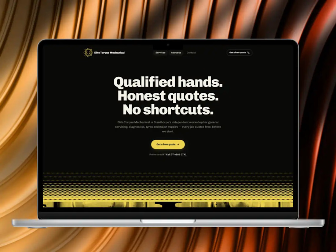
I built this website concept for Elite Torque Mechanical, a local automotive business.
The idea was to take their existing web presence and give it a cleaner, more modern feel while keeping the site straightforward and easy for customers to use.
I focused heavily on the mobile experience, since a lot of customers looking for a mechanic are going to be checking the site from their phone. The layout keeps the important information easy to find, with clear service sections, contact details and strong calls to action without making the site feel cluttered.
I also kept performance in mind throughout the build, using a lightweight custom setup rather than relying on a heavy website builder.
This was a concept project rather than commissioned client work, but it’s a good example of the kind of website I like building for local service businesses: clean, fast, easy to navigate and focused on actually helping customers take the next step.
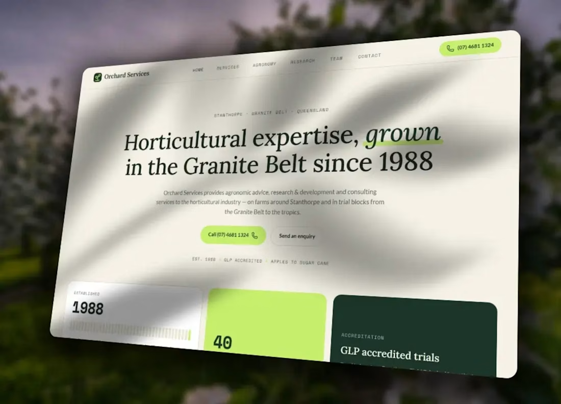
I put this website concept together for Orchard Services, a local agricultural consultancy business.
Their existing site felt pretty dated and wasn’t especially strong on mobile, so I wanted to see what a cleaner, more modern version could look like without making it overly complicated.
The main focus was making the business easier to understand at a glance, what they do, the services they offer, and how to get in touch, while giving the site a much more polished and professional feel.
I kept the design fairly straightforward, with clear sections, strong imagery and prominent contact options. I also made sure the layout worked properly across phones and larger screens rather than treating mobile as an afterthought.
This was a concept project rather than commissioned client work, but it’s a good example of the kind of redesign I like doing for established small businesses: keeping what actually matters, removing the clutter, and making the whole thing feel current and much easier to use.