The network for creativity
Join 1.25M professional creatives like you
Connect with clients, get discovered, and run your business 100% commission-free
Creatives on Contra have earned over $150M and we are just getting started
Back to feedPost

I'm redesigning my portfolio, and would love to know in your opinion, what sections a portfolio MUST have? Would love to know

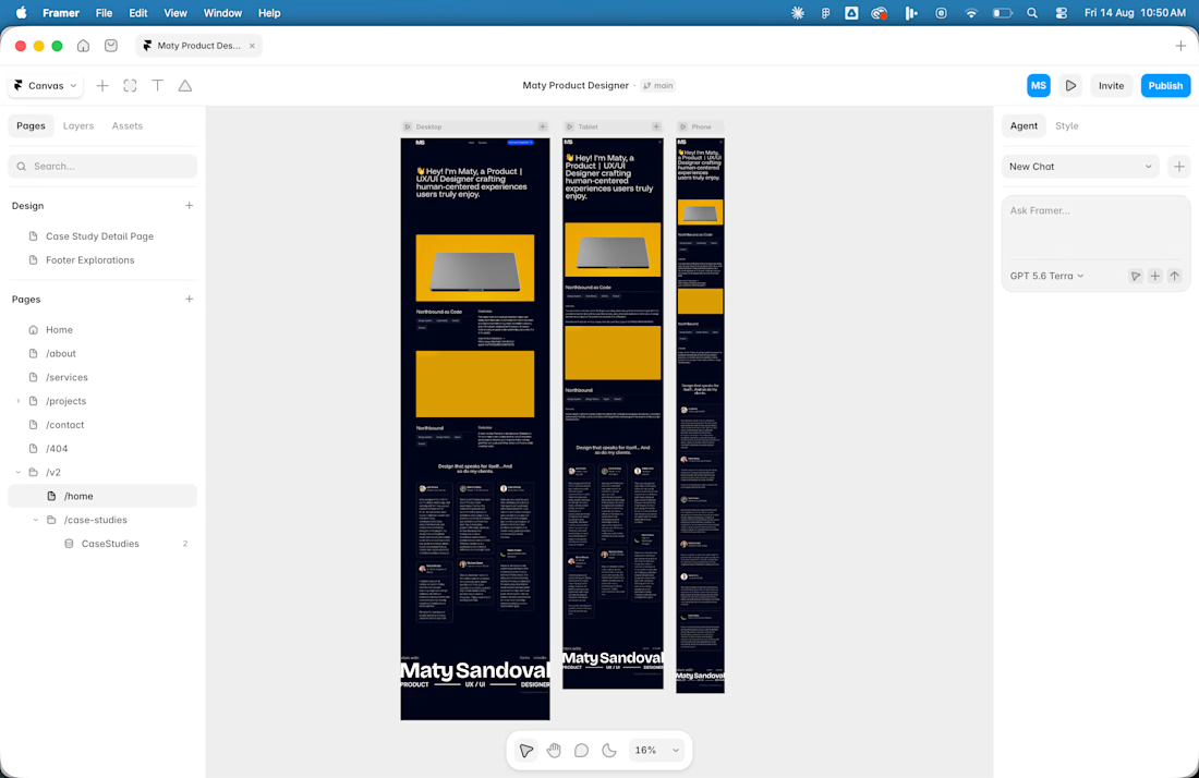

Hello Maty, hero section is most important thing in my opinion.
Strongly agree with you! The first impression gives users contexts and make them stay and navigate through the rest of the site


Project gallery must be very straight forward UX wise
The network for creativity
Join 1.25M professional creatives like you
Connect with clients, get discovered, and run your business 100% commission-free
Creatives on Contra have earned over $150M and we are just getting started

Challenges
View all


Related posts

I usually don't stop at 3 breakpoints when building a website.
Most people think about: Mobile, Tablet, Laptop
I like adding one more: Desktop
Because what looks great at 1440px can feel completely different at 1920px...
- The layout gets too wide.
- Spacing starts feeling off.
- Content loses its balance.
So I like testing the system across: Mobile → Tablet → Laptop → Desktop
Not because every website needs exactly 4 breakpoints. But because responsive design isn't about making a few screen sizes work.
It's about making the whole system work.
Follow Rushabh for more website fundamentals, experiments, and things I learn while building for the web.
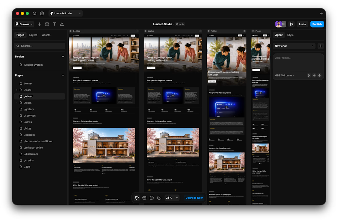

Wide screens expose spacing issues that laptop previews can hide.

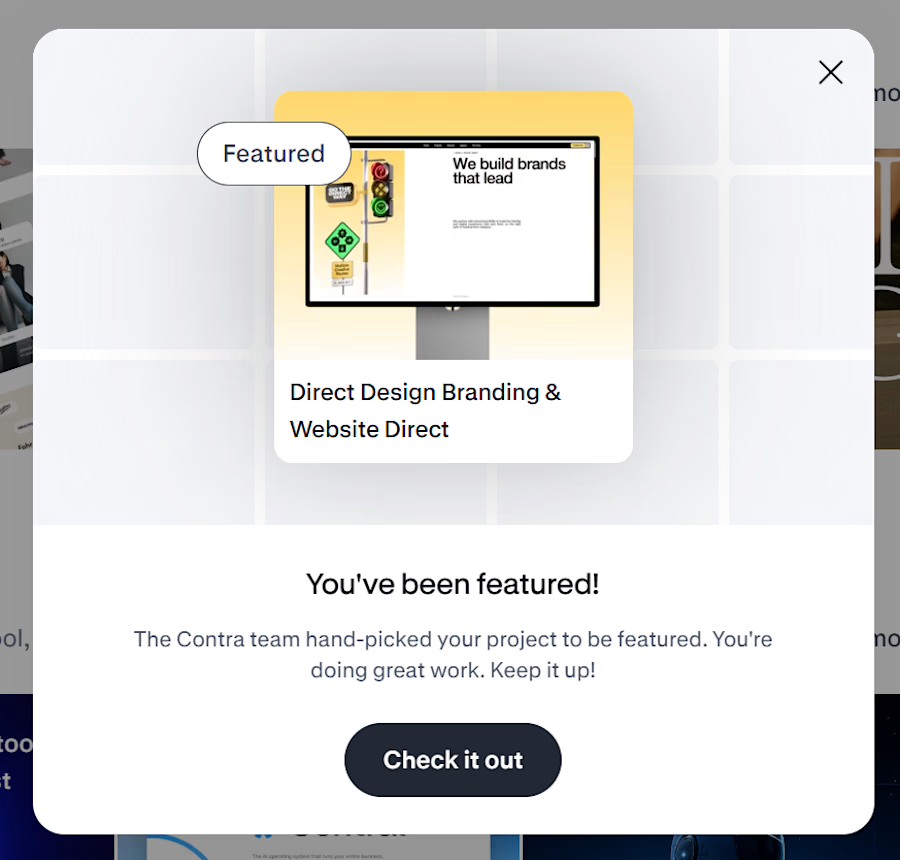
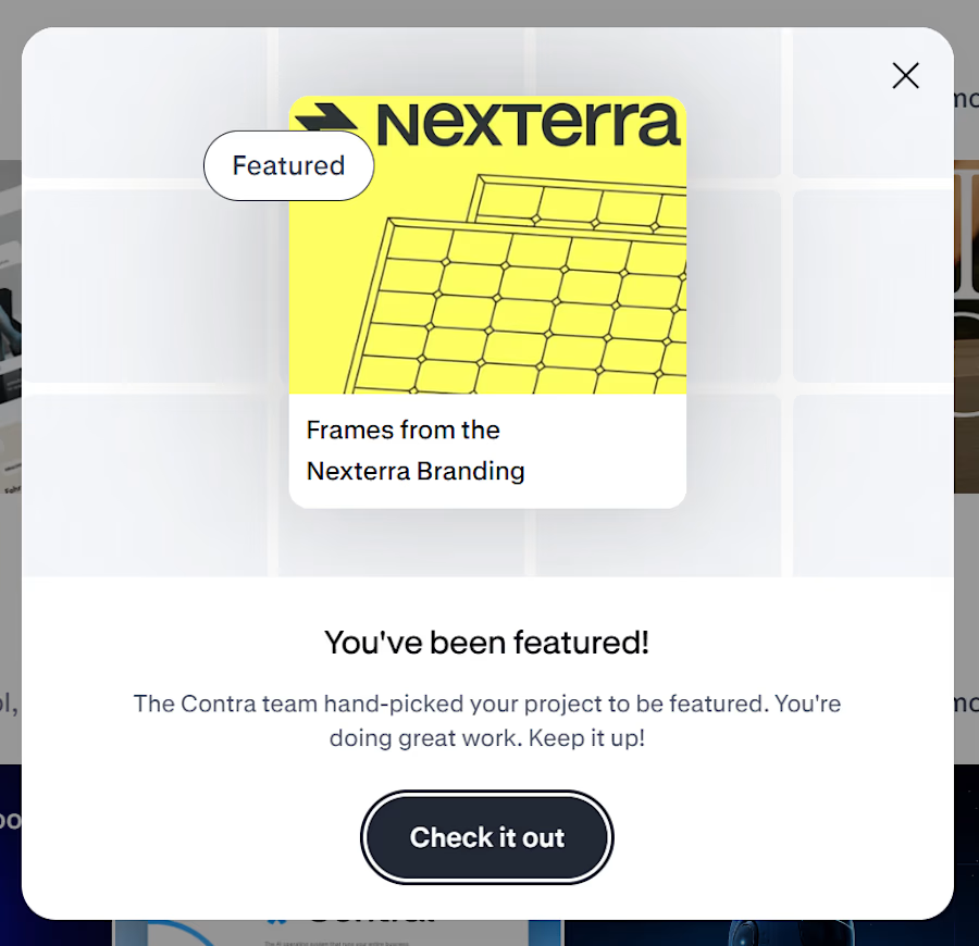
Woke up to these messages today 🤩
Never really thought my first features on Contra would feel this reassuring. Seeing both Direct Design and Nexterra get picked by the Contra team honestly means a lot.
There’s always that little doubt when you put your work out there, wondering if it’s good enough, if the right people are seeing it or if you’re moving in the right direction.
So this was a really nice reminder to keep going and keep making things I believe in.
Thank you to the Contra team for noticing the work and for the little bit of encouragement I didn’t know I needed. 🫶
More to come. 🌠


A SaaS website can explain every feature perfectly and still leave one question unanswered:
Why should I care?
That's why CORESPACE includes Stories.
Instead of only describing what the product does, Stories give those features context — showing how they're used and what they make possible.
Features explain the product.
Stories make it relatable.

The “why should I care?” framing is exactly the right antidote to feature tours. Turning real team stories into the connective tissue between the product and its impact makes the homepage feel human, not just informative.