The network for creativity
Join 1.25M professional creatives like you
Connect with clients, get discovered, and run your business 100% commission-free
Creatives on Contra have earned over $150M and we are just getting started
Back to feedPost

Woke up to these messages today 🤩
Never really thought my first features on Contra would feel this reassuring. Seeing both Direct Design and Nexterra get picked by the Contra team honestly means a lot.
There’s always that little doubt when you put your work out there, wondering if it’s good enough, if the right people are seeing it or if you’re moving in the right direction.
So this was a really nice reminder to keep going and keep making things I believe in.
Thank you to the Contra team for noticing the work and for the little bit of encouragement I didn’t know I needed. 🫶
More to come. 🌠
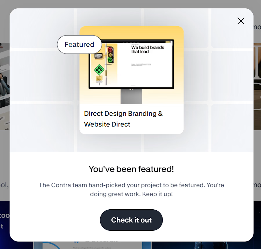
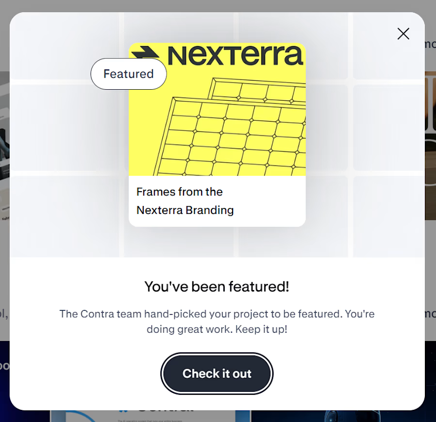

Congrats on the features—those two case-study tiles communicate a clear brand story at a glance. The contrast between Direct Design's editorial layout and Nexterra's structured system makes the breadth of your work feel especially convincing.
Thanks Rohan!

Thanks Ganesh!
The network for creativity
Join 1.25M professional creatives like you
Connect with clients, get discovered, and run your business 100% commission-free
Creatives on Contra have earned over $150M and we are just getting started





Related posts

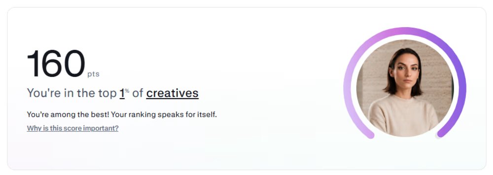
Made it to the top 1% of creatives on Contra.
My discovery points are still going up, with one more case study left to write.
Grateful for the people I’ve met through Contra, the projects we’ve worked on, and the opportunity to keep growing together. 🎉


Congratulations!🎉 🚀

Winder is a bold brand identity built around a geometric W-inspired symbol, combining sharp angles and forward movement to represent progress, speed, and direction.
The identity uses a striking red and deep burgundy palette, supported by clean typography and a consistent visual system across brand guidelines, digital applications, and product mockups.
Progress in Motion.




Great logo it feels it really has an identity 🎉🎉


Rejected logo concepts exploring collaboration, shared expertise & working side by side