The network for creativity
Join 1.25M professional creatives like you
Connect with clients, get discovered, and run your business 100% commission-free
Creatives on Contra have earned over $150M and we are just getting started
Back to feedPost
Taste Test

Which About Section Feels More Premium? 👀
Same content. Two different layouts.
I’m testing two directions for a modern healthcare website — one prioritizes visual impact and spaciousness, while the other focuses on balance, readability, and structured composition.
Which one would you choose: A or B?
Drop your choice in the comments and tell me what made the difference for you — layout, hierarchy, spacing, or overall visual feel.
#WebDesign #UIDesign #Figma #Framer #HealthcareDesign


4 voted
80%
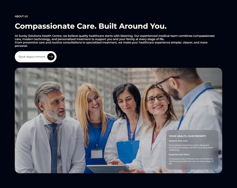
1 voted
20%
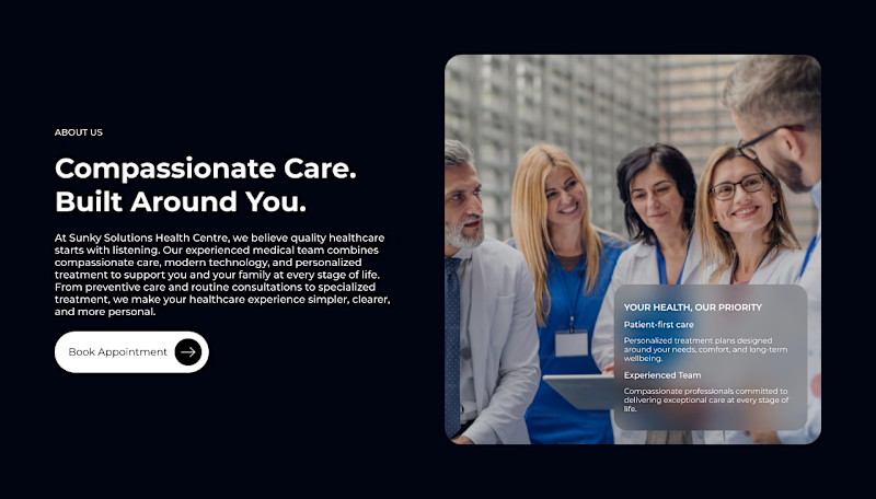
5 votes
Closed

option a is better

I go with A

The network for creativity
Join 1.25M professional creatives like you
Connect with clients, get discovered, and run your business 100% commission-free
Creatives on Contra have earned over $150M and we are just getting started

Challenges
View all


Related posts

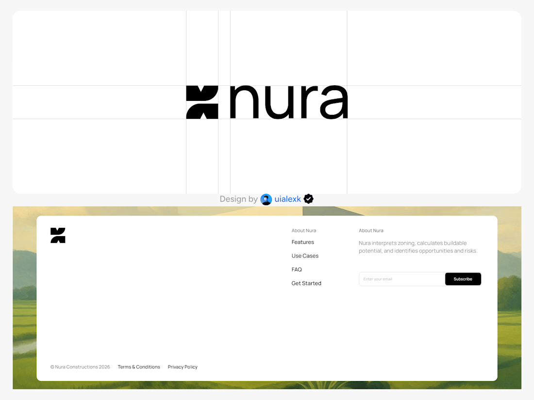
Branding design and Framer Development for an AI real estate tool
See full Case study

amazing work!🚀

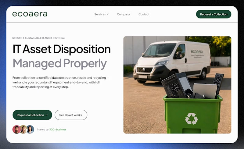
Which design feels more professional and trustworthy for a B2B company?
A recent website redesign for Ecoaera, a UK-based IT asset disposal company. We transformed their existing site into a modern B2B website with improved UX, stronger service pages, and SEO + AI optimisation.
1 voted
9%
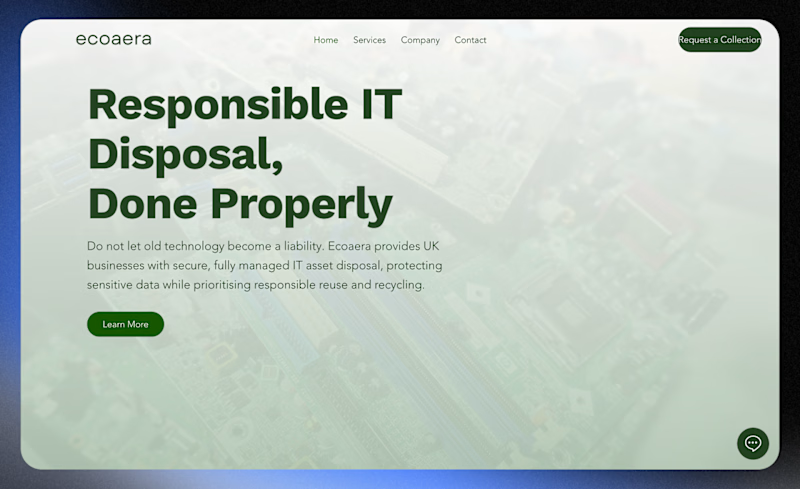
10 voted
91%
11 votes
Closed


Looks great !


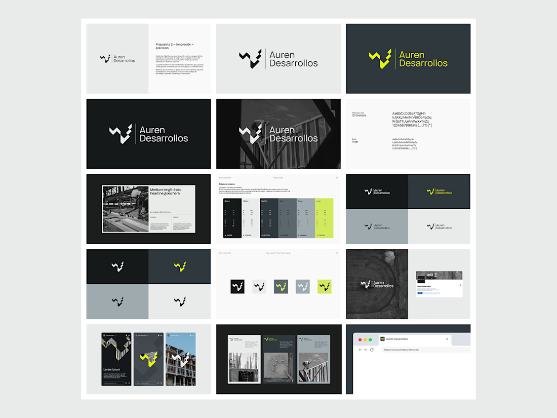
Not every direction makes it to the final brand.. this was one of the directions we explored for Auren Desarrollos, a new construction and development company we’re currently working with on its branding and website.
I’ll be sharing the final result soon, and I think the difference will be interesting to see.
What do you think?


Great!