The network for creativity
Join 1.25M professional creatives like you
Connect with clients, get discovered, and run your business 100% commission-free
Creatives on Contra have earned over $150M and we are just getting started
Back to feedPost
Taste Test

Light Mode or Dark Mode? 👀
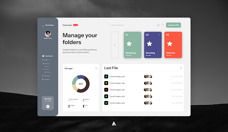
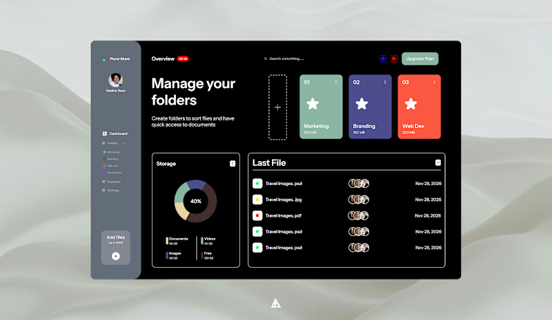
Meet PluralShare — a clean and modern file-sharing dashboard designed to make managing folders, files, storage, and shared documents feel simple and organized.
For this Contra Taste Test, I want to know:
☀️ Light Mode — clean, bright & minimal
🌙 Dark Mode — sleek, bold & easy on the eyes
Which one would you choose for your everyday workflow?
And most importantly… what do you love about the design? 👇
Is it the layout, color system, folder cards, storage overview, or the overall simplicity?
Drop your choice in the comments: ☀️ Light or 🌙 Dark?
Designed by ATA — always exploring better ways to make digital experiences feel simple, functional, and beautiful.
PluralShare Taste Test: Which do you love more—☀️ Light Mode or 🌙 Dark Mode? Drop your pick today! 👇
1 voted
100%
0 voted
0%
1 vote
Closed
The network for creativity
Join 1.25M professional creatives like you
Connect with clients, get discovered, and run your business 100% commission-free
Creatives on Contra have earned over $150M and we are just getting started







Related posts


Finally landed on a version the client is happy with.
Which 'A' letter do you think fits better?
27 voted
52%

25 voted
48%

52 votes
Closed

I choose Short but I don't know the difference but the design is great congrats 🎉


Somewhere between a research lab and a film opening.
Two hero sections I developed in Webflow.
One fills the screen with lab footage. The other pairs a moving gallery with a wordmark that fades out of focus.
Same project, two very different moods. Which one does it for you?


38 voted
57%
29 voted
43%
67 votes
Closed

hard call, but i had to opt for gallery!


Kajabi, Reimagined: From Course Site to Signature Brand
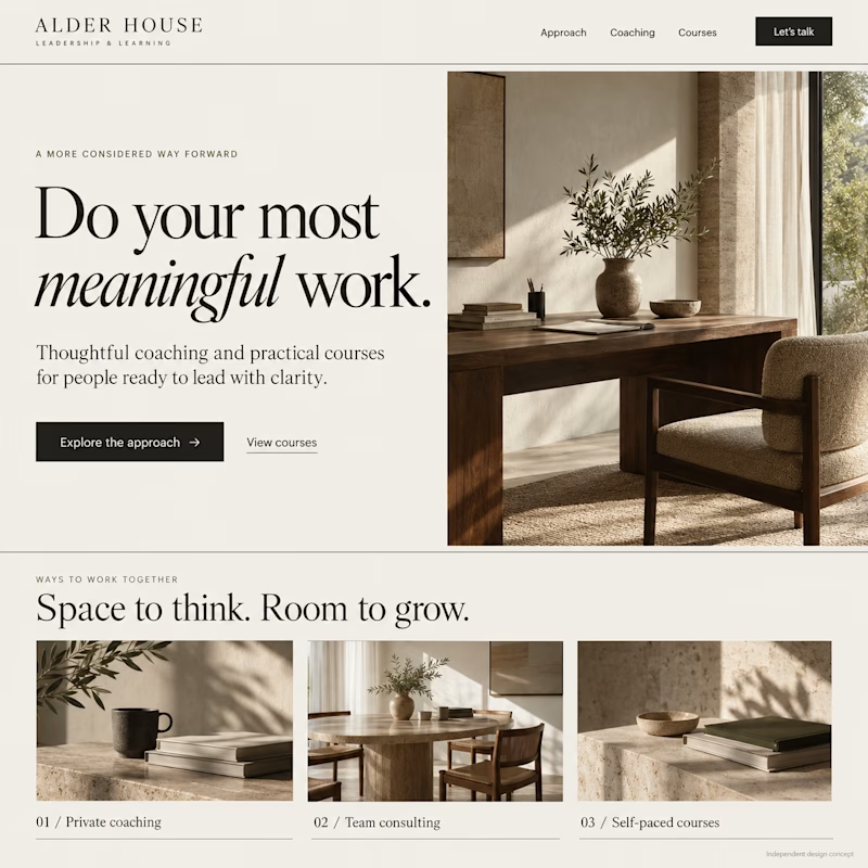
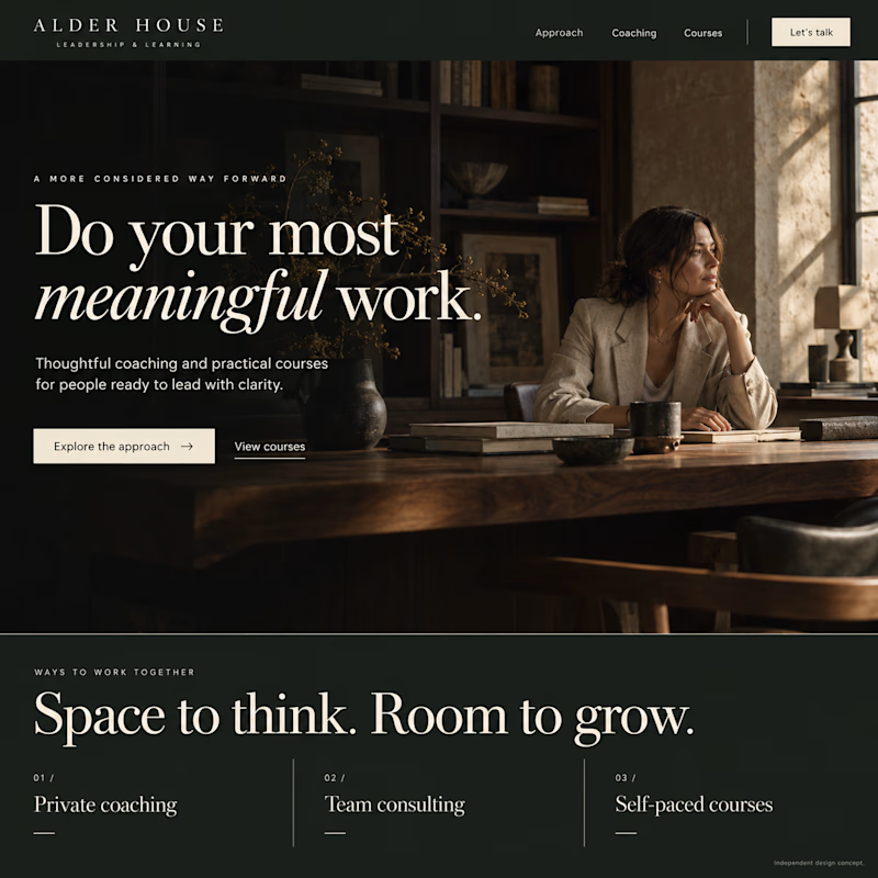
A custom Kajabi redesign concept for coaches, consultants and course creators. Expressive typography, generous spacing and cinematic imagery turn a familiar course-site layout into a premium editorial brand experience.
Ivory Editorial or Midnight Editorial—which would you choose?
Original AI-generated visuals for fictional brand Alder House.

12 voted
52%
11 voted
48%
23 votes
Closed