The network for creativity
Join 1.25M professional creatives like you
Connect with clients, get discovered, and run your business 100% commission-free
Creatives on Contra have earned over $150M and we are just getting started
Back to feedPost


The network for creativity
Join 1.25M professional creatives like you
Connect with clients, get discovered, and run your business 100% commission-free
Creatives on Contra have earned over $150M and we are just getting started
Related posts

I’m designing an alert feature to help users monitor their parents' medication adherence. The goal is to notify children when a dose is missed, while also allowing them to view upcoming schedules, all without feeling too alarmist.
How would you balance this sense of urgency with a supportive, clear UI? I’d love to hear your thoughts on this design direction!
8 voted
40%
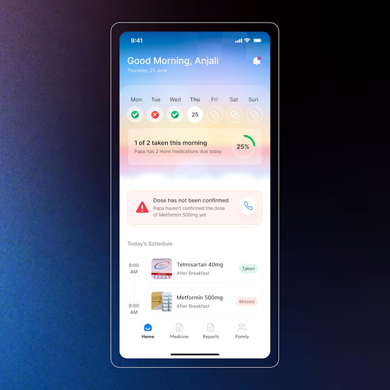
12 voted
60%
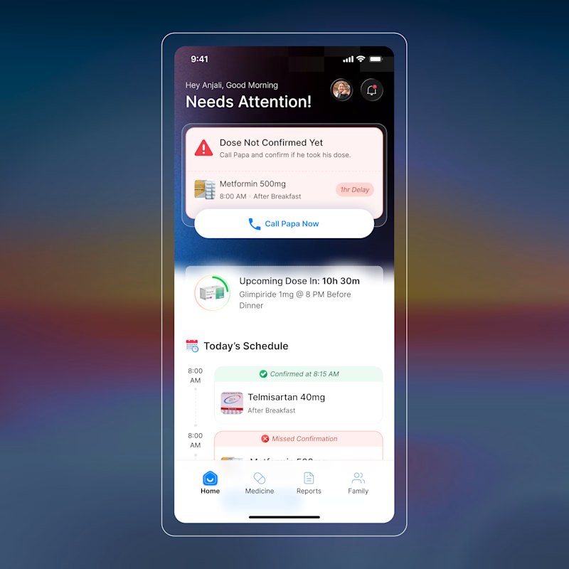
20 votes
Closed

B look organised


Amazing work

Another project wrapped up! 🙌
I recently designed this homepage with a focus on simplicity, clarity, and creating an engaging user experience. It's always exciting to see ideas evolve into polished interfaces.
Would love to hear your thoughts!











Trending

Claude
Claude has entered the design space. How are you using Claude Design?

Contra University
Learn from expert creatives how to earn more using next-gen AI tools.
creativeaiflow
Creative AI workflows are evolving. What tools do you use, and what are their strengths and weaknesses?
freelancerlife
Freelancer life is wins, pivots, and everything in between. What’s yours right now?