The network for creativity
Join 1.25M professional creatives like you
Connect with clients, get discovered, and run your business 100% commission-free
Creatives on Contra have earned over $150M and we are just getting started
Back to feedPost

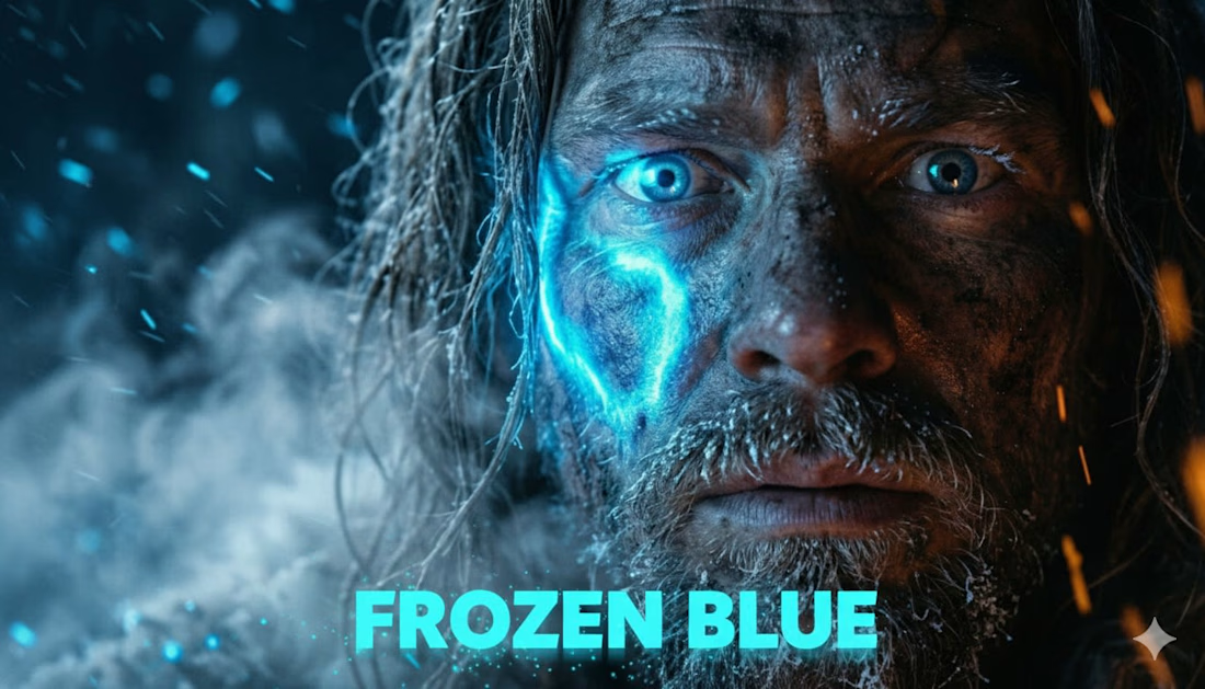
"Frozen Blue" is an exploration of high-fidelity AI cinematography, focusing on character consistency and atmospheric world-building. This film serves as a proof of concept for the future of independent action cinema, blending traditional editing techniques with generative technology.


The network for creativity
Join 1.25M professional creatives like you
Connect with clients, get discovered, and run your business 100% commission-free
Creatives on Contra have earned over $150M and we are just getting started
Challenges
View all


Related posts

Thaw — AI Mental Wellness Platform Landing page
Designed the landing page and dashboard preview for Thaw — an AI platform that tracks anxiety, mood, and burnout, framing emotional buildup as frost that gradually melts through guided sessions.
Mental health apps tend to land in one of two places: too clinical to feel human, or too soft to feel like it takes anything seriously. So the whole design leans on one strong metaphor instead — a head encased in melting ice — and lets oversized typography wrap directly around it for real visual weight.
Below the hero, the dashboard preview does the harder work: mood stability, anxiety signals, sleep quality, and a specific AI-detected insight that makes the product feel genuinely perceptive rather than generic.
A warm dark palette with cool blue type keeps the tone serious without tipping into heavy.
Creative - Midjourney
Animation - Jitter


Playing around with SaaS motion using Claude + After Effects + Higgsfield.
Just started experimenting with smooth movements, little bounces, and some morphing techniques.
Still figuring things out, but this workflow is pretty interesting. If this keeps working, making a full explainer video might not take a whole week anymore. 😄


Caelum — Concept project (fictional brand)
Caelum isn't a real product. It's a self-initiated portfolio piece — a fictional daily collagen gummy I built end to end to practise taking a clinical category and giving it clean-beauty desirability.
The name (Latin for "sky") set the direction: clarity. Skin, clear as sky. Form came before colour — I skipped the generic supplement jar for a sculptural asymmetric bottle, with a wide mouth for the gummies and matte soft-touch plastic instead of glass (glass would've been dishonest for something you open every day — the luxury is in the touch, not the shine).
The campaign was directed through my Augmented Art Direction approach: AI as a precision instrument under tight direction, then unified by hand in Affinity so the set reads as one campaign.
Real question for you: does the matte plastic feel more premium than glass here, or less? Curious where people land. 👇
Design & direction: Vidrio.


These are some sick visuals Andreu, good job! 😍