The network for creativity
Join 1.25M professional creatives like you
Connect with clients, get discovered, and run your business 100% commission-free
Creatives on Contra have earned over $150M and we are just getting started
Back to feedPost


Can you spot the W? 👀
I designed the identity for WalletStamp, a SaaS that puts loyalty cards into Apple and Google Wallet.
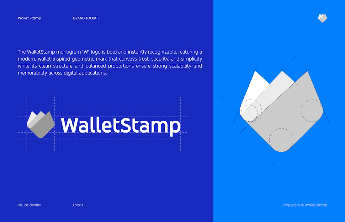
The idea: a wallet made of three layers. The peaks on top form the W, and the pointed base reads like a pocket.
What I focused on:
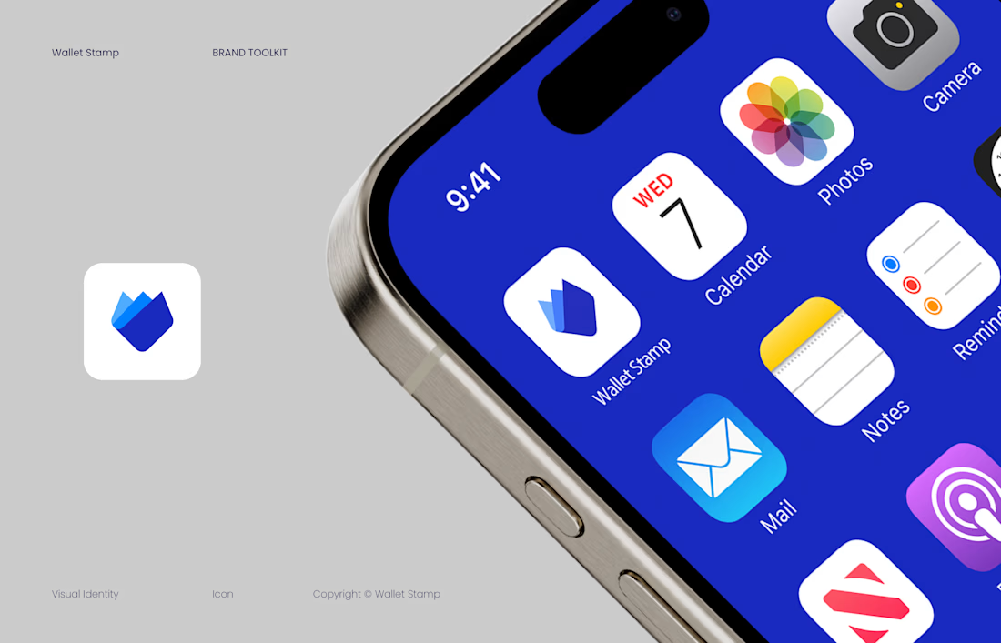
One shape, many sizes. Flat tints, no gradients, and corners built from circles. It works as a logo, an app icon, and a splash screen.
Colors that say “trust me.” Deep Blue #192BC2 and Dark Blue #080E42 for authority, Blue #007FFF for energy, Ice Climber #50B0FF for lightness.
Guidelines the team can use. A 16-page brand toolkit delivered as a PDF and source files, covering logo versions, typography (YouTube Sans), social templates, app screens, and what never to do.
If you’re launching a SaaS or app and need a mark that works at app-icon size, my Logo Design Package is $350 and takes 7 days: https://contra.com/s/ccA6mOOo-logo-design-package-primary-logo-variations
Did you see the W first, or the wallet? 👇

Great job 🎉🎉
The network for creativity
Join 1.25M professional creatives like you
Connect with clients, get discovered, and run your business 100% commission-free
Creatives on Contra have earned over $150M and we are just getting started











Related posts



Aryna, that golden symbol pops so nicely against the plum background ✨

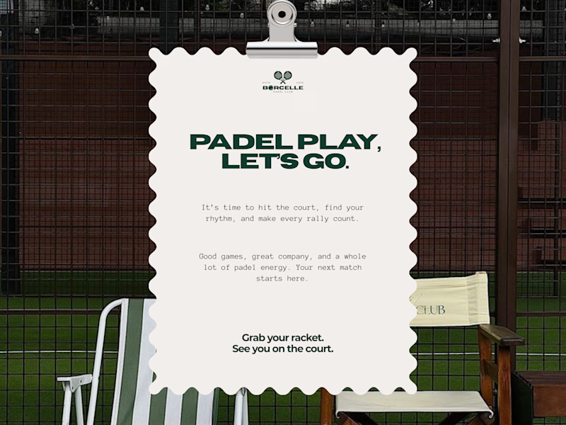
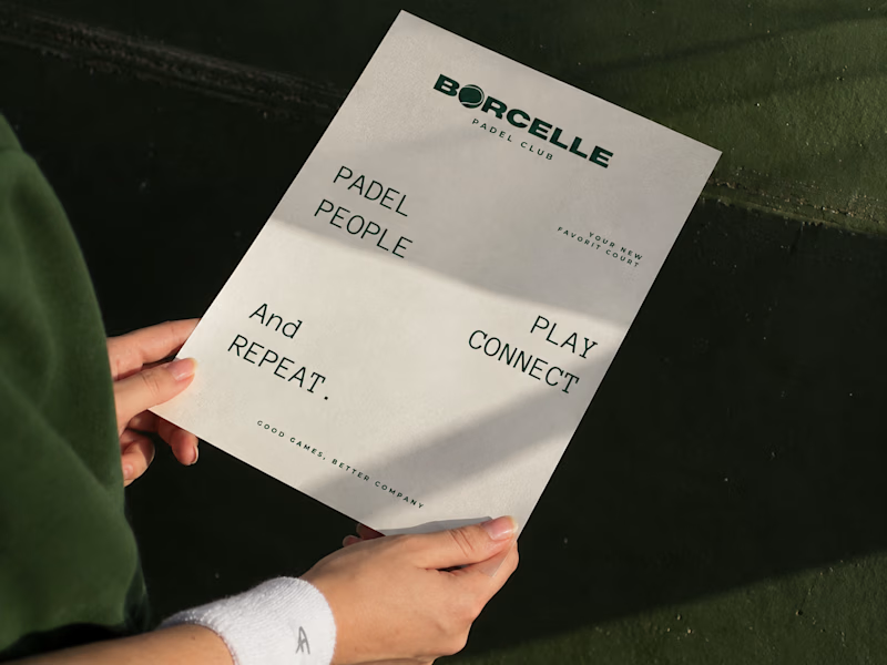
From the court to the little details, every touchpoint is an opportunity to bring the brand to life.
Good games, better company. 💚
What do you think of this direction?
11 voted
69%
5 voted
31%
16 votes
Closed

The green carries so nicely from the court to the small touchpoints. Feels sporty and friendly at the same time.

Finally a Contra Top Independent!
Been part of this community for a few years now, sharing my work, joining challenges, meeting some great people, and even picking up a few wins along the way.
I've genuinely enjoyed being part of Contra and seeing how much the platform has grown.
This one means a lot. Big thanks to the Contra team for the recognition!
More to come!
