The network for creativity
Join 1.25M professional creatives like you
Connect with clients, get discovered, and run your business 100% commission-free
Creatives on Contra have earned over $150M and we are just getting started
Back to feedPost
Taste Test
Awesome!
Grey looks minimalist
Really like the hint of color here; nice design too @Denys Dod
good work
Grey is nice
Three hours well spent, the High-Fidelity finish shows! ✨
As a social media manager, I’m curious: does the color version align better with the rest of the brand’s Visual Authority, or does the monochrome version help the content breathe more?
Both look incredibly professional!
The pink is more eye catching!
pink💯 , cos it will stop my scrolling and grab my attention.
Grey makes the other colors pop more, slick design though
Both looks good
Welcome
And you ate!
it's nice without color
I prefer Grey
With color It looks compact and visually pleasing.
Personal preference but I like it better with color
with colors definitely! Awesome skills 😉
Isn't it crazy that sometimes something like this can take three hours?
Love it
The network for creativity
Join 1.25M professional creatives like you
Connect with clients, get discovered, and run your business 100% commission-free
Creatives on Contra have earned over $150M and we are just getting started
Related posts
Exploring two hero section directions for the same product.
A or B?
4 voted
33%
8 voted
67%
12 votes
Closed
Static Design vs Micro-Animations. Same layout. Same content. The only difference? Motion.
Micro-animations help guide attention, provide feedback, and make interfaces feel more intuitive and engaging.
Which version do you prefer?
13 voted
20%
52 voted
80%
65 votes
Closed
I go with Micro animation
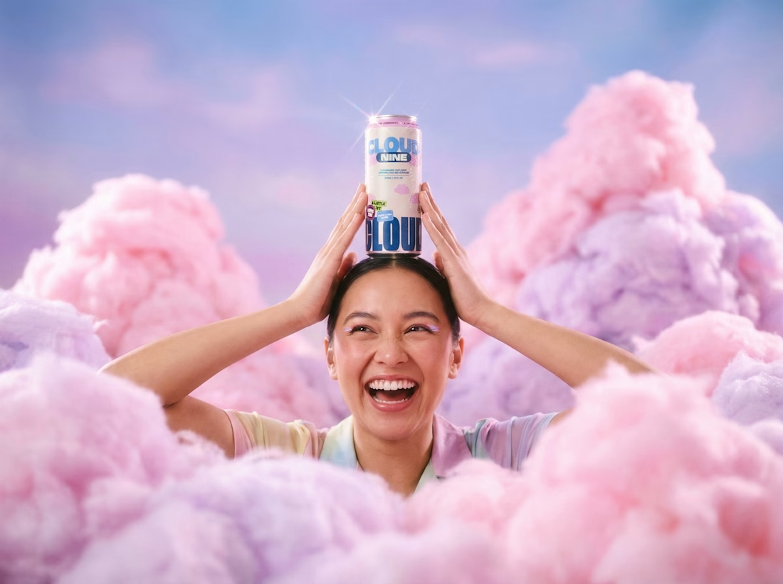
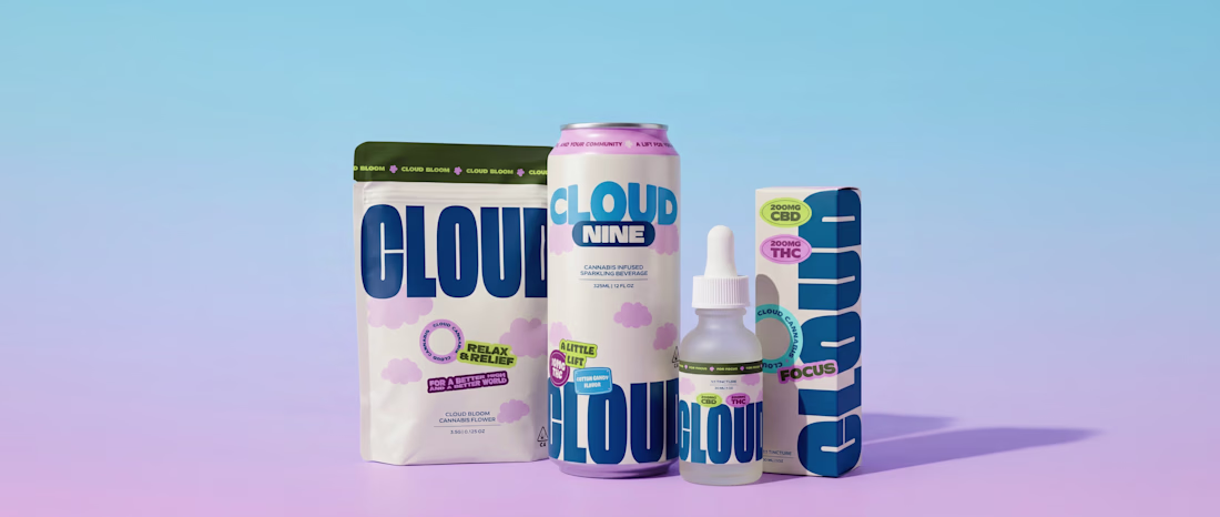
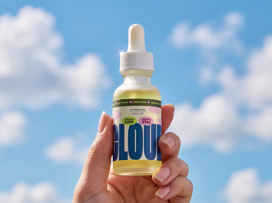
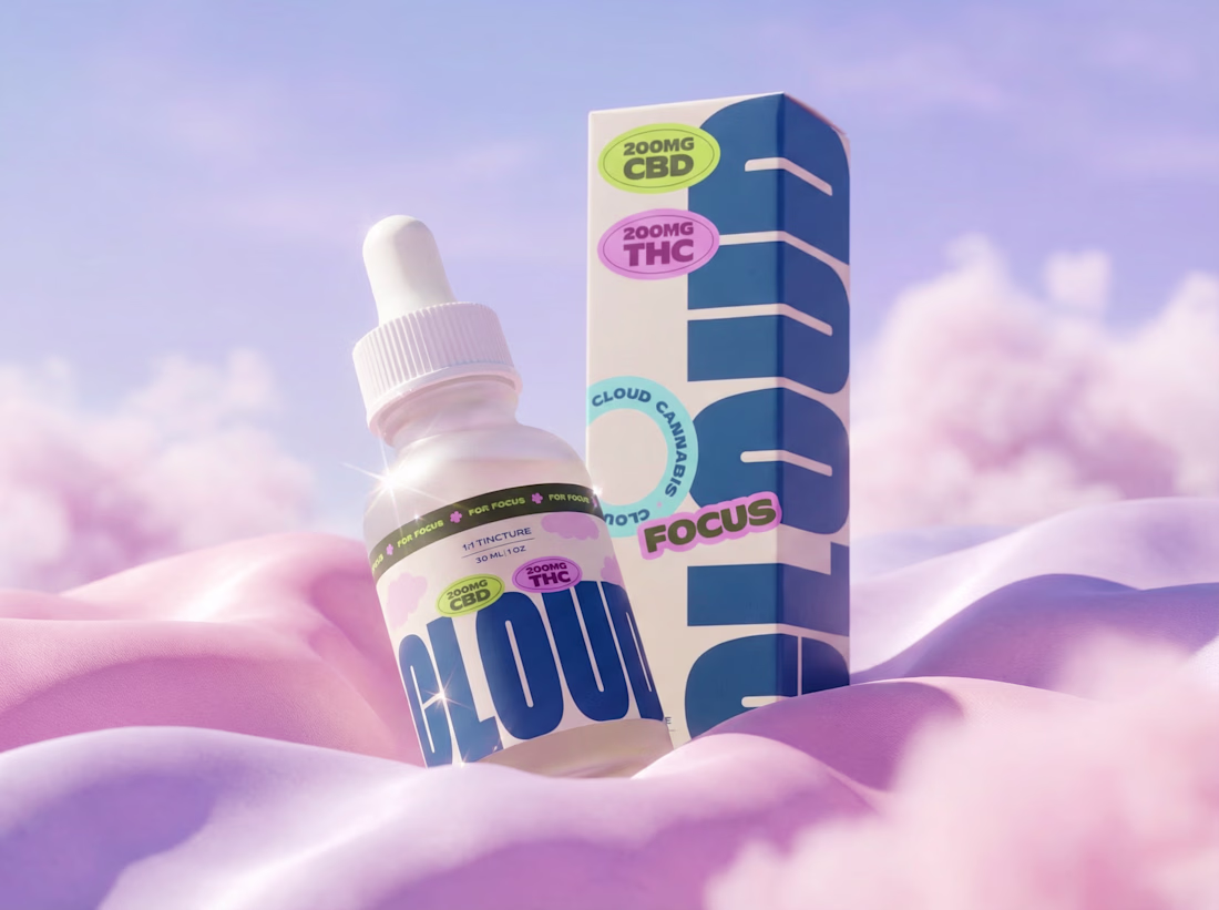
Cloud is a community-led cannabis brand built around inclusion, culture and education. They wanted an identity that felt bold and welcoming with loads of personality, but still trustworthy enough for something you're actually putting in your body.
That balance was the tricky bit. We didn't want it to feel too clinical, but it couldn't tip into novelty either.
So we leaned into big, confident type and a soft cloud world to give it warmth, then grounded everything with navy and clean layouts to keep it feeling grown up. The bright palette does the heavy lifting on the fun, community side.
It runs right across the range too, from tinctures to drinks to flower, so it always reads as Cloud no matter which product you pick up.
Brand identity, packaging and art direction.
nice work~
Challenges
View allTrending
Claude
Claude has entered the design space. How are you using Claude Design?
Contra University
Learn from expert creatives how to earn more using next-gen AI tools.
creativeaiflow
Creative AI workflows are evolving. What tools do you use, and what are their strengths and weaknesses?
portfolioreview
The best portfolios tell a story, not just show a grid. Share yours for feedback.
freelancerlife
Freelancer life is wins, pivots, and everything in between. What’s yours right now?