The network for creativity
Join 1.25M professional creatives like you
Connect with clients, get discovered, and run your business 100% commission-free
Creatives on Contra have earned over $150M and we are just getting started
Back to feedPost

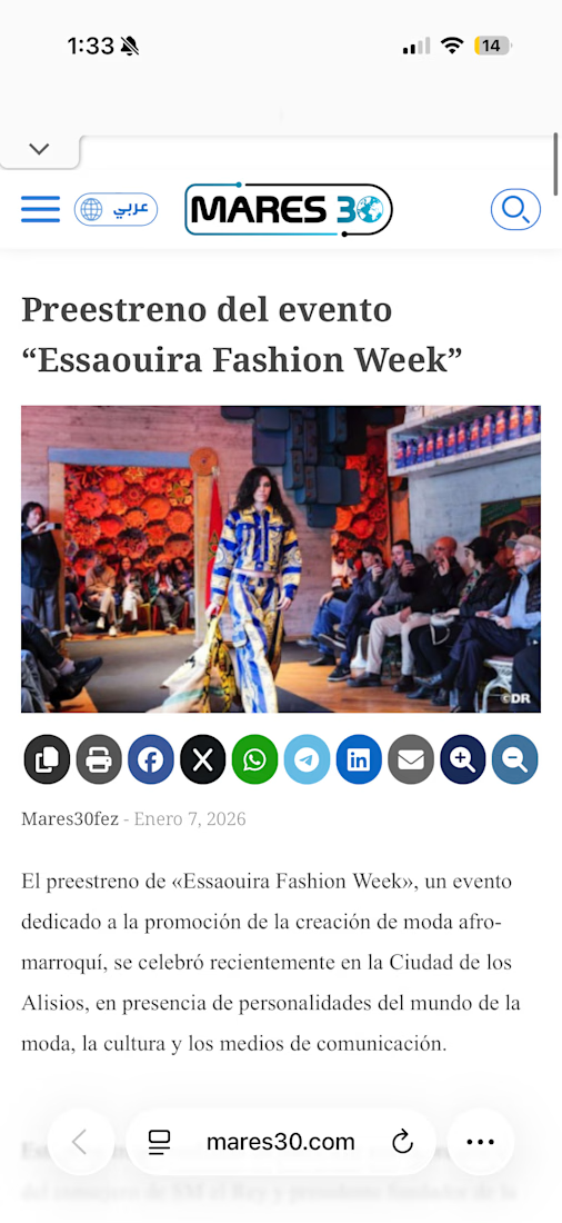
Essaouira Fashion Week 2026 — Institutional & Investor Communications
Fashion & Events PR · Essaouira, Morocco
Developed the institutional communications package for a major fashion week, including a master dossier, a New Voices emerging-designer program section, and investor-facing pitch materials positioning Italy as Country of Honor. Produced the promotional video script and the formal outreach used to secure institutional and gubernatorial support. Work that operates at the intersection of fashion, cultural diplomacy, and high-level stakeholder communication.


The network for creativity
Join 1.25M professional creatives like you
Connect with clients, get discovered, and run your business 100% commission-free
Creatives on Contra have earned over $150M and we are just getting started





Related posts

I built KolaCuts, a premium mobile barber booking platform designed to make booking a grooming appointment simple, fast, and seamless.
The app lets customers explore barber services, view pricing, choose a preferred date and time, enter their location and contact details, review their appointment, and confirm their booking, all without calling or messaging the barber.
I focused on a clean, premium, mobile-first experience that feels like a real product, not just a landing page. The booking flow also includes availability, appointment confirmation, calendar integration, and options to reschedule or cancel.
The goal was to solve a real business problem: reducing booking friction for customers while giving a mobile barber a structured way to manage appointments and deliver a better customer experience.
Built with Lovable, with a focus on responsive design, intuitive UX, and functional booking logic.


Perfect work

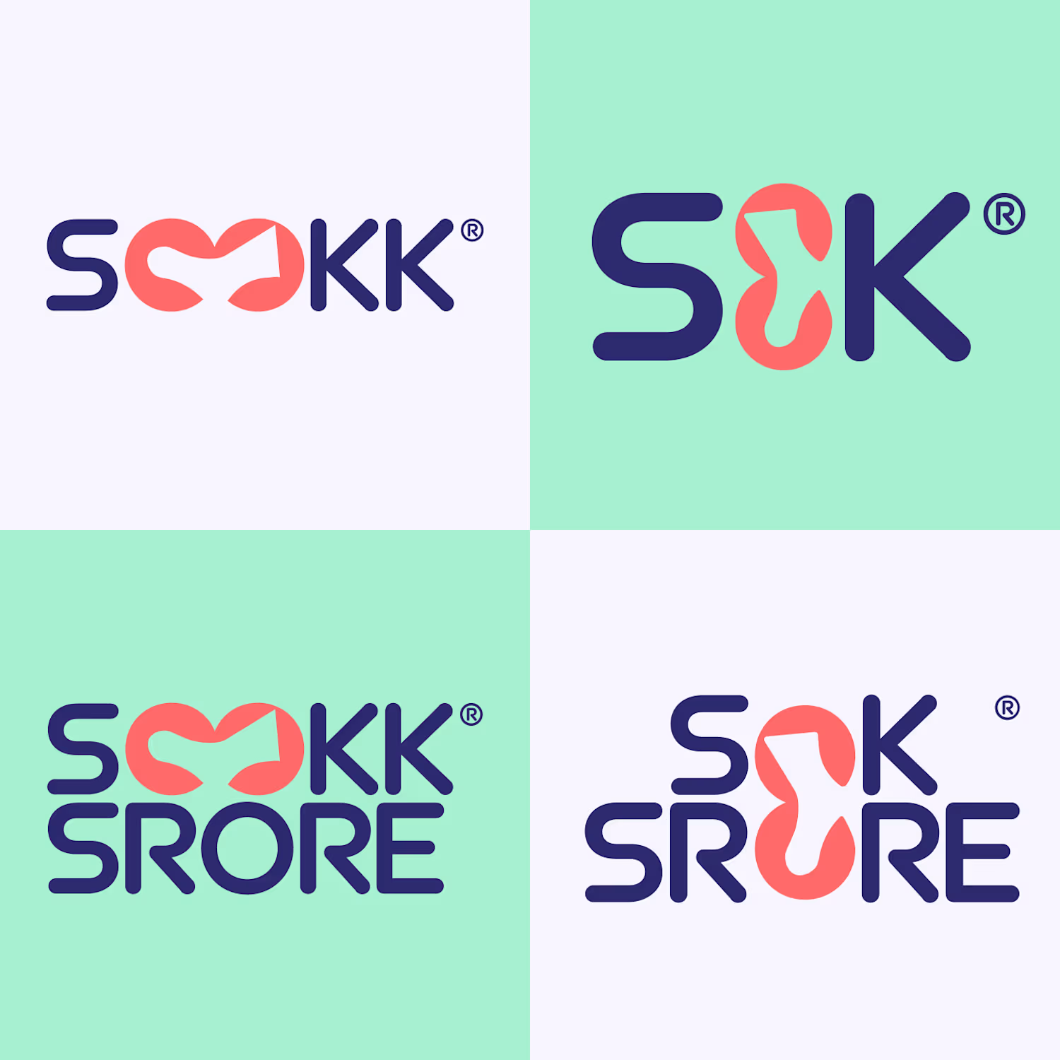
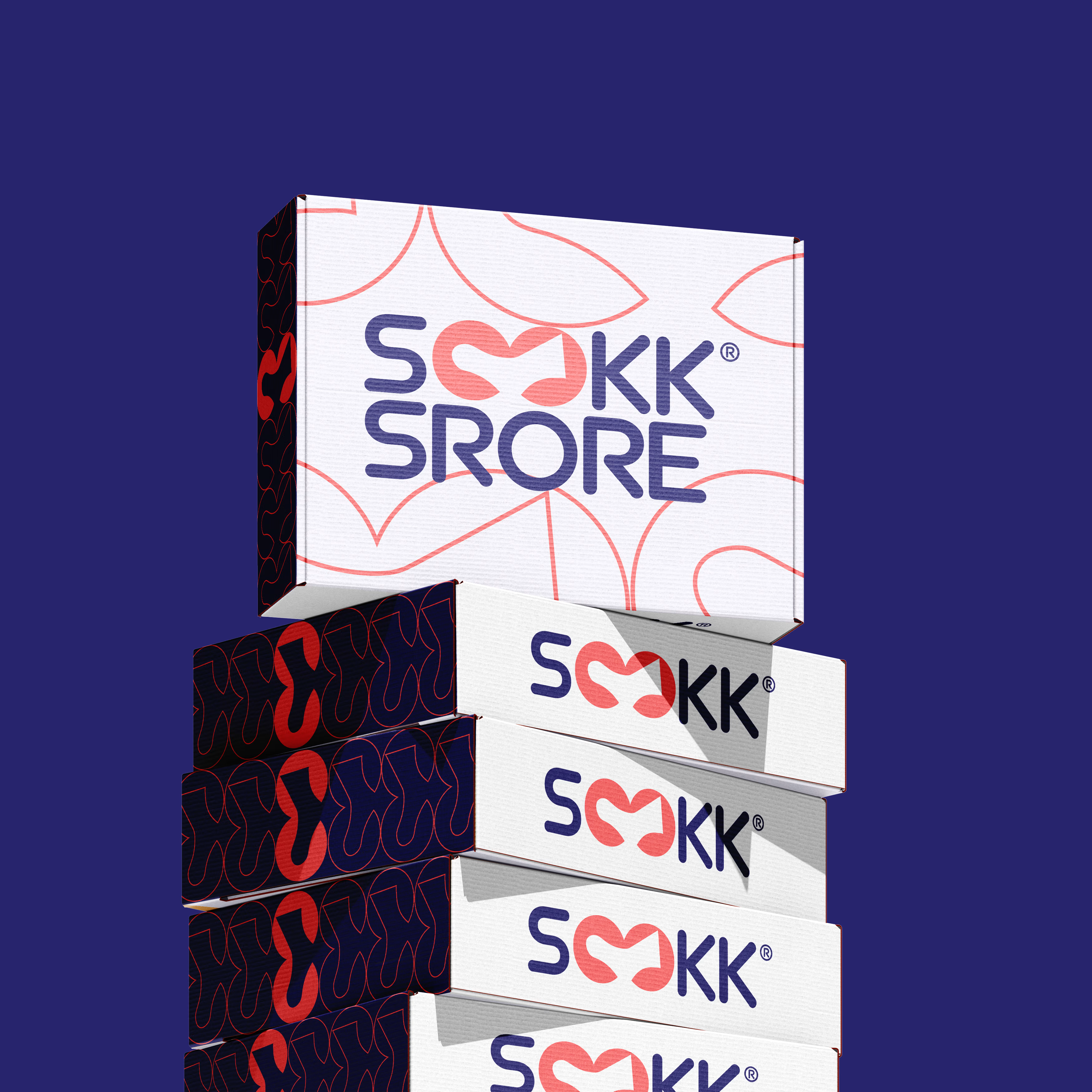
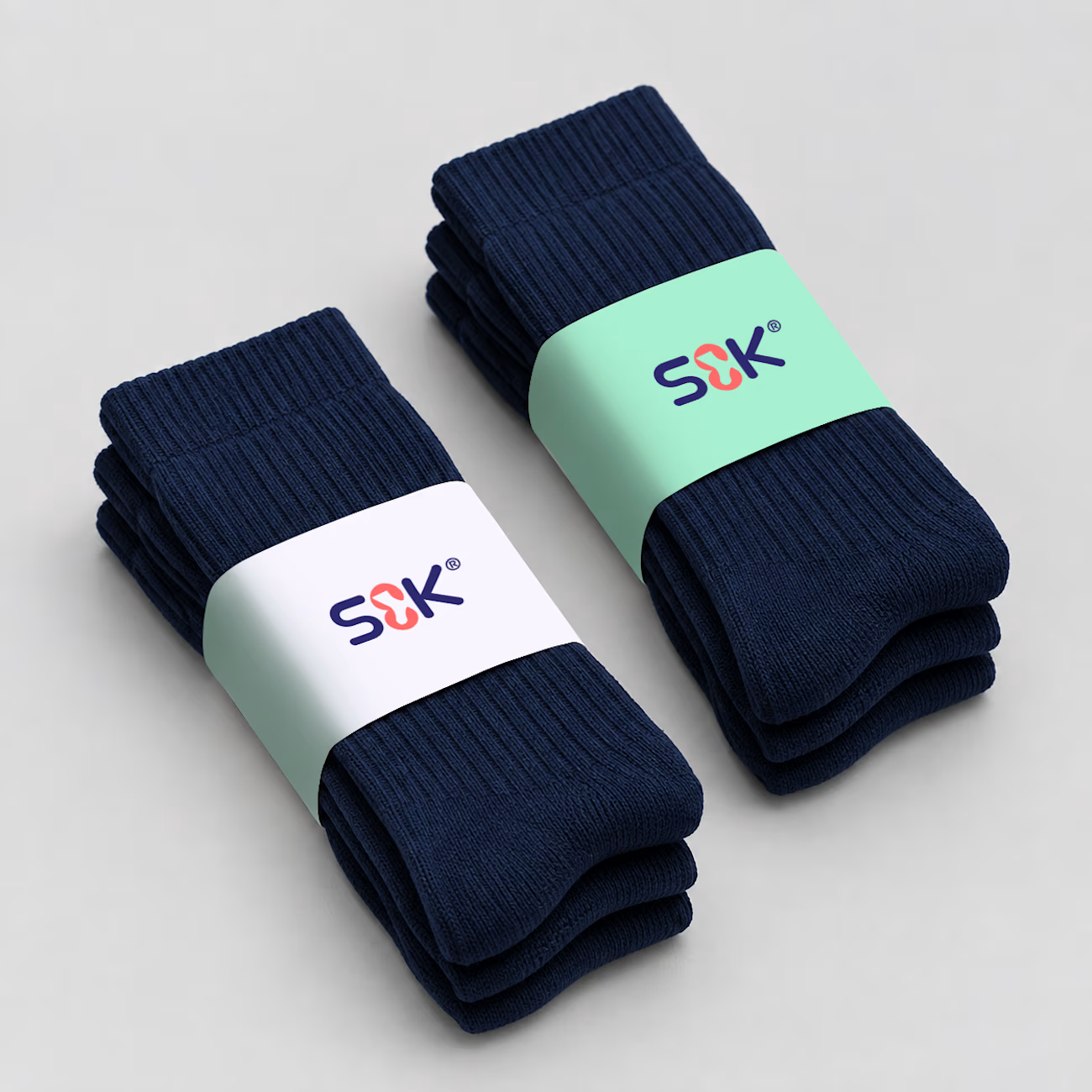
Sookk: Logo Design & Brand Identity
Sookk is a fashion accessories company that sells modern socks made with affordable materials. The client came to me needing a logo and a complete brand identity.
Research: I started by studying the brand and looking at what its competitors were doing. My goal was to create something completely different, so Sookk would stand out in a crowded market.
Target audience: Sookk targets budget-conscious shoppers, mostly younger, style-aware consumers such as students and early-career professionals. They want their outfits to look considered without paying premium prices. They value affordability, but they still care about aesthetics. They want to feel they got something stylish, not something cheap.
Moodboard and logo exploration: With this in mind, I created a moodboard that matched the client's needs, and this is where my logo exploration began. I went for a design that is modern, clean, and easy to identify, with colors that appeal to the target audience.
Variations and mockups: Once the logo was approved, I created variations for use across different areas of the brand. I made mockups for sock labels, packaging boxes, the store sign, and other touchpoints. This step shows the client how the brand will look in real-life scenarios.


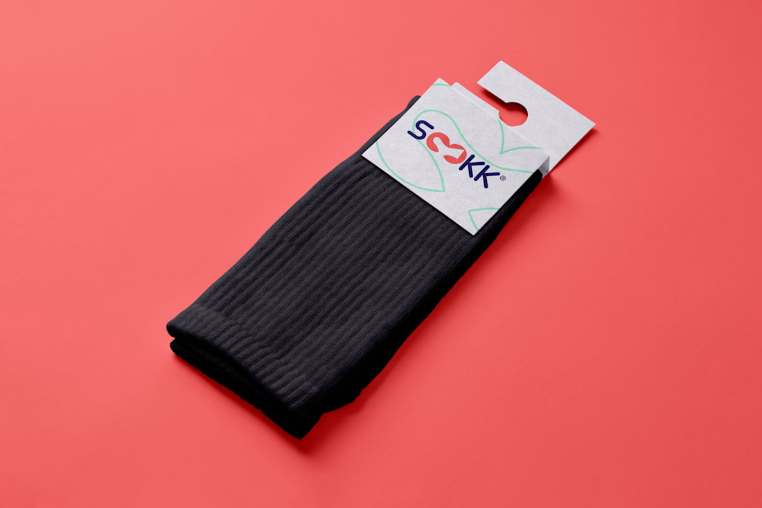

THat a pretty good design concept ✨

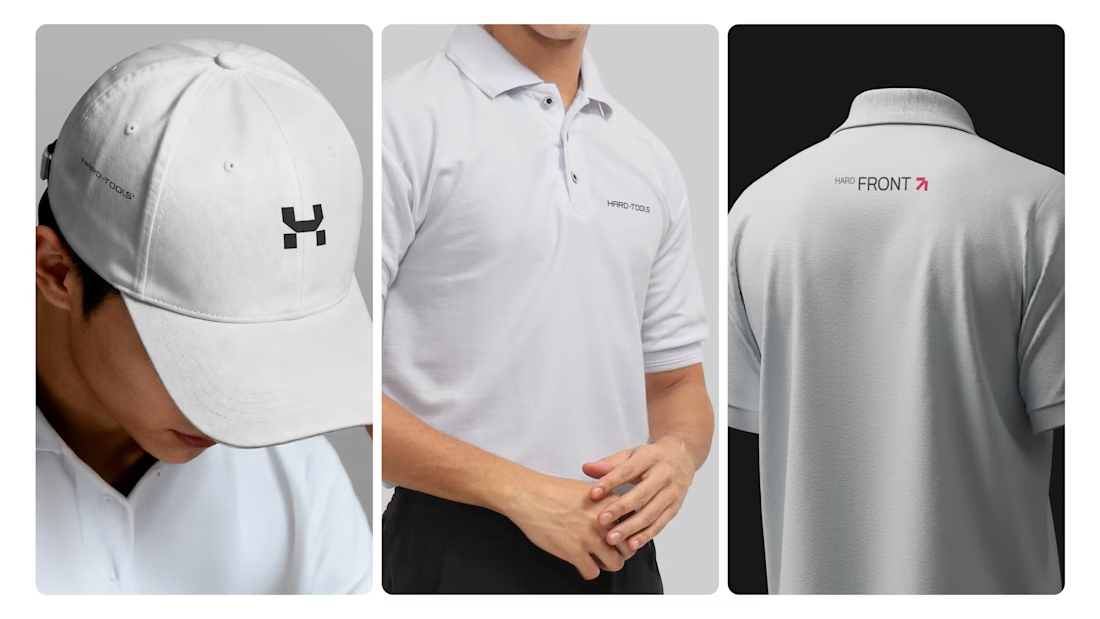
Hard-Tools needed to strengthen its brand presence and turn its communication into a clearer, more consistent, and more professional expression of the business.
The project started with a central question: how can a tools and equipment brand communicate strength, reliability, and expertise without falling into the generic visual language of the category?
The strategy focused on three main objectives:
01 — Strengthen perceived value
Build a visual communication system that conveys solidity, quality, and authority, bringing the brand’s perceived professionalism closer to the level it aims to occupy in the market.
02 — Create consistency across communication
Develop a visual language that could work across different touchpoints — campaigns, commercial materials, social media, and promotional assets — while maintaining recognition and coherence.
03 — Turn products into brand communication
Rather than simply showcasing tools and products, the visual approach was designed to communicate the attributes behind the brand: performance, precision, durability, and reliability.
Based on this strategic direction, I developed the creative and visual direction and designed the communication materials, working across composition, hierarchy, typography, image treatment, identity application, and commercial layouts.
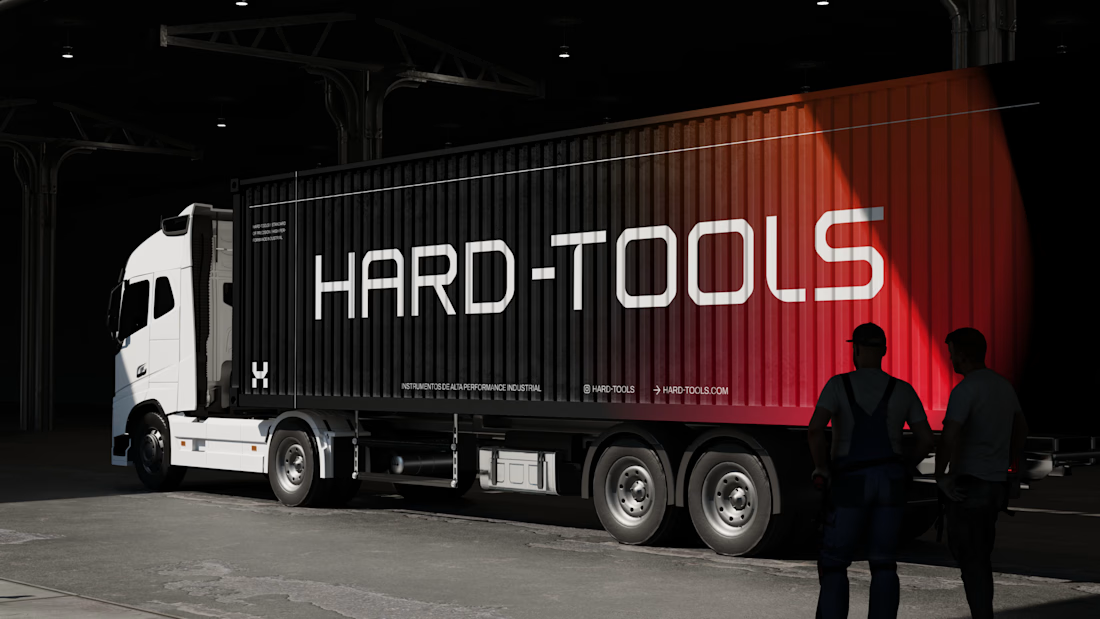
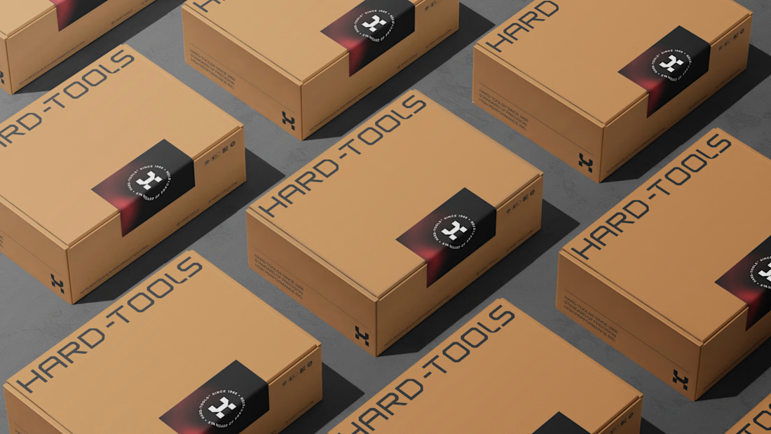

TOP!!