The network for creativity
Join 1.25M professional creatives like you
Connect with clients, get discovered, and run your business 100% commission-free
Creatives on Contra have earned over $150M and we are just getting started
Back to feedPost
MUST READ, DESIGNERS: Apple just broke 19 years of UI dogma. Nobody's talking about it.
Everyone's stuck on the $1,999 price tag and the Touch ID downgrade. Fine, sure. But that's not the story if you actually design for a living. I spent last night cross-referencing the HIG diagrams instead of sleeping, and the real story is buried in there. This is the biggest interface shift since the Dynamic Island.
Here's what stood out.
The Dock just moved. 📱 Home Screen Dock. Tab bars. The Dynamic Island itself. All of them shift to a vertical side rail, on the outer screen and on the inner screen in landscape. Horizontal navigation has been gospel since 2007. Apple just quietly retired it. Every app that hardcodes a horizontal tab bar is about to break.
There's actual math behind the fold. Inner display, 1.42:1. Outer display, 1.45:1. Both modeled on ISO 216, the same ratio as A4 paper. Not an aesthetic flex. It's why content scales proportionally instead of breaking when you fold or unfold the thing. Root-two geometry, in your pocket.
The 1.42 problem is real. 77% more screen area than the iPhone 18 Pro. Sounds great until you play a 16:9 video and lose 20% of it to letterboxing anyway. Bigger canvas, same old aspect ratio fight. Nobody puts this in a keynote. It's going to define how the thing actually feels to use.
Transparency is now a variable. ✨ Liquid Glass ships with a user-controlled slider, from fully clear to fully tinted. Which means contrast accessibility now has to hold up across an entire opacity range, not just one frosted-glass default. That's a new QA category nobody's fully ready for.
Odd grids are officially a bug. 3 column and 5 column layouts straddle the hinge crease. Apple's mandating even-numbered grid columns at the OS level now. Your design system's grid just became a hardware constraint. Wild.
Foldables were never just "bigger screens." They're forcing a rethink of where navigation lives, how grids get built, even what "edge of the screen" means. Samsung patched around this problem. Apple built the fix into the OS itself.
If you're designing for iOS over the next 12 months, the vertical rail and the reserved-region grid rules aren't a footnote. They're the new baseline.
My bet: the vertical dock doesn't survive first contact with real users and gets walked back by 27.2. Curious who disagrees.
#ProductDesign #FoldableUX

Sources for this one 👇
📖 Apple Newsroom — iPhone Duo unveiled, full specs and features: https://www.apple.com/newsroom/
📖 Apple — iPhone Duo Technical Specifications: https://www.apple.com/iphone-duo/specs/
📖 Apple Developer — "Strike a pose with adaptive layouts on iPhone Duo"...

apple.com
Newsroom
The official source for news about Apple, from Apple. Read press releases, get updates, watch video and download images.

The strongest insight here is treating fold/unfold as a responsive state, not just a resized canvas. The side-rail shift and near-continuous display ratios point to a much more intentional information architecture for dual-screen devices.
Absolutely. The key shift is thinking about the fold/unfold interaction as a change in context, not simply screen size.
That’s where the information architecture and hierarchy really start to matter.
The network for creativity
Join 1.25M professional creatives like you
Connect with clients, get discovered, and run your business 100% commission-free
Creatives on Contra have earned over $150M and we are just getting started





Related posts

Paws & Pour: 3D Interactive Booking for Experiential Cafés 🐾
Business Name: Paws & Pour Cat Café
Location: Kemang, South Jakarta
Archetype: Appointment-based Experiential Café
Realistic Problems:
The solo owner is drowning in WhatsApp DMs and playing "table tetris" every single day. Customers don't just want any table; they want to sit near specific resident cats (like Mochi or Pepper). Additionally, due to high demand, the café strictly caps visits at 30, 60, or 90-minute sessions. This causes endless back-and-forth messaging, manual double-booking errors, and frustrated walk-ins.
I transformed a chaotic, manual DM-based reservation process into a self-serve, mobile-optimized 3D map, allowing guests to independently secure their exact table, time slot, and preferred cat companion instantly.
Fixing the Front Door :
To turn an inbound inquiry into a confirmed booking with zero effort from the owner, I completely redesigned the customer-facing booking flow. Instead of a boring, standard form, I built an immersive 3D seating map where customers can:
- Pick Their Vibe: Visually explore the café layout and select a specific cozy corner. See where their favorite resident cats are currently hanging out on the map.
- Lock in the Rules: Select precise session lengths (30, 60, or 90 minutes) during the booking process, automatically setting expectations.
- Book Anywhere: Experience a flawless, fully mobile-optimized booking journey directly from their phone.
The Impact:
The owner’s manual work goes from hours of coordinating schedules, answering DMs, and managing table assignments to zero. The real-time admin portal automatically handles availability, updates the seating chart, and tracks guest sessions. The owner can finally focus on running the café and taking care of the cats instead of staring at a screen.
Lovable Public Link: https://paws-and-pour-cafe.lovable.app/
Social Post: Check on twitter!
#lovable #catcafe #cat #webdesign


3D interaction while booking looks great!

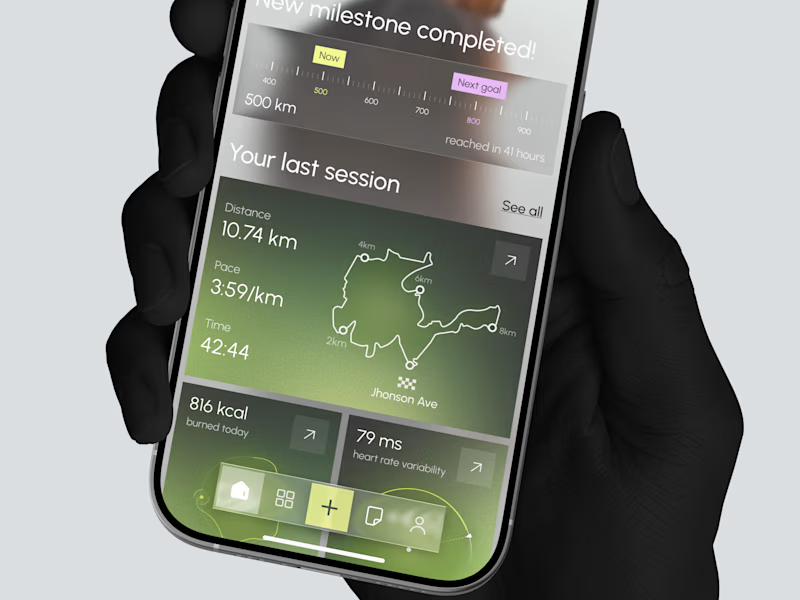
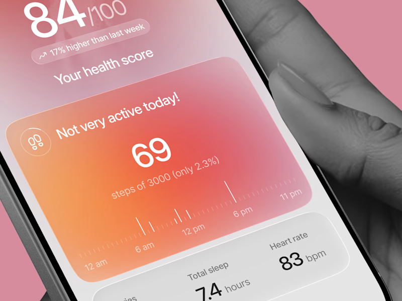
Designed two directions for a health tracking app
Same data, but two very different feelings
One is dark and focused, built for athletes. The other is warm and friendly, built for everyday people
What do you think?
Which one would you open every day, A or B?

21 voted
39%
33 voted
61%
54 votes
Closed

Option 1 gave me a very fin-tech feel and option 2 feels like my health is in danger, sorry 😂

A self-initiated product: a booking and ordering system for a billiard club in Tbilisi. I designed it in Figma from scratch and built all of it, from the interface to the database.
Guests call the club and nobody answers. They arrive and every table is taken. They want food and wait at the bar. Side Pocket moves all of that to the website.
Key decisions
No guest accounts. A booking needs a name and a phone number. The guest gets a private link to move, extend or cancel. The link is the account.
A 15-minute hold. Guests check in with "I'm at the table." A table nobody claims goes to the waitlist, and the next person gets the same 15 minutes.
Ordering tied to the table. Guests order from their phone during the game, add time themselves and see the bill as it grows.
One screen for staff. Every table's state for the night, late arrivals and orders to serve pinned to the top, bookings and orders boards, alerts in Telegram.
A Telegram bot. It understands "table for 4 tonight at 8" in English or Russian and finishes the booking with buttons.
Scope
Guest site with live availability, single and group booking, waitlist, private booking page, table page with menu, cart and bill, email confirmations and reminders, staff dashboard, Telegram bot.
Stack
React 19, TanStack Start, TanStack Router and Query, Tailwind 4, Radix UI, Supabase Postgres with row-level security, pg_cron, Brevo and Resend, Telegram Bot API, Vitest.
Business rules sit in plain functions, separate from the UI and the database, with 73 tests. Only server functions touch the database.
My role
Product design, UI design, front-end, back-end, database, integrations.
Live demo: side-pocket.lovable.app
Built for the #LovableChallenge by @Contra and @Lovable. #BuiltWithLovable😊

nicety accomplished.. great work