The network for creativity
Join 1.25M professional creatives like you
Connect with clients, get discovered, and run your business 100% commission-free
Creatives on Contra have earned over $150M and we are just getting started
Back to feedPost

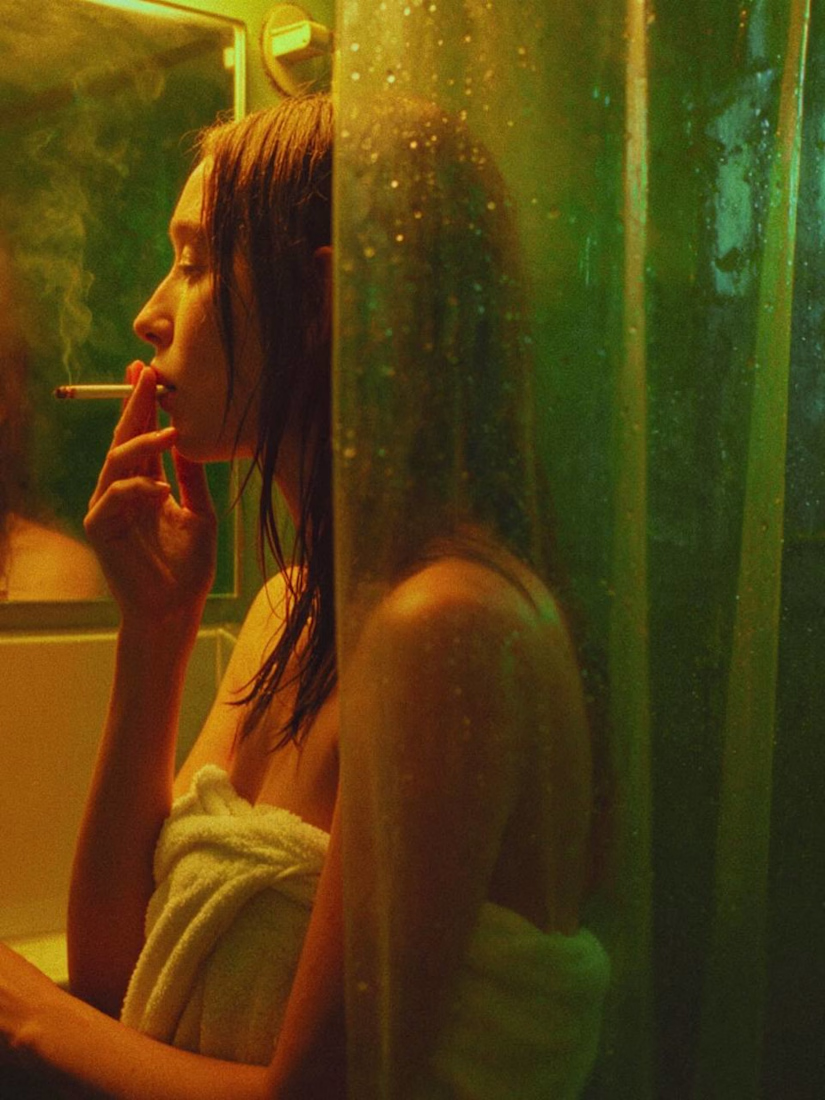
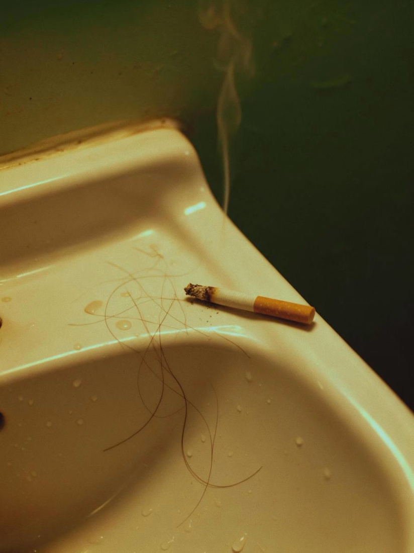
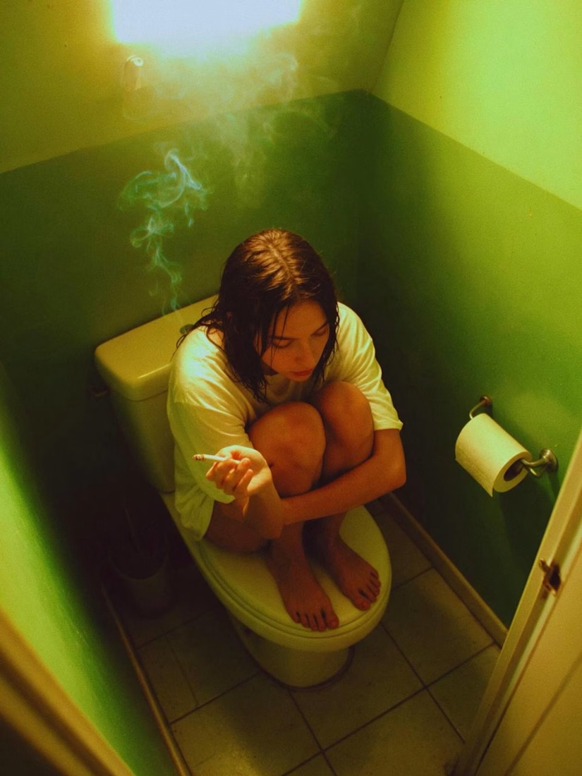
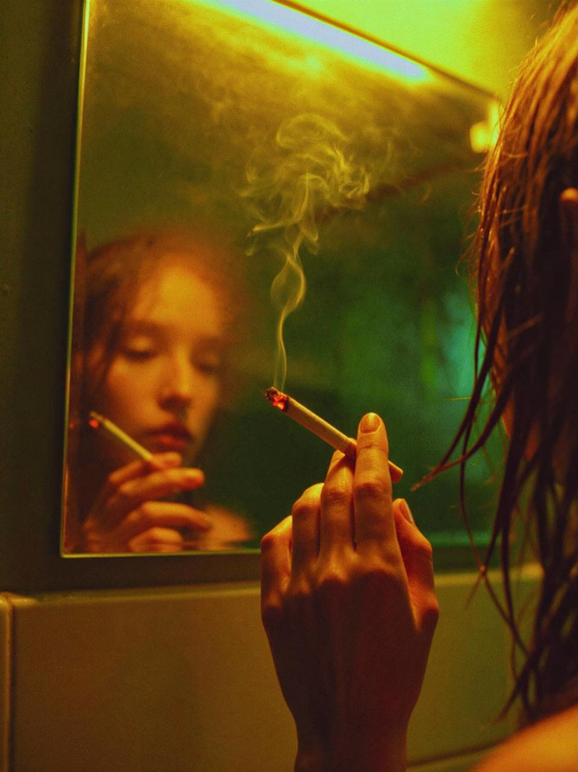
Somewhere between teenage nostalgia and an indie film.
This time, I experimented with a multi-layered composition, playing with depth and different visual planes.
It brought me straight back to my teenage years and the TV series Skins. I wanted to capture that raw, nostalgic, slightly chaotic atmosphere and turn it into something that feels like a scene from an indie movie.
What do you think? Which shot speaks to you the most?

The network for creativity
Join 1.25M professional creatives like you
Connect with clients, get discovered, and run your business 100% commission-free
Creatives on Contra have earned over $150M and we are just getting started






Related posts


so easing cool

Timeless fashion × priceless masterpieces
Branding and brand content for Numbers, a young fashion label that makes clothes to last for decades, presented through homages to classical paintings and drawings from museum collections mixed with AI animation 💎


classical paintings moving for a fashion brand.. weirdly it fits

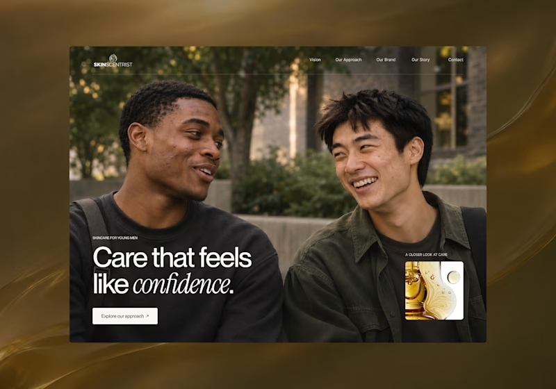
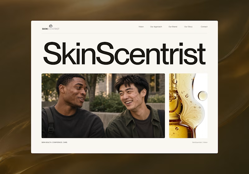
I’m exploring two homepage hero directions for SkinScentrist, a skincare brand focused on helping young men feel more confident in their skin.
Both concepts use the same imagery but take very different approaches to storytelling and visual hierarchy.
Direction 1 feels more emotional, immersive, and lifestyle-driven. The full-screen photography and bold messaging create a stronger connection to confidence and self-care.
Direction 2 feels more minimal, editorial, and brand-focused. The oversized typography, clean layout, and product imagery give it a more refined, contemporary skincare feel.
Direction 1: immersive, personal, emotional
Direction 2: minimal, editorial, premium
Which direction feels stronger for a modern skincare brand?

14 voted
93%
1 voted
7%
15 votes
Closed

Direction one — the full-screen photo feels warmer.


