The network for creativity
Join 1.25M professional creatives like you
Connect with clients, get discovered, and run your business 100% commission-free
Creatives on Contra have earned over $150M and we are just getting started
Back to feedPost
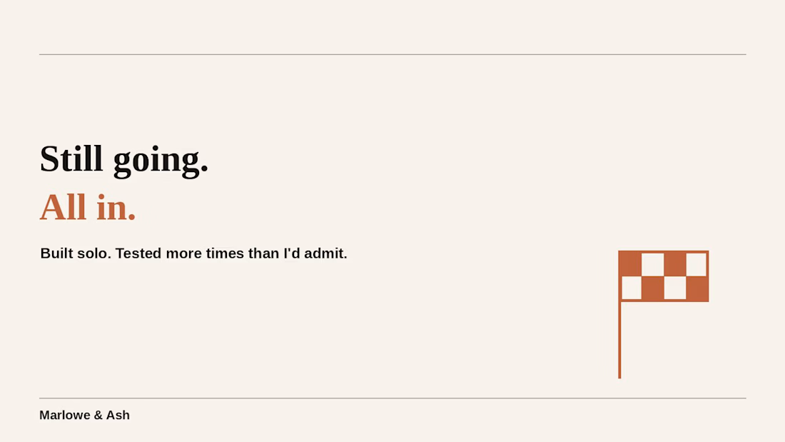
not gonna lie, been scrolling other #lovablechallenge submissions today and some are really good. still going all in on mine. built it solo, tested it on myself more times than I'd like to admit, genuinely proud of where it landed.



From one solo builder to another: keep going, it’s worth it! 💚 And yes, there are some really great projects out there, but we should be proud of what we’ve built too. 🙌

Those are true words.. Thank you 💙
The network for creativity
Join 1.25M professional creatives like you
Connect with clients, get discovered, and run your business 100% commission-free
Creatives on Contra have earned over $150M and we are just getting started







Related posts

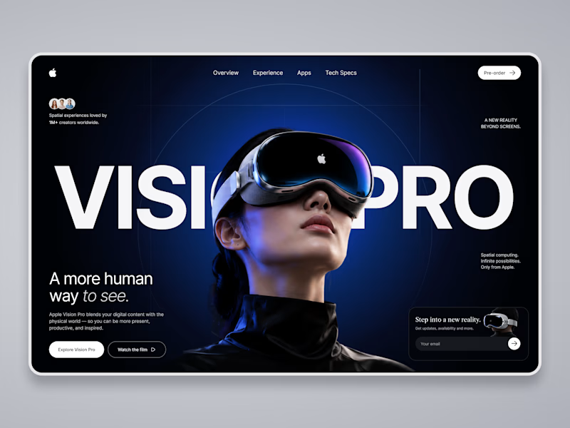
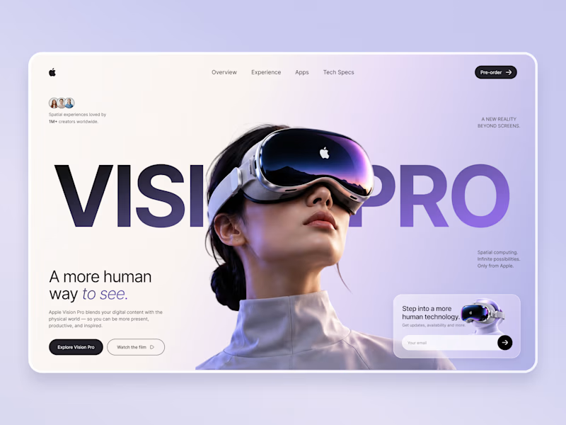
Which Apple Vision Pro Landing Page Feels More Premium?
I'm exploring two visual directions for an Apple Vision Pro landing page concept and would love your feedback.
Option A: Dark cinematic interface with immersive spatial-computing vibes.
Option B: Soft lavender & light minimal interface with a premium Apple-inspired aesthetic.
Which version would you choose for a real product launch page, and why? Your feedback will help shape the final case study.

10 voted
59%
7 voted
41%
17 votes
Closed

Option A wins...Its visual appearance suddenly grad against Option B!!

Recently tried this poster type ads and seeing the CTR and engagement going higher across platforms

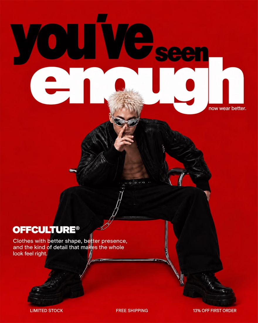

Interesting result. It’s a good reminder that testing different creative formats can make a noticeable difference in both CTR and engagement. Would be interesting to see how the poster-style ads perform over a longer period.

First drafts for iPhone Duo. It's too early, but I already can say that there are so many weird UX things going on with this device. Nevertheless, this is a great design challenge!