The network for creativity
Join 1.25M professional creatives like you
Connect with clients, get discovered, and run your business 100% commission-free
Creatives on Contra have earned over $150M and we are just getting started
Back to feedPost

Recently tried this poster type ads and seeing the CTR and engagement going higher across platforms


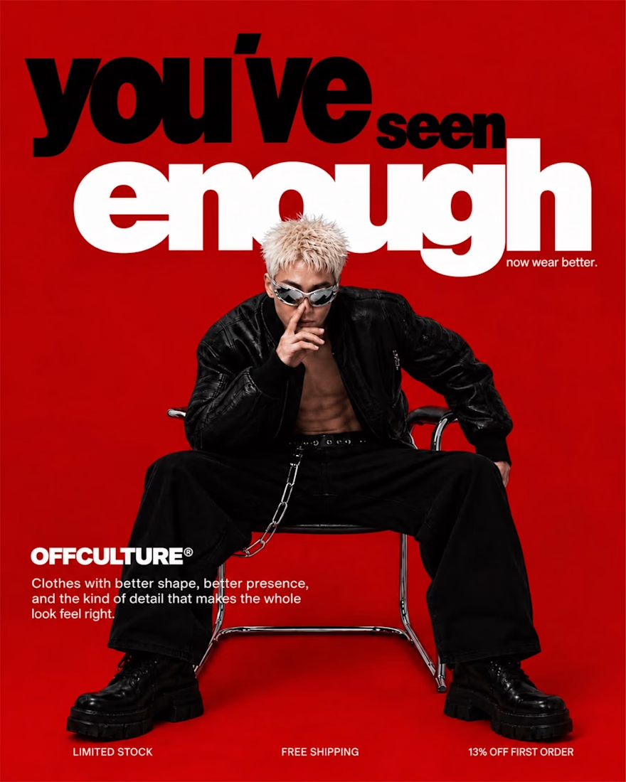


Interesting result. It’s a good reminder that testing different creative formats can make a noticeable difference in both CTR and engagement. Would be interesting to see how the poster-style ads perform over a longer period.
The network for creativity
Join 1.25M professional creatives like you
Connect with clients, get discovered, and run your business 100% commission-free
Creatives on Contra have earned over $150M and we are just getting started
Challenges
View all


Related posts

What if an image grid could behave like liquid?
Just finished Chromatic Grid, a new experiment exploring how a traditional image gallery can become something more sculptural and interactive.
A few things I explored:
→ An hourglass-shaped 3D image grid.
→ Scroll-driven stretching and twisting.
→ Liquid distortions that respond to cursor movement.
→ Fluid reveals and color-to-B&W transitions.
The challenge was making everything feel like one continuous material rather than separate effects.
Built with Three.js, WebGL, GLSL & ChatGPT.
Would love to hear what you think!


Turning a SaaS product into a visual story.
For this SaaS motion concept for Vastly, I focused on clean typography, smooth transitions, and visual pacing to make the message feel simple and easy to follow.
The goal wasn’t to add more effects — it was to make every movement communicate something.
Motion Design
✦ Typography Animation
✦ SaaS / Product Animation
✦ Adobe After Effects
Built in After Effects with a focus on clarity, pacing, and clean motion.


Really relate to this, Chethan. For my luxury product films I follow the same rule — goal isn't more effects, it's making every movement intentional. Your focus on clean typography + smooth transitions for Vastly makes the complex SaaS message feel simple. How did you handle the...


The Synq logo is built around a distinctive geometric “S” symbol, created through clean, precise forms that reflect connection, movement, and technology. The structured geometry gives the mark a modern and intelligent character, while its simplicity keeps it highly recognizable and versatile across digital platforms.
The Synq brand identity is designed to communicate innovation, connectivity, and forward-thinking technology. A minimal visual language, refined typography, and a focused color system create a clean and contemporary presence suitable for a modern tech company. The geometric “S” acts as the core visual element, providing a consistent foundation across digital products, social media, presentations, and other brand touchpoints.


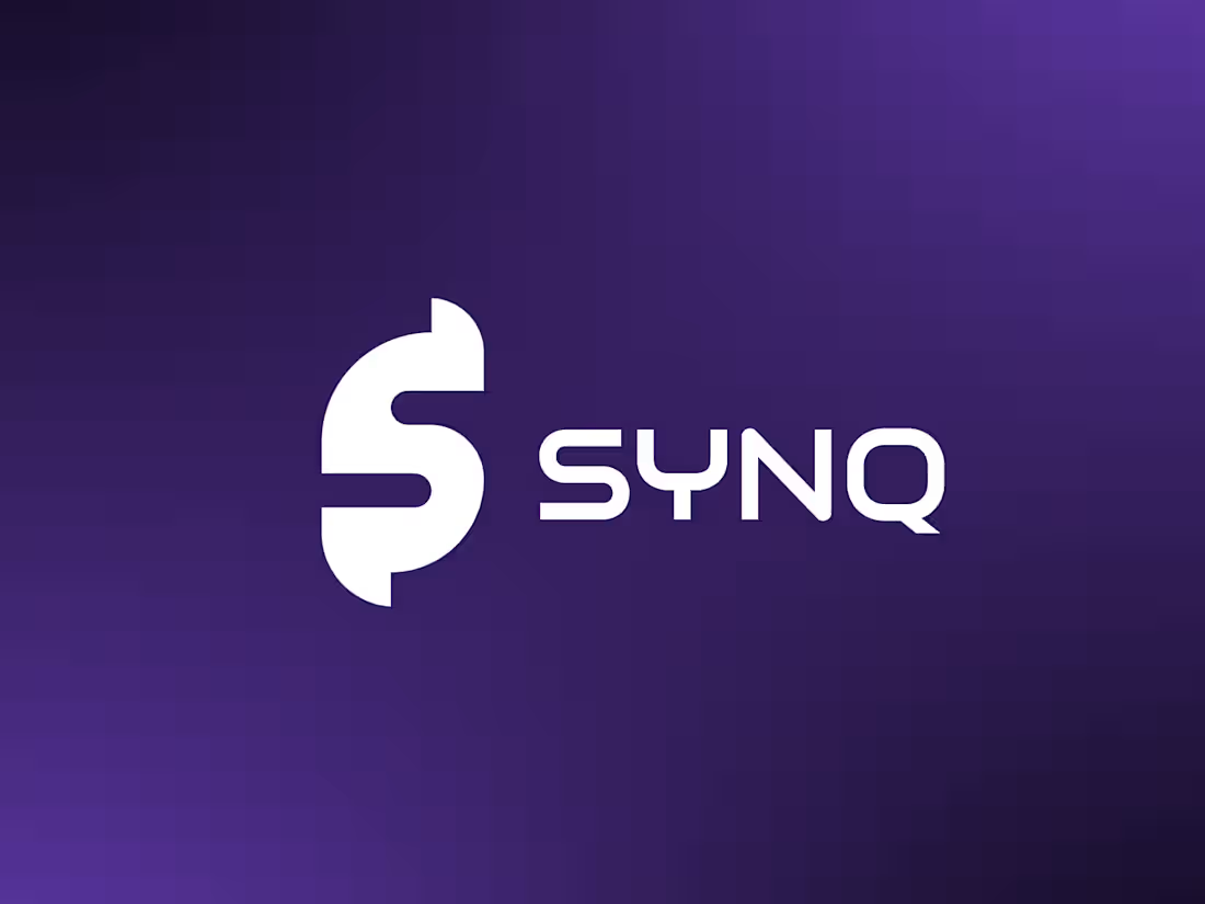
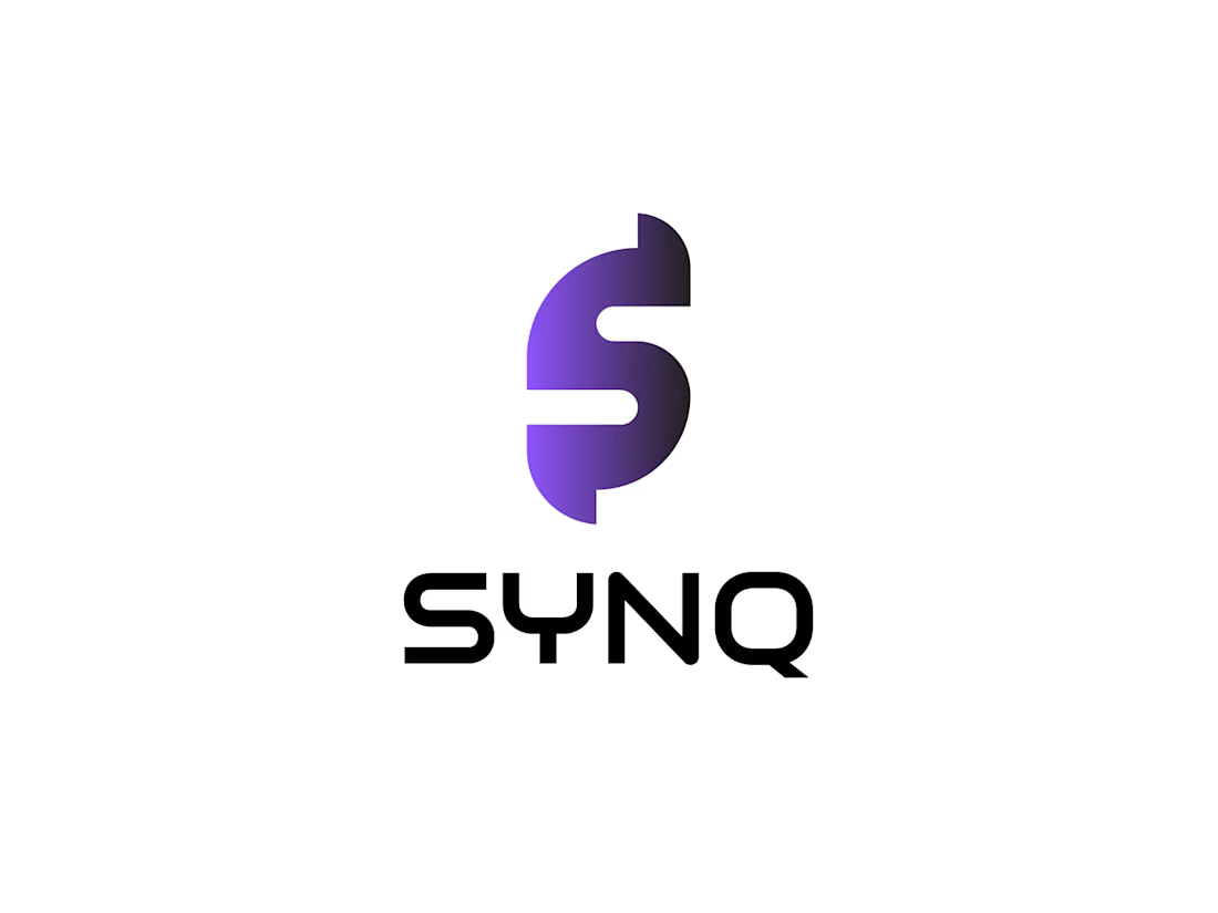
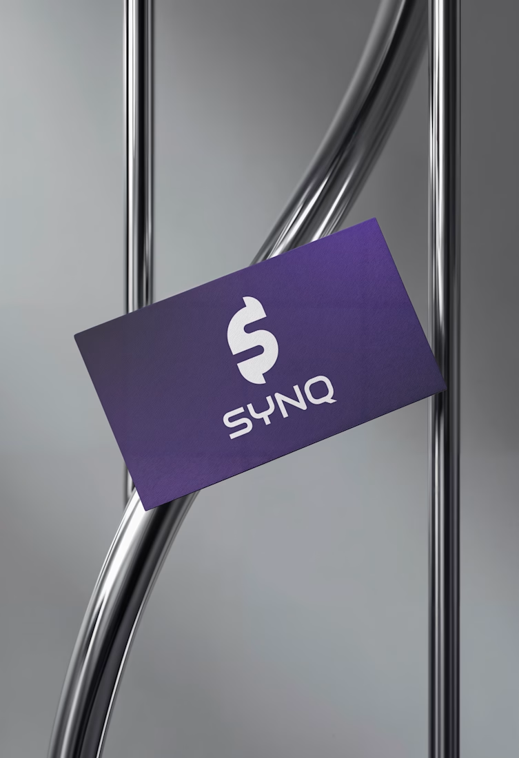

Clean geometry and the purple gradient on the card hold together well. One risk worth testing: the S with a vertical bar through it can read as a dollar sign at small sizes, which sends a very different signal than connection. Try it at favicon size before it ships.