The network for creativity
Join 1.25M professional creatives like you
Connect with clients, get discovered, and run your business 100% commission-free
Creatives on Contra have earned over $150M and we are just getting started
Back to feedPost

Brazilian Sweet 100% AI Brand and Visual Design
Today, it's almost impossible to think about design without thinking about AI. Recently, I joined a @CapCut Design Studio challenge in other platform where the goal was to create an entire brand and campaign using only the platform.
I was skeptical at first and expected limited results, but I committed to the process and intentionally stepped away from my usual workflow.
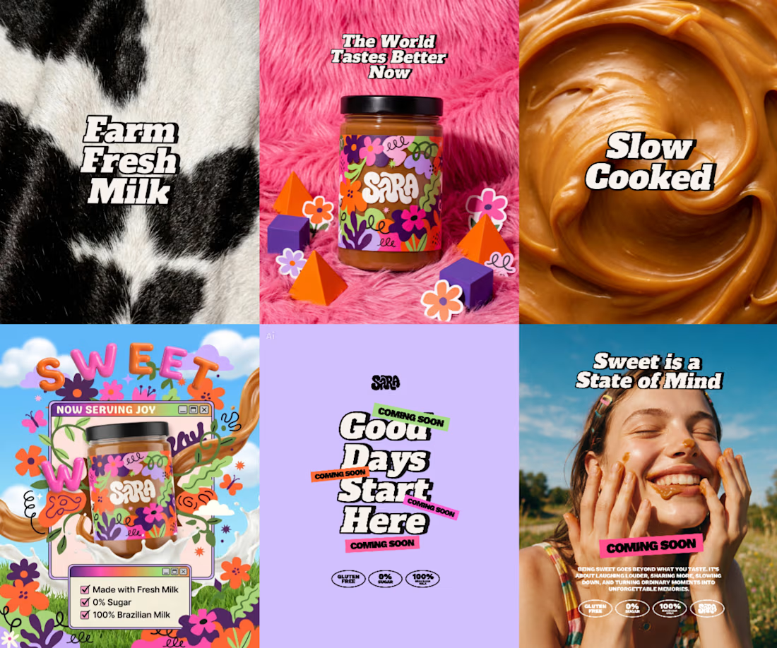
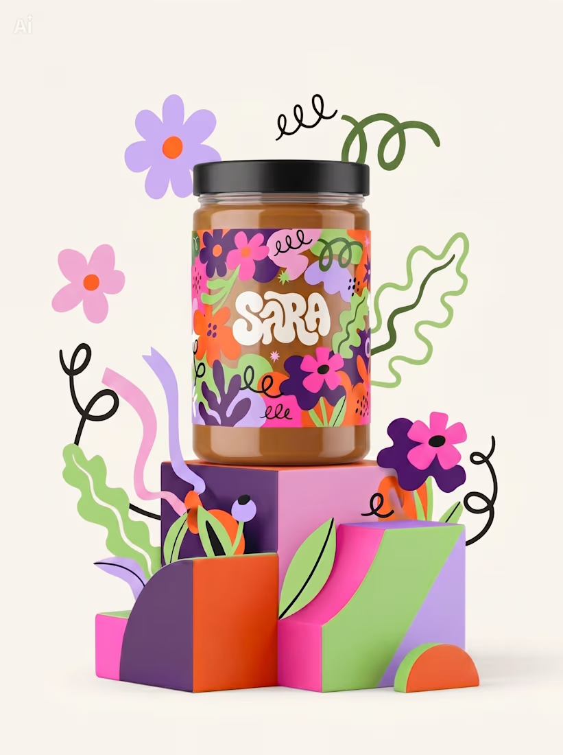
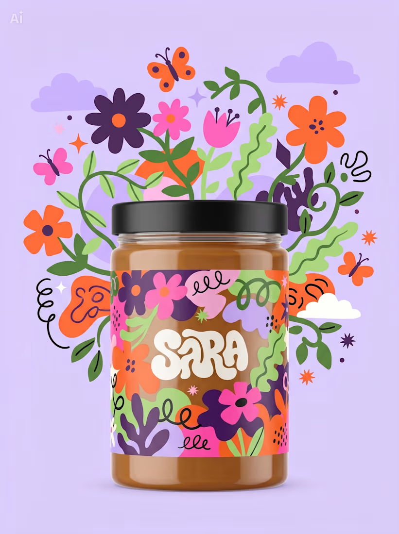
The images below showcase part of the final campaign and reflect how AI supported different stages of the project as a creative partner.
Concept: 90% AI
Logo: 100% AI
Color Palette: 70% AI
Product Stills: 100% AI
Campaign Posts: 50% AI (AI assets combined with manual art direction and composition)

The network for creativity
Join 1.25M professional creatives like you
Connect with clients, get discovered, and run your business 100% commission-free
Creatives on Contra have earned over $150M and we are just getting started











Related posts

Brand Expressions -- Olivir




Thats so crazy!!!!!! Seeing this I feel we humans are still far better than AI

Most early-stage brands play it safe and disappear after a while. For Drylendar, I did the opposite.
3 weeks from brief to full identity: logo, illustration system, app visuals, collectible cards and even merch.
AI makes things cheaper. Personality makes brands memorable.
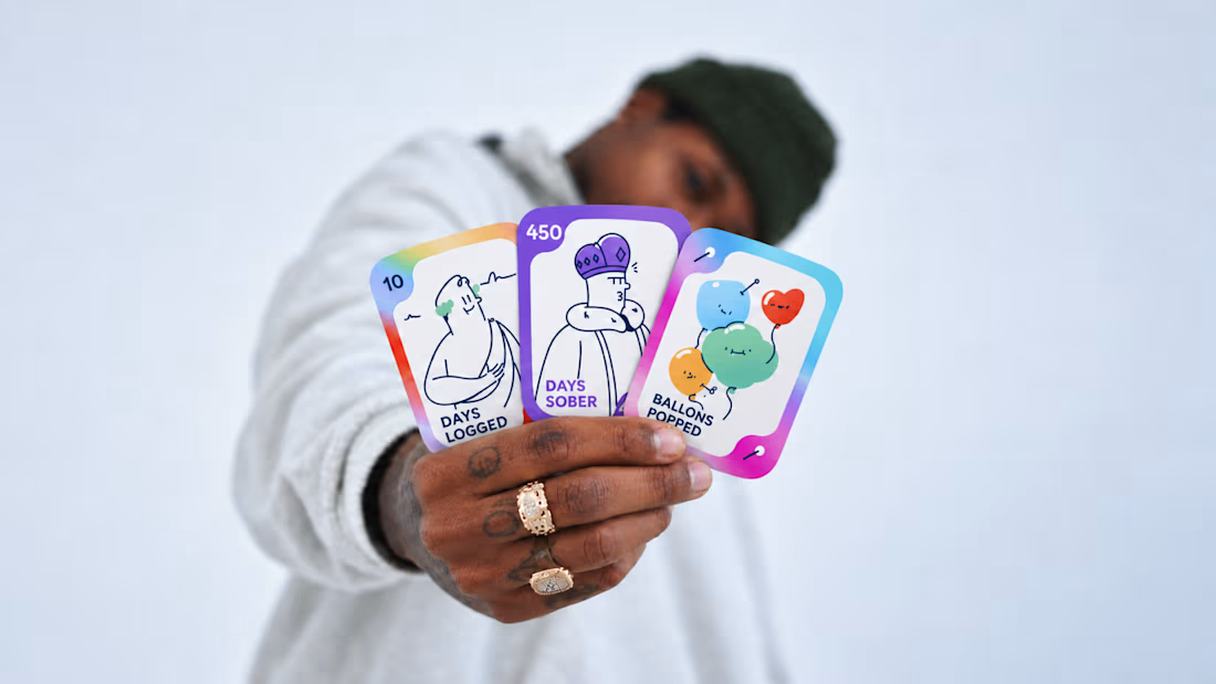
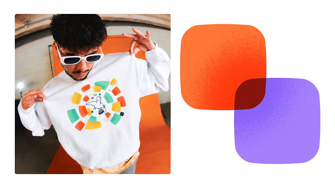
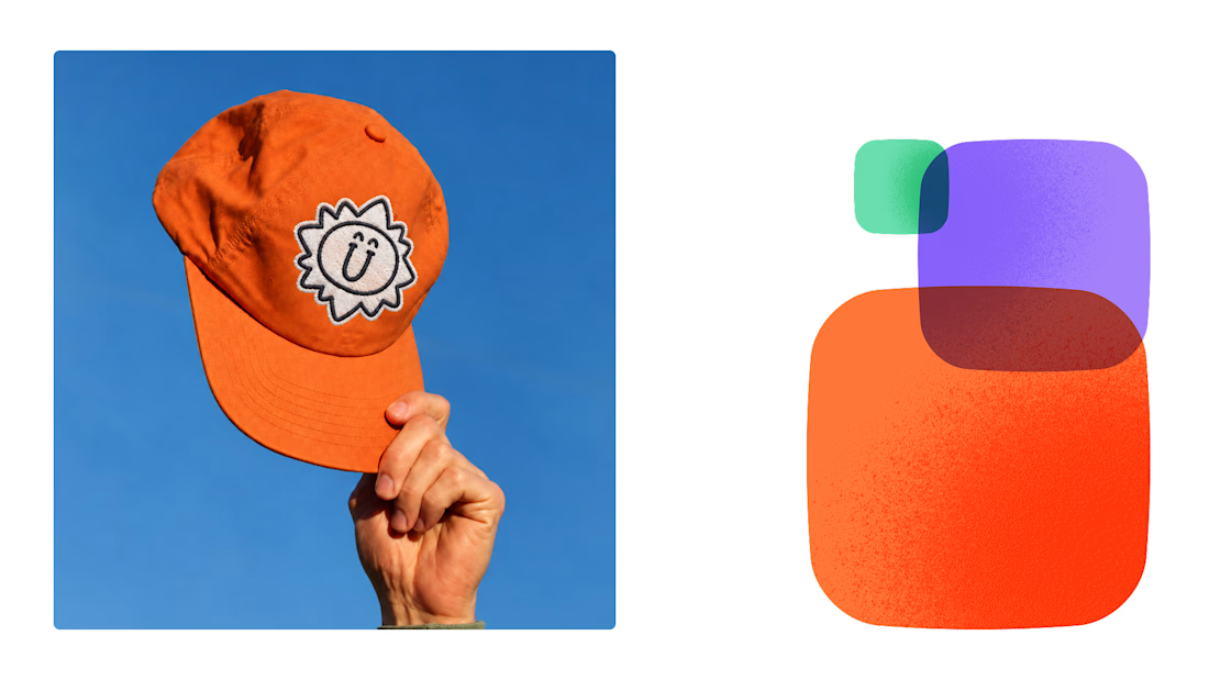
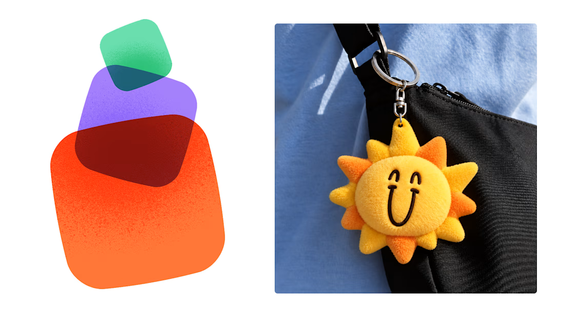

This is exactly what branding should be! 🔥 3 weeks for full identity, merch, cards - you really built personality, not just a logo. Love the Drylendar vibe. AI makes it cheap, but this makes it memorable - so true!

A little peek at the brand work we did for Elio Mortgage.
A warm, approachable identity full of warm vibrant colors paired with soft sun rising inspired gradients, inner glows and custom illustrations & more. Loved this direction!
Full case study coming soon, from process to final identity.
Plenty of logo explorations to share too!


That color palette takes the whole identity to a different level!! I loove it.