The network for creativity
Join 1.25M professional creatives like you
Connect with clients, get discovered, and run your business 100% commission-free
Creatives on Contra have earned over $150M and we are just getting started
Back to feedPost

"Nobody scrolls" is how homepages end up with five messages fighting for the first screen.
• People scroll when the top of the page gives them a reason to.
• Lead with one clear message instead of five competing ones.
• Give each section below it one idea.
• GA4's enhanced measurement records a scroll event when a visitor reaches 90% of a page, so you can check it on your own site.
What is the first thing visitors see on your homepage?
Follow for more videos: instagram.com/sellwrightstudio · youtube.com/@sellwrightstudio

Totally agree, one clear message up top does more than five competing ones. Giving each section a single idea also makes the page so much easier to build and maintain.
Exactly, and it helps the edits later too: when a section only has one job, a client can update the copy without breaking the flow of the page. The hard part is usually agreeing on which single message goes up top.
The network for creativity
Join 1.25M professional creatives like you
Connect with clients, get discovered, and run your business 100% commission-free
Creatives on Contra have earned over $150M and we are just getting started
Related posts

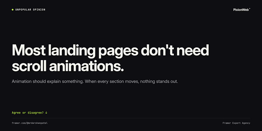
Unpopular opinion: most landing pages don't need scroll animations.
Animation should explain something: how a product works, what changed, where to look next. When every section fades in, nothing stands out and the page feels slower.
My rule: start with zero animation, then add it only where it earns its place.
Agree or disagree? 👇

Agree. Starting with zero animation and adding it only where it explains something is the right default, and it keeps performance in check too.
"People will see that on the homepage." Many of your visitors never see the homepage.
• Many visitors arrive on an inner page, from search, an ad or a shared link.
• So every page has to work as a first page.
• Say who you are on every page, and give each page one clear next step.
• The Landing page report in GA4 shows where visits really start.
Which page is your most common landing page?
Follow for more videos: instagram.com/sellwrightstudio · youtube.com/@sellwrightstudio

Work in progress: homepage for Velar, an insurance brand. Built headless: WordPress + ACF as the CMS, so every section, headline and card is editable from the admin, with a Next.js frontend for speed, smooth scroll animations and SEO.
Home page is almost done, the inner pages are next. Feedback welcome!



