The network for creativity
Join 1.25M professional creatives like you
Connect with clients, get discovered, and run your business 100% commission-free
Creatives on Contra have earned over $150M and we are just getting started
Back to feedPost

"People will see that on the homepage." Many of your visitors never see the homepage.
• Many visitors arrive on an inner page, from search, an ad or a shared link.
• So every page has to work as a first page.
• Say who you are on every page, and give each page one clear next step.
• The Landing page report in GA4 shows where visits really start.
Which page is your most common landing page?
Follow for more videos: instagram.com/sellwrightstudio · youtube.com/@sellwrightstudio
The network for creativity
Join 1.25M professional creatives like you
Connect with clients, get discovered, and run your business 100% commission-free
Creatives on Contra have earned over $150M and we are just getting started


Related posts

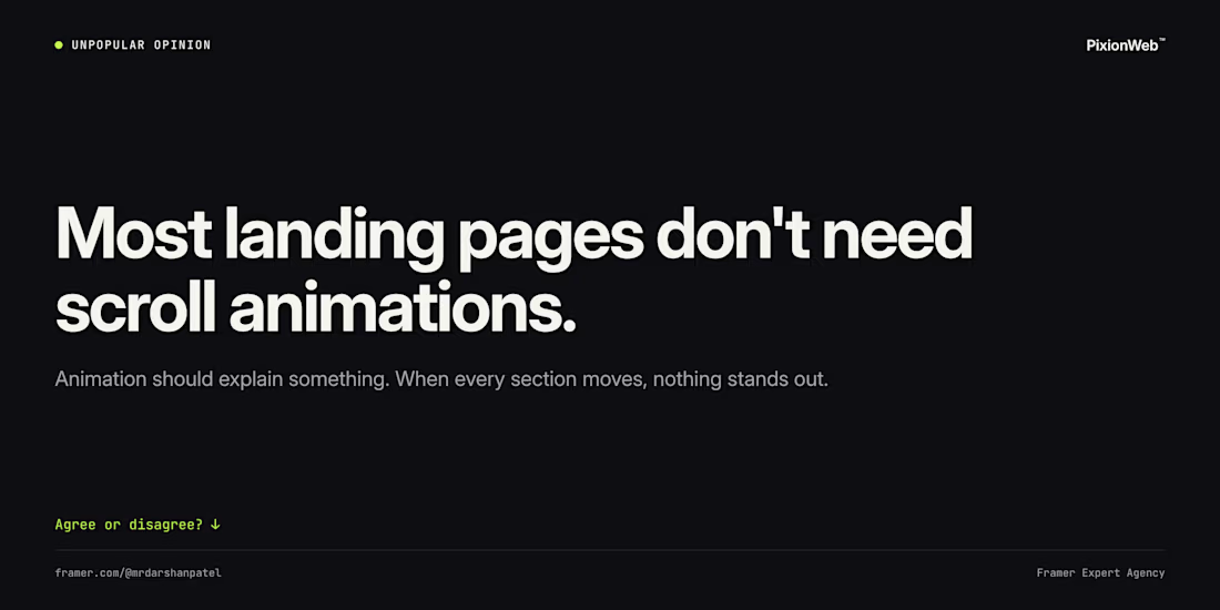
Unpopular opinion: most landing pages don't need scroll animations.
Animation should explain something: how a product works, what changed, where to look next. When every section fades in, nothing stands out and the page feels slower.
My rule: start with zero animation, then add it only where it earns its place.
Agree or disagree? 👇


Agree. Starting with zero animation and adding it only where it explains something is the right default, and it keeps performance in check too.
Would you go this colourful for an agency site? Watch this one build itself.
The RankScience homepage, replayed in about 9 seconds from the live site: wireframe, layout, content, live.
RankScience is an SEO and AI search agency. I built the site in Webflow.
• A bold gradient hero
• Illustrated sections between the copy
• Long-form copy blocks the team edits in Webflow
Bold colour or calm neutrals for an agency homepage?
Live: rankscience.com
Follow for more videos: instagram.com/sellwrightstudio · youtube.com/@sellwrightstudio

I'd go this colourful for an SEO agency, the gradient hero stands out in a pretty grey category. Nice that the team can still edit the long-form copy blocks in Webflow.

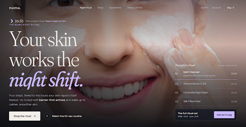
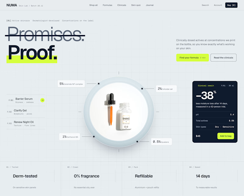
Two Shopify hero sections. Same skincare brand. Two different approaches.
Which one would you choose?
Option A: Night Ritual
Immersive photography, emotional storytelling, and a complete skincare routine with a direct add-to-cart option.
Option B: Lab Specimen
Bold typography, ingredient breakdowns, clinical information, and a clear path to purchase.
Both serve the same brand but take different approaches.
A builds an emotional connection and sells the experience.
B builds trust through product transparency and helps shoppers understand the formula.
But which approach would drive more conversions?
If you were designing this Shopify storefront, which would you choose?
A: Lifestyle & Storytelling
B: Product & Science
And why?

11 votes
Ends in 10h