The network for creativity
Join 1.25M professional creatives like you
Connect with clients, get discovered, and run your business 100% commission-free
Creatives on Contra have earned over $150M and we are just getting started
Back to feedPost

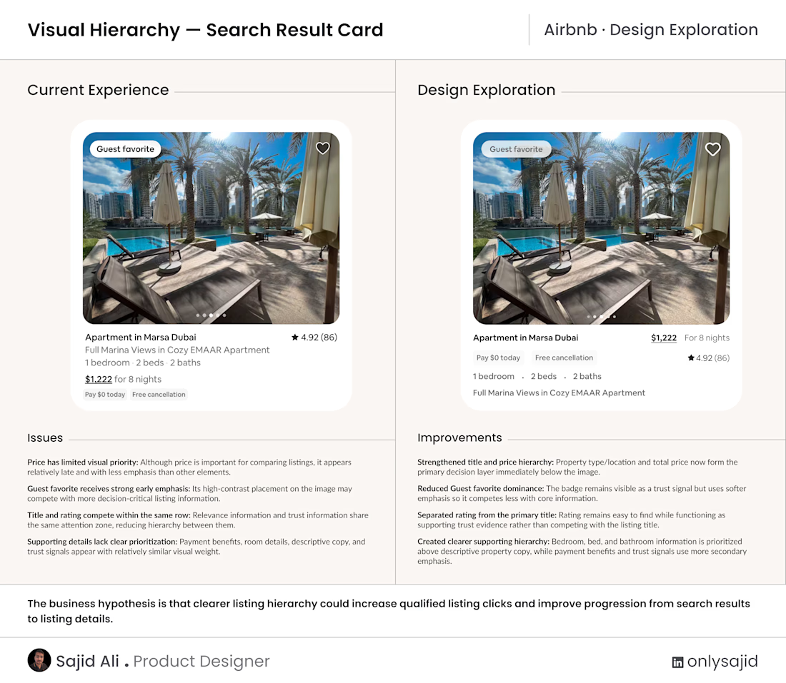
Today I explored an Airbnb search-result card with one question:
When users scan multiple listings, does the card visually prioritize the information that helps them decide what is worth opening?
In the current experience, the Guest favorite badge receives strong early attention, while price competes with other information and rating sits in the same visual zone as the listing title.
In my design exploration, I:
strengthened the title and price hierarchy
reduced the dominance of the Guest favorite badge
separated rating from the primary title
prioritized bedroom, bed, and bathroom details above descriptive property copy
The goal was not to remove information, but to make the decision hierarchy easier to perceive at a glance.
Business hypothesis: clearer listing hierarchy could increase qualified listing clicks and improve progression from search results to listing details.
This is an independent design exploration based on the visible Airbnb experience, not a claim that the current solution is wrong. Real impact would need validation through user behavior, comparison tasks, and product metrics.
When you scan accommodation results, what do you look at first: image, location, price, capacity, or rating?

The network for creativity
Join 1.25M professional creatives like you
Connect with clients, get discovered, and run your business 100% commission-free
Creatives on Contra have earned over $150M and we are just getting started







Related posts

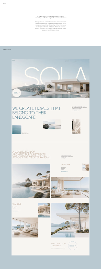
A luxury property deserves a presentation that does it justice.
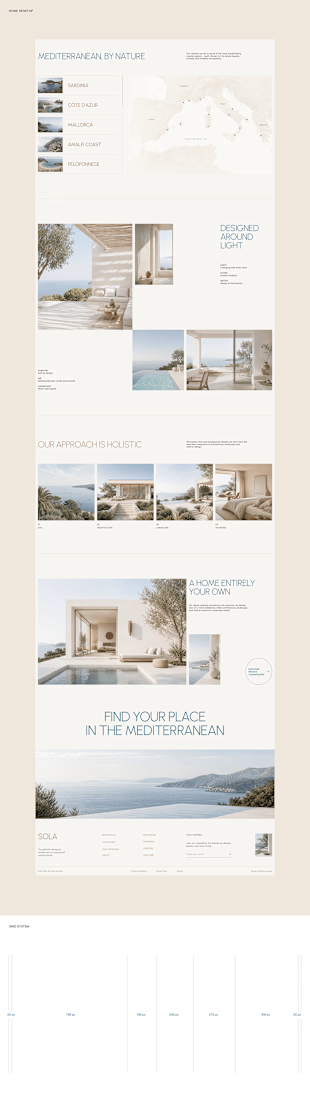
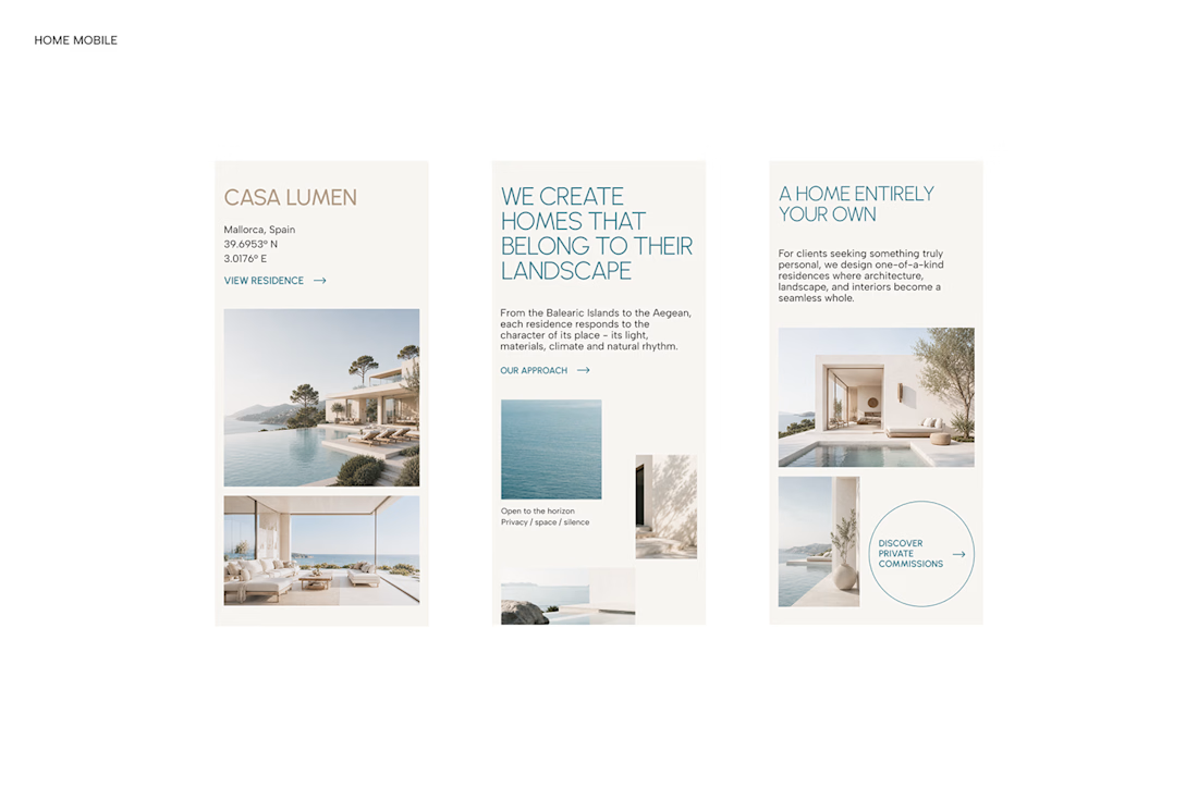

With SOLA – Architecture Studio & Luxury Real Estate, I wanted to bring the beauty of modern coastal architecture into the website itself.
From the large property images and soft blue tones to the clean layout across desktop and mobile, every part of the design helps create a calm, premium feel while making the homes the centre of attention.
I like how the website brings architecture and digital design together, giving visitors a chance to explore the properties before making an enquiry.
If you were looking for a luxury home, would a website like this make you more interested in the property?
#WebDesign #Architecture #LuxuryRealEstate

Incredible work, you transformed SOLA into a premium property brand.


Yo Designers!
We're looking for a skilled product designer with an exceptional sense of visual design to create 5 high-end UI showcase visuals.

Sounds like a fun one! Looking forward to seeing the visuals that come out of this


Every element feels perfectly placed! 👏

