The network for creativity
Join 1.25M professional creatives like you
Connect with clients, get discovered, and run your business 100% commission-free
Creatives on Contra have earned over $150M and we are just getting started
Back to feedPost
A clean and premium packaging design for raw organic Shea Butter, combining elegant typography, botanical illustrations, and a warm natural palette to create a refined wellness-focused product identity.
packagingdesignlabeldesigngraphicdesignPackaging DesignGraphic DesignAdobe IllustratorAdobe Photoshop


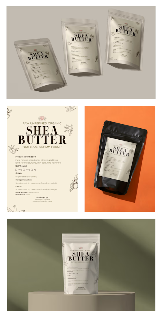

The warm natural palette and botanical details make the Shea Butter feel both premium and genuinely grounded. I especially like how the restrained typography gives the label room to breathe while keeping the product information clear.

thanks
The network for creativity
Join 1.25M professional creatives like you
Connect with clients, get discovered, and run your business 100% commission-free
Creatives on Contra have earned over $150M and we are just getting started
Related posts

Which option works better? 👀
Option 1: the full lineup with the mesh bag
Option 2: the picnic setup
7 voted
20%
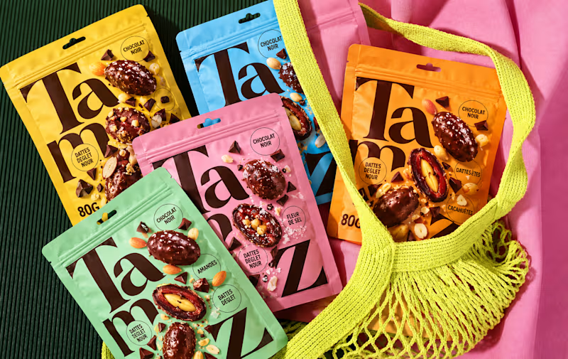
28 voted
80%
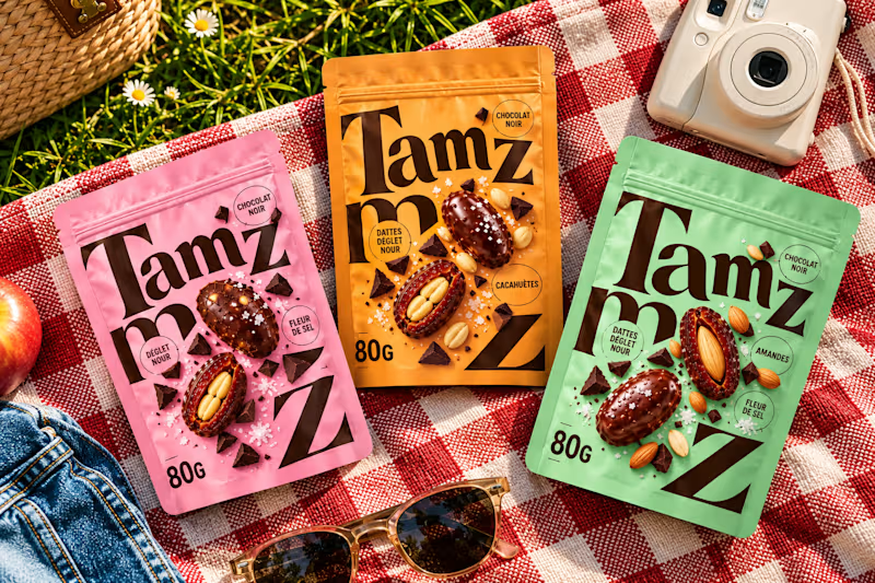
35 votes
Closed


option 2 for me, the picnic setup feels like something you would actually want to buy

Any good words for the packaging.



If a doctor has to hunt for a patient’s vital signs, the dashboard is getting in the way of care.
Doctors don’t need another dashboard. They need the full patient picture at a glance.
In healthcare, confusing UX isn’t just frustrating. It can delay understanding when every second matters.
DocuVerse brings vital signs, patient metrics, and health trends into one clear view, making complex health data easier to scan and understand.
Less searching. More clarity. Better informed decisions.
That’s what healthcare UX should deliver.
Would you design a healthcare dashboard for more data, or better decisions?

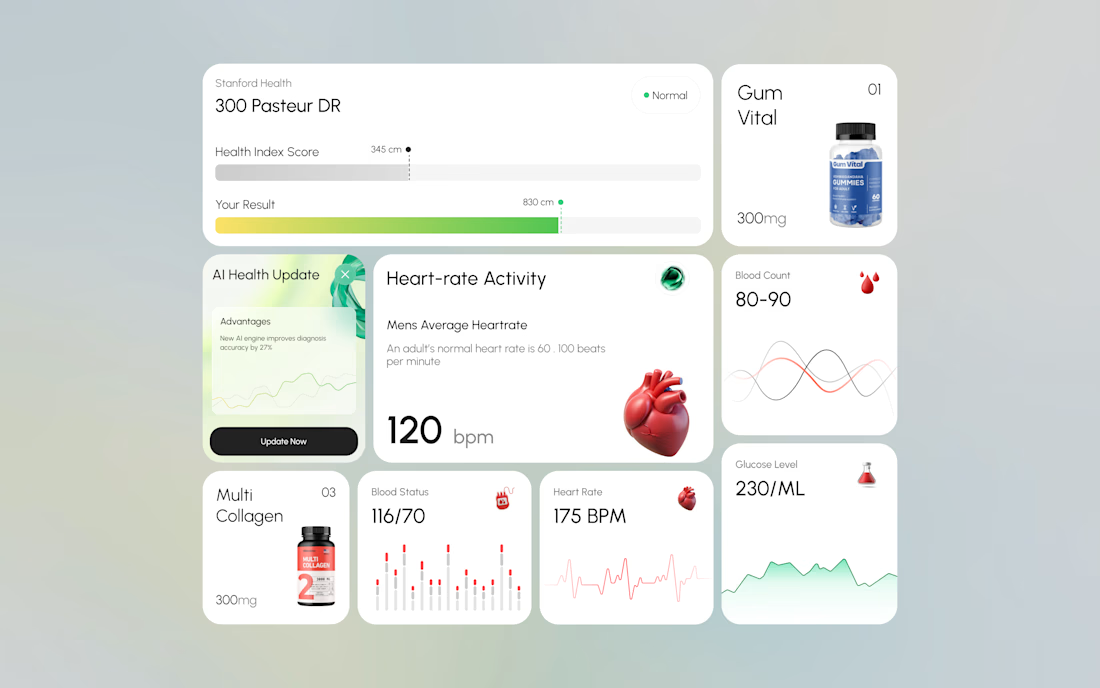
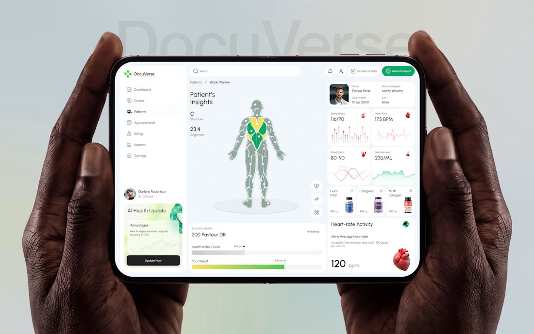

A clearer patient overview can make complex health data feel far less overwhelming. That’s thoughtful UX.