The network for creativity
Join 1.25M professional creatives like you
Connect with clients, get discovered, and run your business 100% commission-free
Creatives on Contra have earned over $150M and we are just getting started
Back to feedPost
Taste Test
Which one would you choose 🤔
1 voted
14%
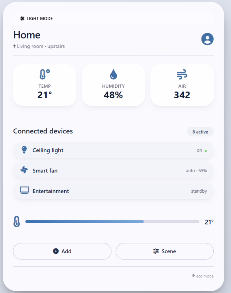
6 voted
86%
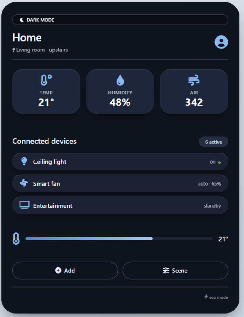
7 votes
Closed
Although first you might think light theme is a better fit for such a concept, light aqua blue look etc, for data standing out and looking better, I' d go with the dark one!
I’d go with Dark Theme. The contrast makes the device cards and metrics stand out more, which improves readability for dashboards like this.
The network for creativity
Join 1.25M professional creatives like you
Connect with clients, get discovered, and run your business 100% commission-free
Creatives on Contra have earned over $150M and we are just getting started
Related posts
Which mode you prefer the most
88 voted
68%
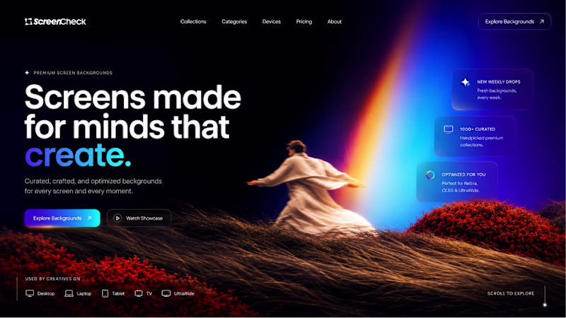
41 voted
32%
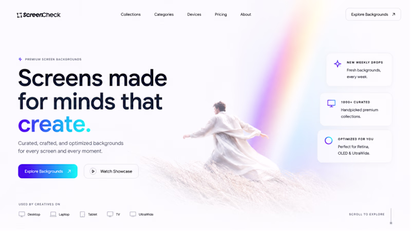
129 votes
Closed
As for me, I choose the option 1
🎨 Design Challenge
Which version catches your attention first?
Now I need your opinion 👇
✅ Left
✅ Right
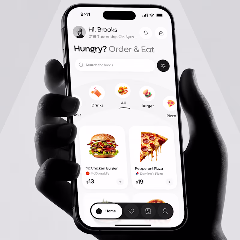
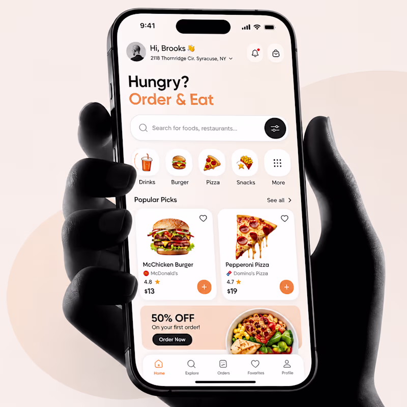
98 votes
Ends in 5h
This is a great reminder that design isn't just about functionality—it's also about creating a feeling.
A large screen catches your attention at an exhibition.
You have about 3 seconds to decide whether to stop and take a closer look.
Which direction makes you more curious?
A) Product-first
B) Message-first
Exploring hero section concepts for Pixtap, an NFC-powered business card brand.
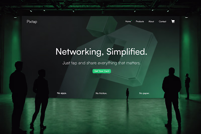
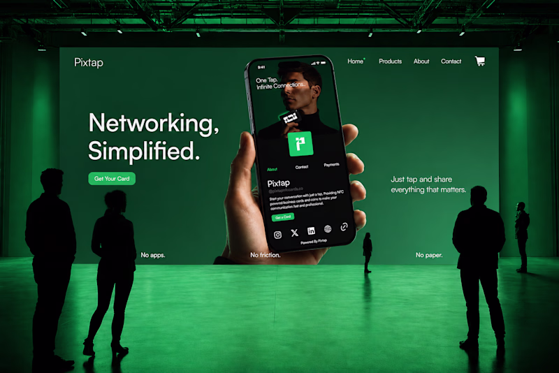
8 votes
Ends in 13h
I prefer the product first Love the visuals, one of the best have seen so far today....... Keep up the great work
Trending
Claude
Claude has entered the design space. How are you using Claude Design?
Contra University
Learn from expert creatives how to earn more using next-gen AI tools.
MagicPath
The canvas is infinite, and exploration is becoming the workflow. How are you using MagicPath?
creativeaiflow
Creative AI workflows are evolving. What tools do you use, and what are their strengths and weaknesses?
freelancerlife
Freelancer life is wins, pivots, and everything in between. What’s yours right now?