The network for creativity
Join 1.25M professional creatives like you
Connect with clients, get discovered, and run your business 100% commission-free
Creatives on Contra have earned over $150M and we are just getting started
Back to feedPost


I have great experience of logo design and doing work on low low price .

The network for creativity
Join 1.25M professional creatives like you
Connect with clients, get discovered, and run your business 100% commission-free
Creatives on Contra have earned over $150M and we are just getting started





Related posts

Last year, I had the privilege of designing the logo for Quantavo. It’s always a win when technical precision meets clean design.
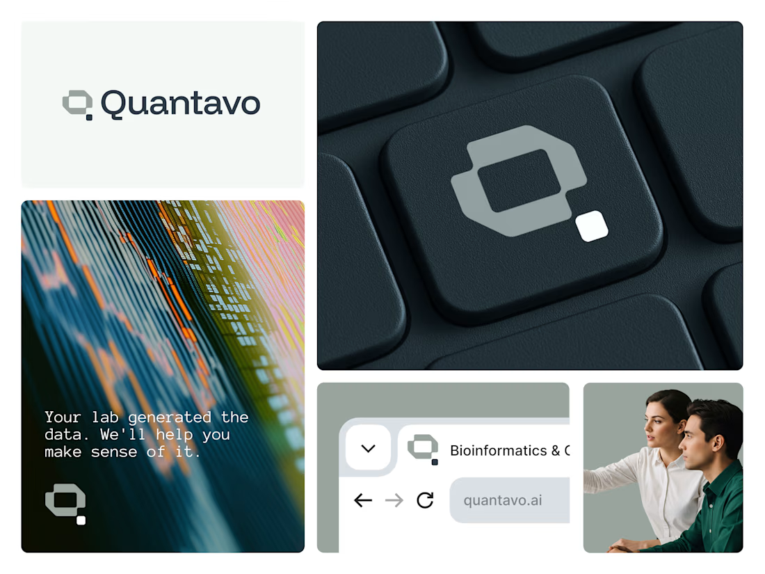

That geometric Q is such a confident mark, Illia. Technical precision is exactly the right read for Quantavo, and the way it holds up on the keycap and site shots shows real craft.


A logo reveal created in Blender, where simple geometric shapes come together to form the Geisleris Studio identity.


Nice

Title: Proper Form — Brand Identity & Visual Language
A brand identity for Proper Form built around a more modern, movement-driven take on recovery and healthcare.
The visual system extends the logo into a complete language through color, typography, imagery and layout, creating a consistent identity across different brand touchpoints.
Created by Lepisov Branding in collaboration with @Creative Mints
Logo design: Ilya Gorchanyuk
Creative direction: Dmitry Lepisov
Brand identity: Lepisov Branding × Creative Mints


Using the logo mark as the big graphic across the layouts is smart. The purple to pink gradient gives recovery a more energetic feel.