The network for creativity
Join 1.25M professional creatives like you
Connect with clients, get discovered, and run your business 100% commission-free
Creatives on Contra have earned over $150M and we are just getting started
Back to feedPost

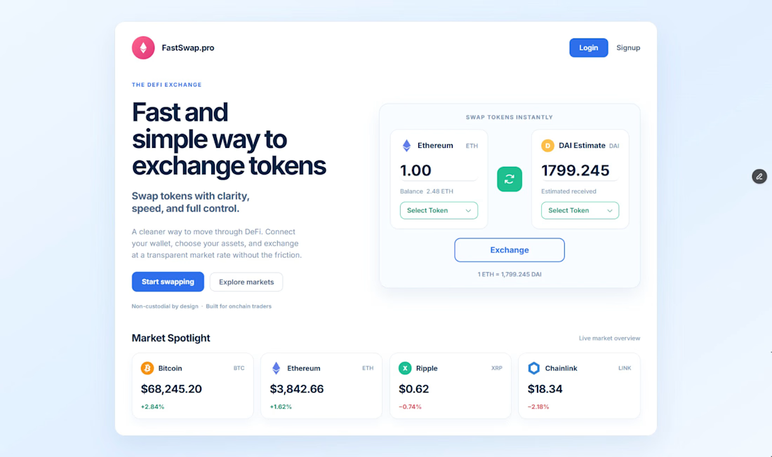
Here's a modern #Crypto Exchange #Dashboard UI designed with usability and clarity in mind. The goal was to create an interface that makes swapping digital assets feel effortless while maintaining a premium fintech experience.
✨ Features
• Clean and minimalist interface
• Token swap functionality
• Live market spotlight section
• Responsive dashboard layout
• Modern fintech color palette
• Clear visual hierarchy
• Smooth user experience focused on simplicity
Every element was designed to reduce friction and help users focus on what matters most—trading quickly and confidently.
💬 I'd love to hear your thoughts! What feature would you add to improve this crypto exchange experience?


The network for creativity
Join 1.25M professional creatives like you
Connect with clients, get discovered, and run your business 100% commission-free
Creatives on Contra have earned over $150M and we are just getting started

Challenges
View all


Related posts

Hi :) This is a journey through asteroids into the heart of a star. Built with Three.js, React Three Fiber, and custom GLSL shaders. Liquid images, interactive particle typography, and a core that opens under your cursor.


Man... this is cool. 😍


Amazing work


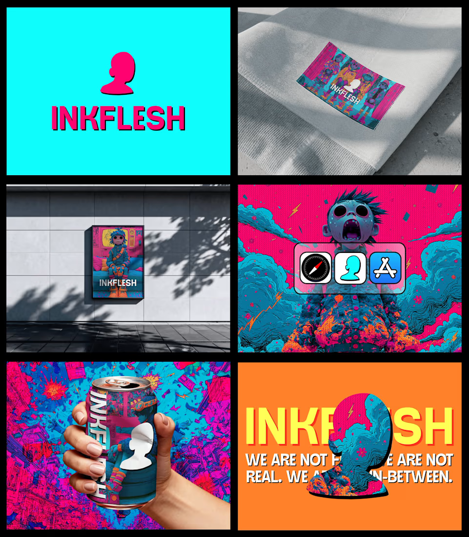
In my INKFLESH identity work, the wordmark runs off the can's curve and gets partly hidden behind artwork on posters. That crop asks the rest of the identity to carry more recognition. The mark has a job when the name is only partly there.