The network for creativity
Join 1.25M professional creatives like you
Connect with clients, get discovered, and run your business 100% commission-free
Creatives on Contra have earned over $150M and we are just getting started
Back to feedPost


* Micro case study
—
Some projects never launch, like islands that never appear on maps.
What goes unseen still leaves a mark. Today, WAIRE emerges from the mist.


super!

Looks amazing Javi!
Thanks! @Gergő Cserba

wow! loved it

"Some projects never launch, like islands that never appear on maps" is a genuinely good line for a case study intro, most people just jump straight to the deliverables. Was WAIRE a passion project that stalled, or a client thing that got shelved and you're now showing the work regardless?
This is an excerpt from the brand strategy we were working on. It’s a nod to that exploratory and defining phase that we’re so passionate about.
The project was put on hold by the client. There were too many legal hurdles and difficulties raising investment.
Thanks for the mention @Maty Sandoval
The network for creativity
Join 1.25M professional creatives like you
Connect with clients, get discovered, and run your business 100% commission-free
Creatives on Contra have earned over $150M and we are just getting started







Related posts


Proud to be an Official Framer Expert Agency for 2026!
Explore our work:
https://artonest.design/
https://www.framer.com/@artonest-design-studio/



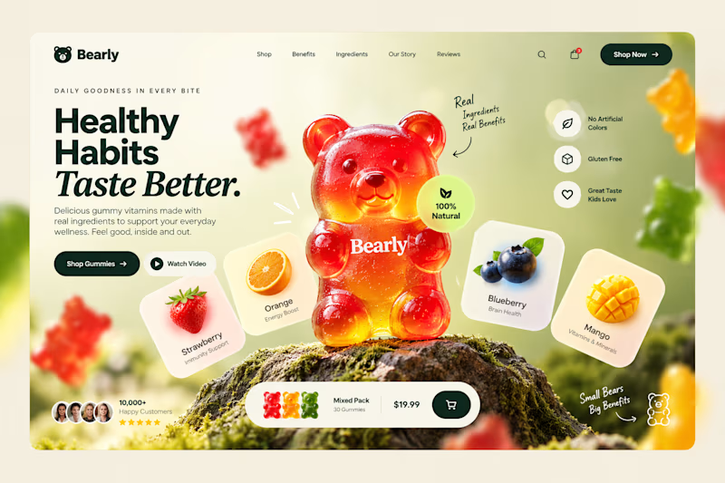
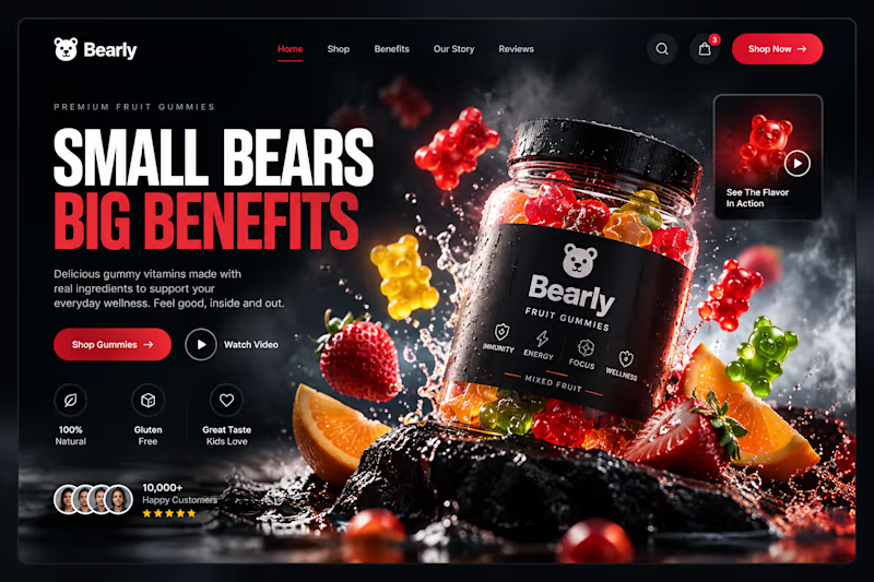
Which gummy brand would make you stop scrolling?
Two different directions for Bearly, a gummy candy brand concept.
One is bright, playful, and fruit-inspired. The other is bold, dark, and premium.
Same product, two completely different visual experiences.
Which one would you choose? Vote below! 👇
#BrandIdentity #WebDesign #UIUX #EcommerceDesign #Figma #DesignInspiration #ABTesting
9 voted
75%
3 voted
25%
12 votes
Closed

I will always love it playful cant lie

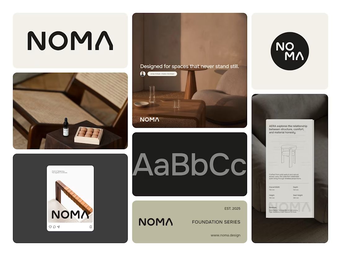
Noma is furniture brand from indonesia, they have clean visual identity.