The network for creativity
Join 1.25M professional creatives like you
Connect with clients, get discovered, and run your business 100% commission-free
Creatives on Contra have earned over $150M and we are just getting started
Back to feedPost

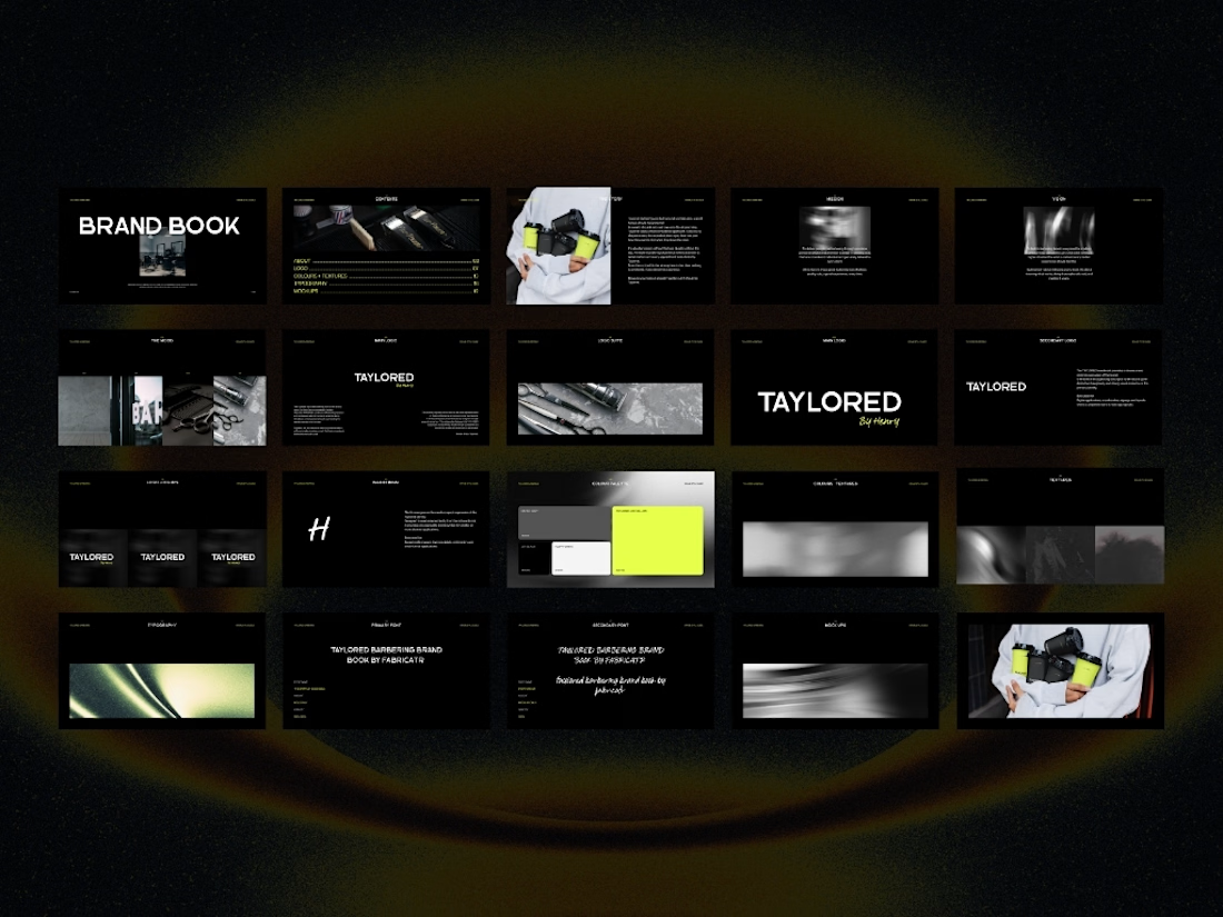
A brand guidelines kit built to make the boring part of branding feel a lot less boring.
I built The Brand Guidelines Template Kit as a flexible starting point for designers, studios and brands that want to present a visual identity properly, without rebuilding the same 20+ pages from scratch every time.
Built for:
— brand guidelines
— visual identities
— typography systems
— colour systems
— imagery direction
— layout & composition
— brand applications
Dark, editorial, minimal but intentionally flexible enough to make it your own.
Available now for $49.
Built in Canva. Designed to be customised.
The network for creativity
Join 1.25M professional creatives like you
Connect with clients, get discovered, and run your business 100% commission-free
Creatives on Contra have earned over $150M and we are just getting started



Related posts

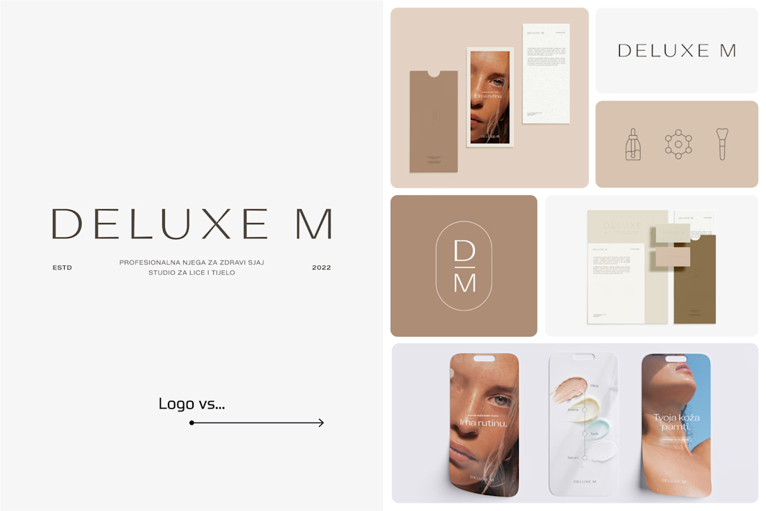
A logo is one thing. Giving it a whole personality is another. 👀
I picked a few of my branding projects to show what happens beyond the logo.
First, the logo on its own. Then, the full visual identity: colours, typography, graphic elements, patterns, packaging, and all the little details that make each brand feel like itself.
Because I don't want a logo to just look good sitting on a presentation slide. I want to see what it can become when it gets out into the real world.
Every project has a different story, personality, and visual direction. And that's probably my favourite part of brand design: figuring out how to turn one initial idea into a whole visual language.
Swipe through and meet the logos, then their bigger personalities. ;)
A logo is the starting point. The fun really begins after that.
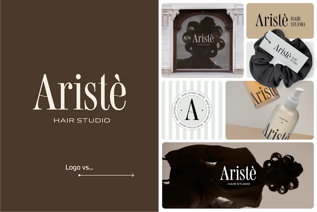
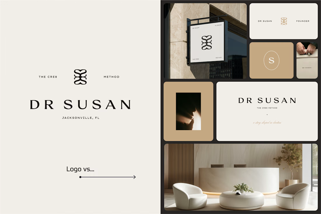
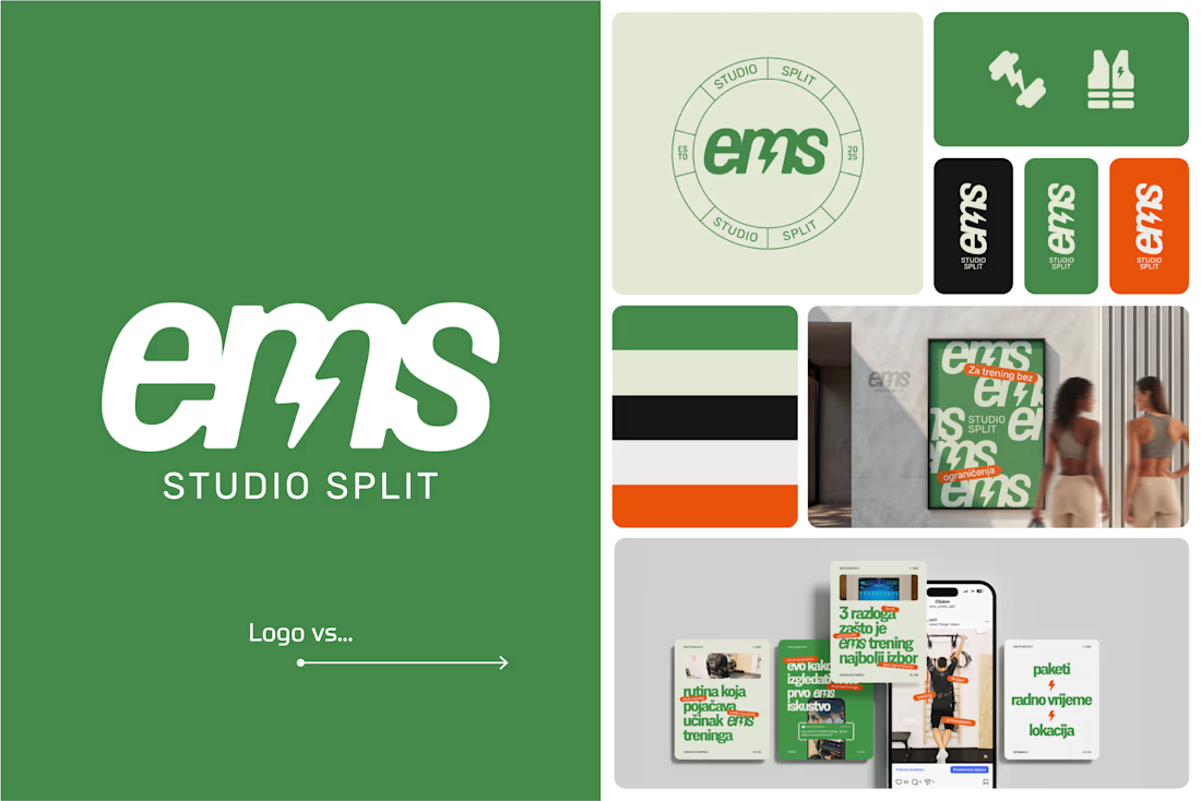

Clever use of the lightning bolt in the EMS logo!


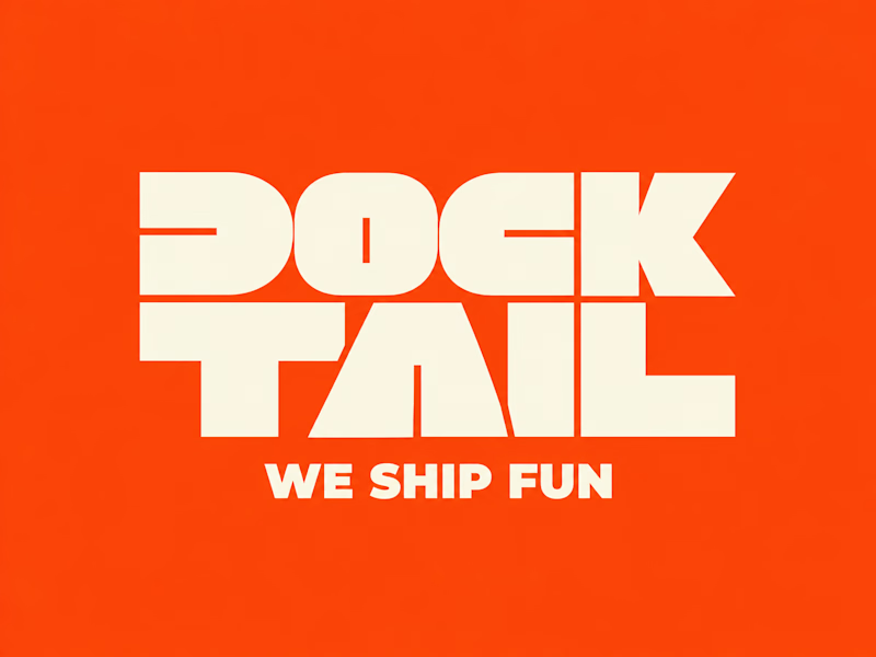
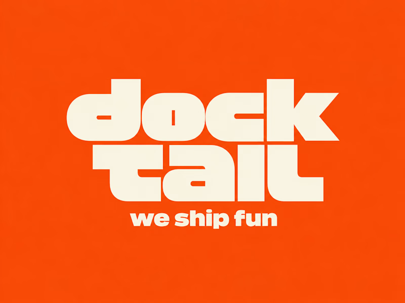
DockTail approached me with a fun idea: make us look nothing like what we do.
As strange as it sounds, I think this is one of the most exciting creative challenges. When branding a business, the primary objective is usually to communicate what it does. But what happens when you deliberately take that away?
After a few days of brainstorming, experimentation, and using Curative Intelligence, I arrived at these two concepts.
One is ALL CAPS, the other is all lowercase. Both carry the same personality, but express it through two entirely different approaches.
Now I'm curious: Which one do you like more?
22 voted
65%
12 voted
35%
34 votes
Closed

A quiet, minimal Framer template is now live on the marketplace. Plaster is for anyone who wants their work to speak first and a new portfolio published in minutes.
It has four color themes, plus an embossed signature animation.


Amazing work