The network for creativity
Join 1.25M professional creatives like you
Connect with clients, get discovered, and run your business 100% commission-free
Creatives on Contra have earned over $150M and we are just getting started
Back to feedPost

Digital Architect for Fitness Brands | Building Powerful Gym & Health Portals

The network for creativity
Join 1.25M professional creatives like you
Connect with clients, get discovered, and run your business 100% commission-free
Creatives on Contra have earned over $150M and we are just getting started





Related posts

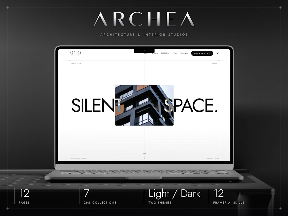
ARCHEA just hit #3 in Architecture on the
Framer Marketplace.
I built it to give architecture studios a quiet, editorial space to show their work. Really happy to see it find its audience.


A modern brand identity concept designed for the architecture, interior design, and construction industry.
The visual identity is built around a distinctive geometric symbol, combining four interconnected forms to create an abstract interpretation of the letter “N.”
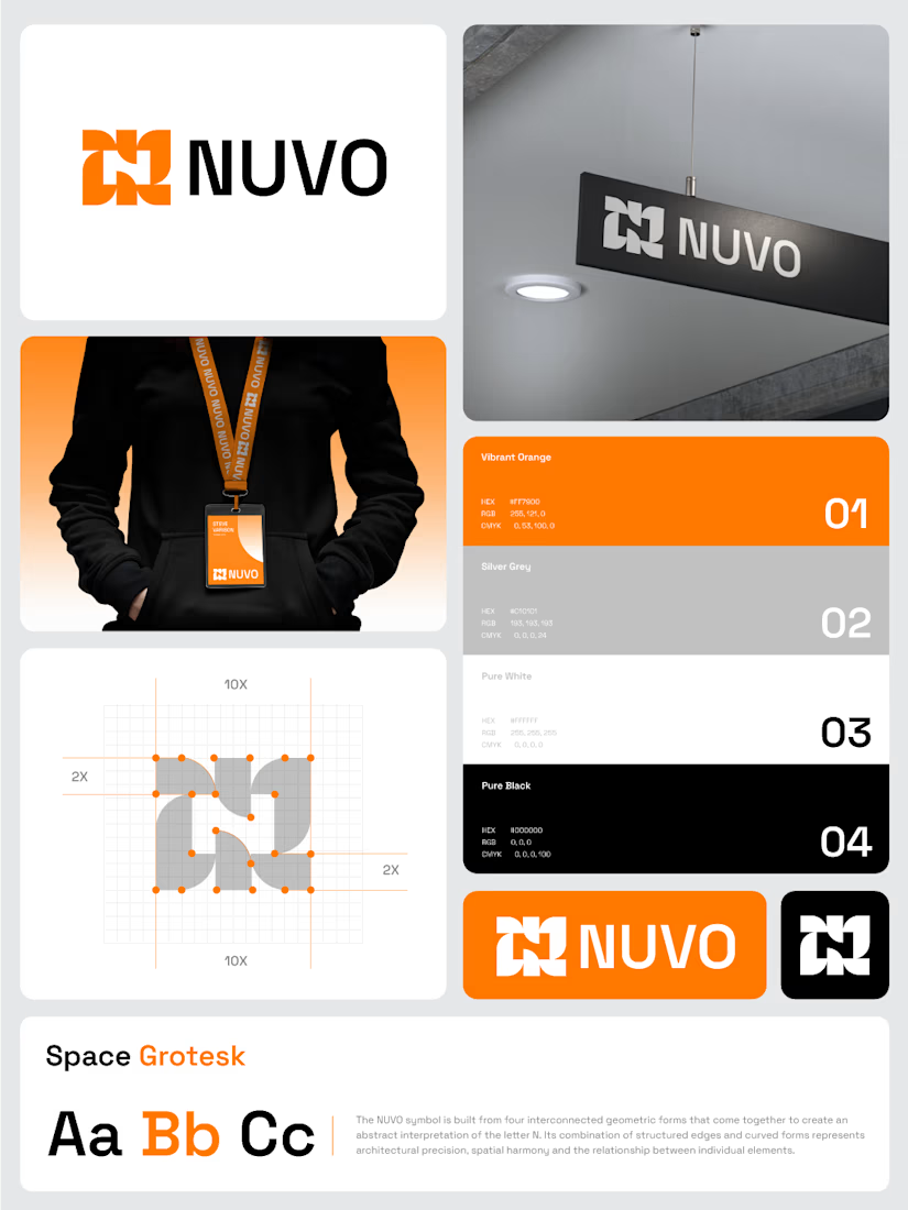

The construction grid with those 2X margins makes the N read as a system, not a one-off mark. Did you test the four-form symbol at favicon or lanyard-badge size, where the gaps between the forms start to close up?

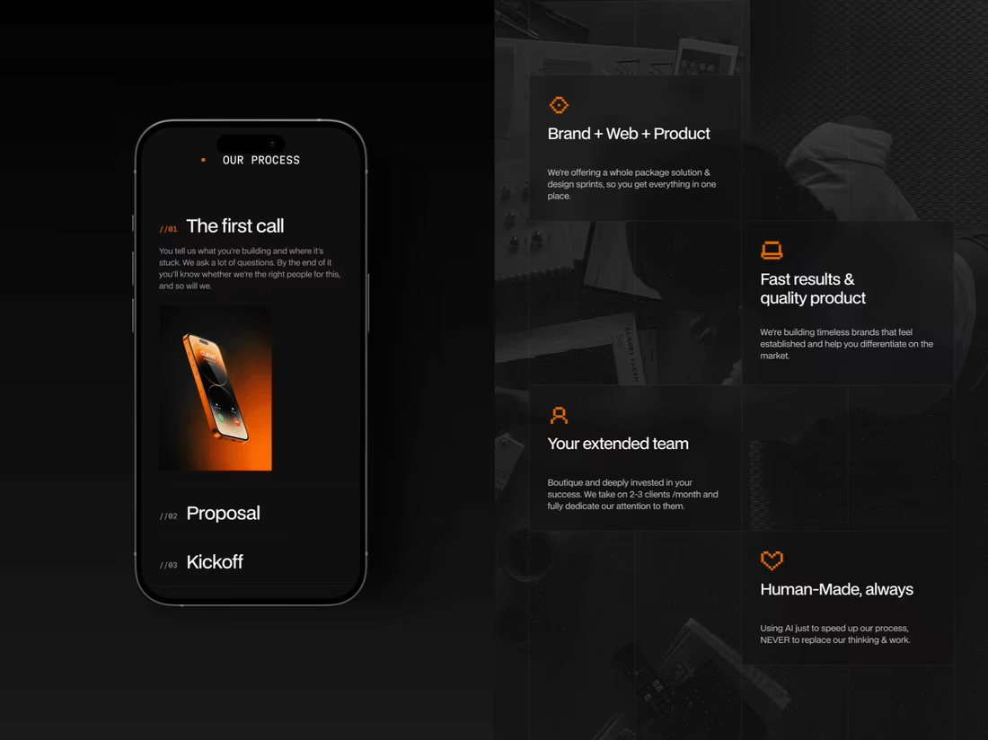
Studio /03 is our own design studio, and we designed its website to unslop the internet. Founders now know how we work, what it costs and how to reach us:)