The network for creativity
Join 1.25M professional creatives like you
Connect with clients, get discovered, and run your business 100% commission-free
Creatives on Contra have earned over $150M and we are just getting started
Back to feedPost
🚀 DAY 22 - POSTING LEGENDARY DESIGN HISTORY - FOLLOW FOR MORE 🚀
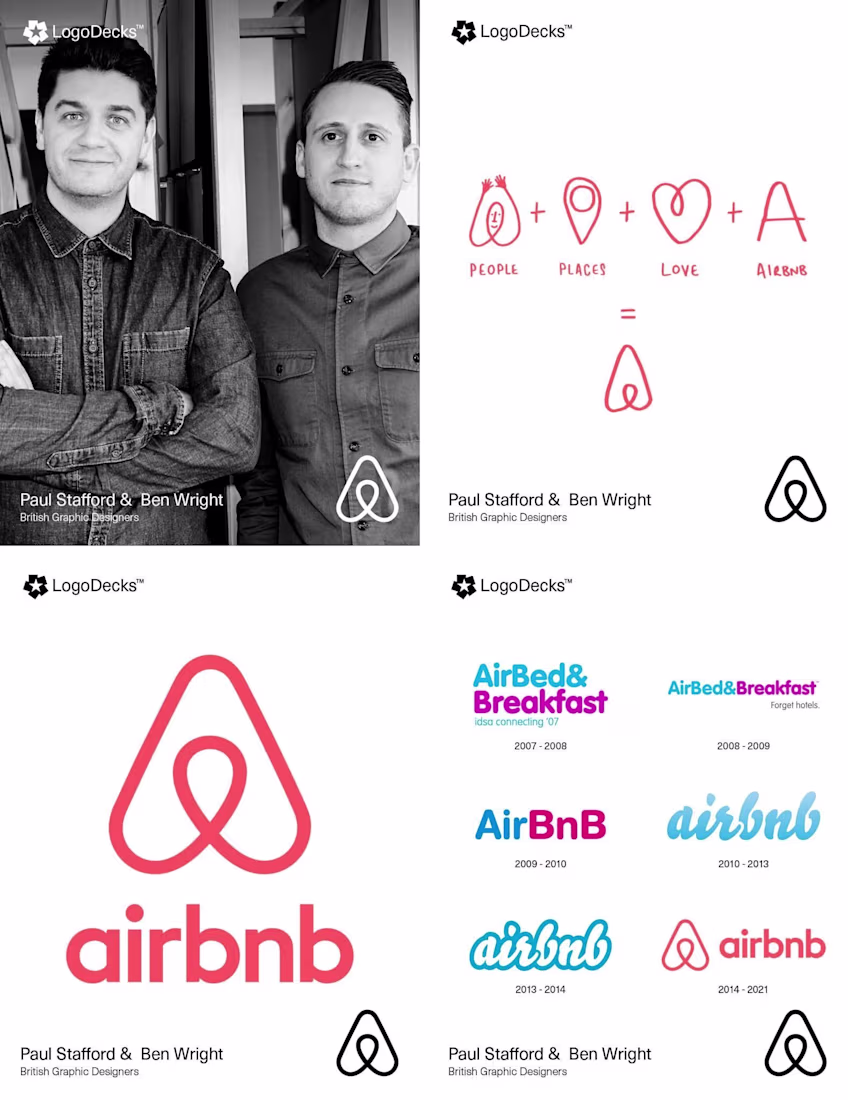
The Airbnb Logo That Sparked a Global Plagiarism Scandal.
The 2014 Airbnb rebrand by British designers Paul Stafford and Ben Wright remains a landmark in modern identity design. Moving away from the company’s original blue script, the co-founders introduced the "Bélo" a minimalist symbol intended to represent "belonging." To capture the brand's soul, the duo embedded their team at Airbnb’s headquarters and sent designers to stay with hosts across four continents. The resulting logo is a geometric synthesis of four icons: a head for people, a location pin for places, an inverted heart for love, and the letter ‘A’. However, the launch was immediately met with controversy over its striking similarity to the 1975 logo for the Azuma Drive-In, designed by Akisato Ueda. While critics pointed out the near-identical looping line work found in vintage design archives, Paul and Ben maintained the shape was a logical evolution of their "people, places, love" concept.
The network for creativity
Join 1.25M professional creatives like you
Connect with clients, get discovered, and run your business 100% commission-free
Creatives on Contra have earned over $150M and we are just getting started
Related posts
May was a busy one.
✓ 8 clients booked
✓ 5 logos delivered
✓ 5 projects delivered
✓ 3 projects still active
✓ 3 brandbooks delivered
✓ 6 packaging designs completed
June is already moving fast, but I’m starting to look ahead to the second half of the year and the new adventures, brands, and challenges that might come with it.
How is your 2026 looking so far?
I can’t wait to land my first gig🥹
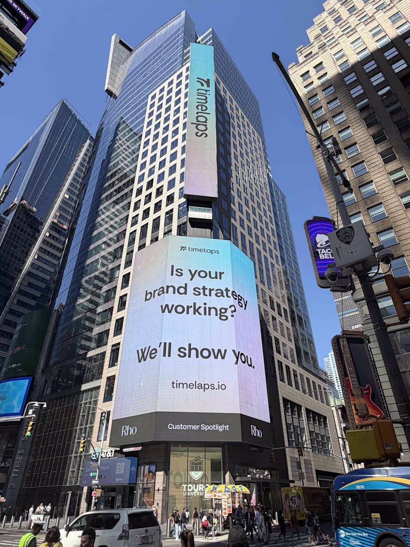
Earlier this week, Timelaps, a brand designed and developed by BrightStudios has been featured on a billboard next to Nasdaq.
Always an incredible feeling
PS full case study is available over on our profile
I saw this somewhere today (most likely on linkedin) and I knew I've seen this name/company somewhere.. now I remember. Well deserved! 🤘 🐐
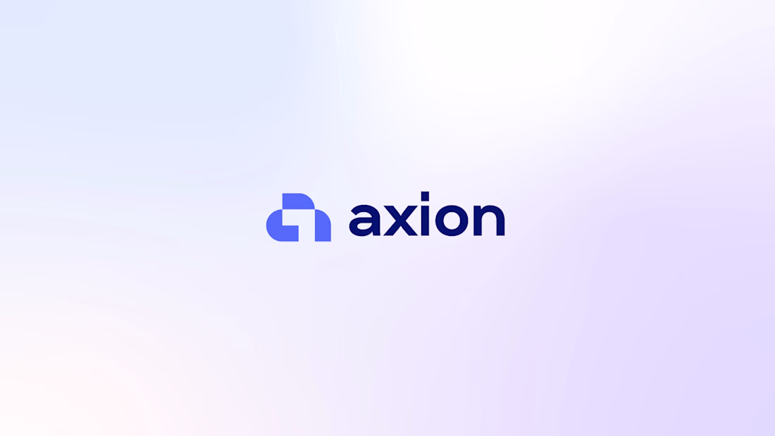
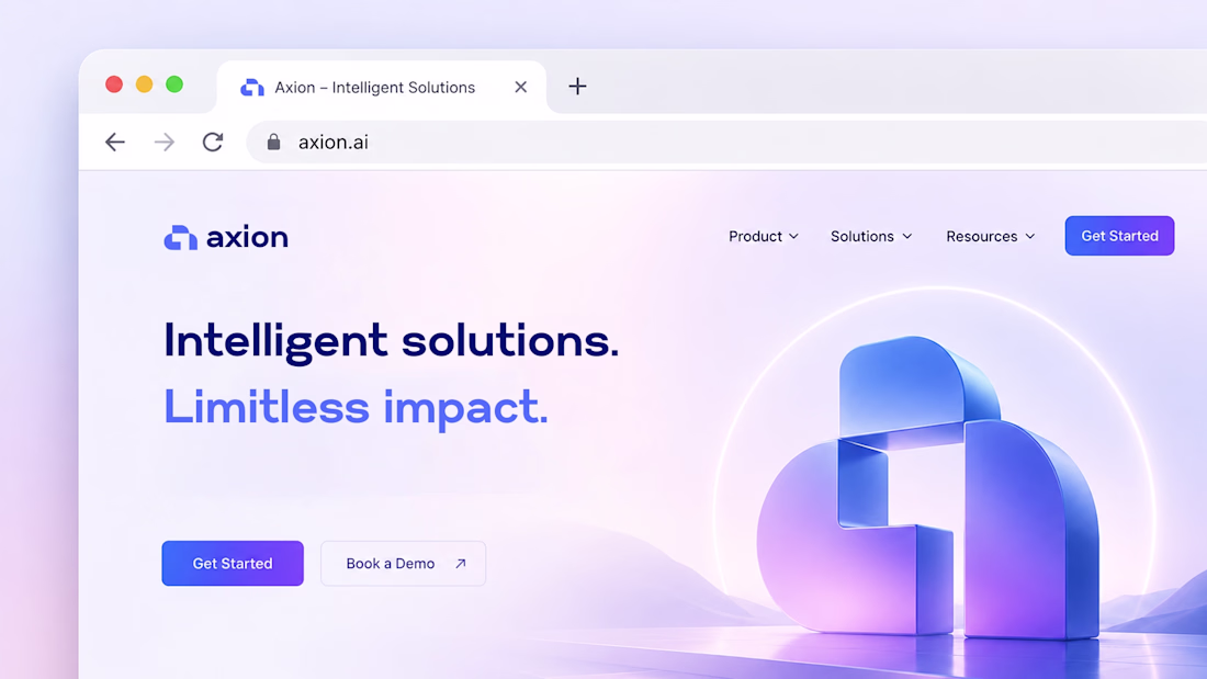
Recently wrapped up brand identity design for SaaS startup
Looks so cool!
Challenges
View allTrending
Claude
Claude has entered the design space. How are you using Claude Design?
Contra University
Learn from expert creatives how to earn more using next-gen AI tools.
MagicPath
The canvas is infinite, and exploration is becoming the workflow. How are you using MagicPath?
creativeaiflow
Creative AI workflows are evolving. What tools do you use, and what are their strengths and weaknesses?
freelancerlife
Freelancer life is wins, pivots, and everything in between. What’s yours right now?