The network for creativity
Join 1.25M professional creatives like you
Connect with clients, get discovered, and run your business 100% commission-free
Creatives on Contra have earned over $150M and we are just getting started
Back to feedPost

AFTERHOURS | Music Festival Poster Concept
An experimental event poster concept combining oversized typography, high-contrast photography, and a bold orange-and-black palette.
Inspired by contemporary music culture and editorial poster design, the composition uses dramatic scale, unconventional type arrangements, and layered visual elements to capture the energy of a live performance.
The result is an expressive promotional graphic designed to command attention across digital and print applications.
Creative focus: Event advertising, experimental typography, poster design, and creative direction.
Independent concept project.

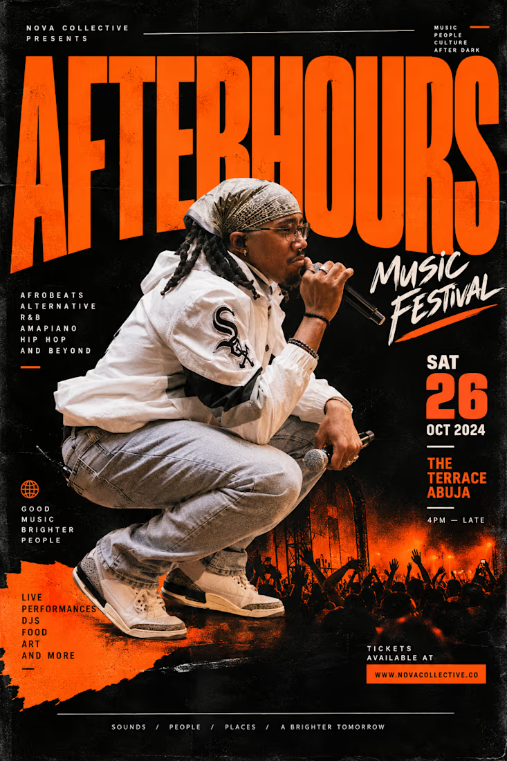

The AFTERHOURS headline cropped behind the performer gives it real depth, and orange on black is loud in the best way. Would you bump the date and venue block a bit so it reads from across the street?
The network for creativity
Join 1.25M professional creatives like you
Connect with clients, get discovered, and run your business 100% commission-free
Creatives on Contra have earned over $150M and we are just getting started



Related posts

Amazing!

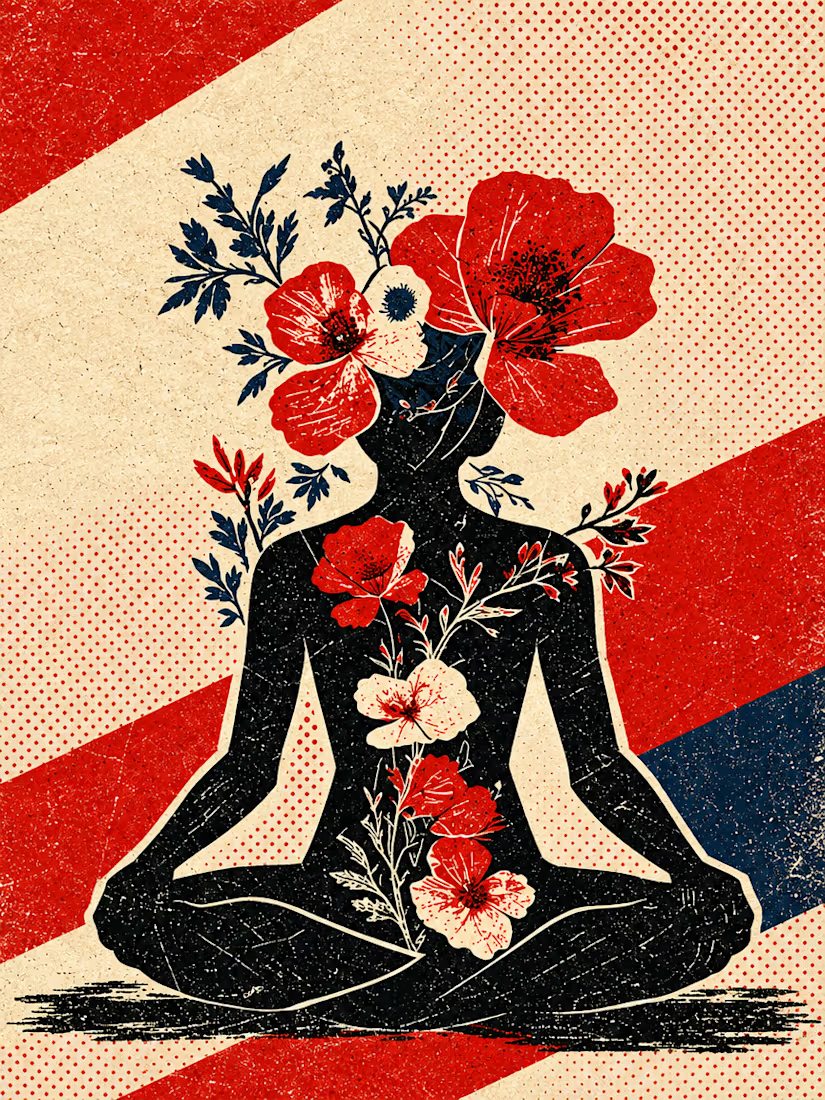
What happens when propaganda designed to erase the self gets pointed at the self instead?
Soviet propaganda spent 70 years trying to erase the individual soul in favour of the collective machine. I pointed that exact visual language at the thing it was built to suppress.
I kept...




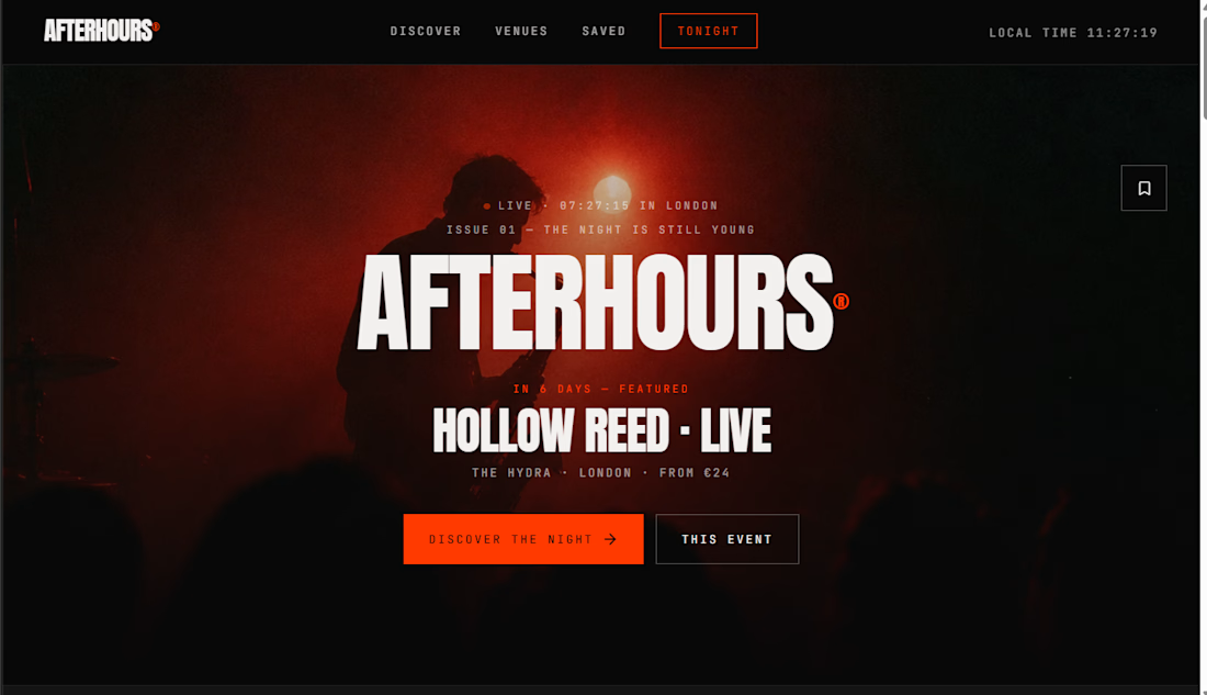
AFTERHOURS® — The Underground Nightlife Discovery Experience




The attention to detail here is excellent. Keep up the great work.