The network for creativity
Join 1.25M professional creatives like you
Connect with clients, get discovered, and run your business 100% commission-free
Creatives on Contra have earned over $150M and we are just getting started
Back to feedPost


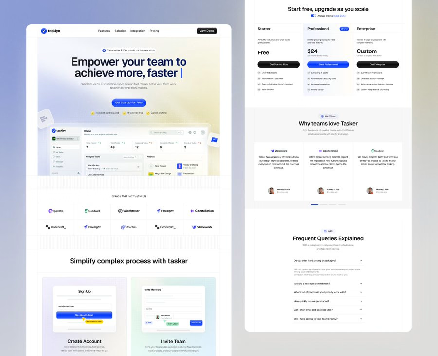
Is your CTA button killing your sales?
To build a high-converting landing page, place CTAs where they’ll convert.
1. Above the fold to attract first attention.
• Best for simple offers like signing up.
2. Below-the-fold CTAs for users who need more information before taking action.
3. Mid-Page CTAs after benefits and use cases.
4. End-of-page CTA after case studies or social proof.
5. Long-Form Landing Pages
• After benefits, testimonials, pricing, or case studies.
6. Sticky CTAs For Better Mobile UX
• Always accessible on screen
• Actions within thumb’s reach.
Check your CTA placement on your landing page.
DM me if you have any questions.



Super clean work!

In your tests do you find people convert better with a sticky bottom bar on mobile or just keeping a static button inside each main section?
The network for creativity
Join 1.25M professional creatives like you
Connect with clients, get discovered, and run your business 100% commission-free
Creatives on Contra have earned over $150M and we are just getting started







Related posts


Every element feels perfectly placed! 👏

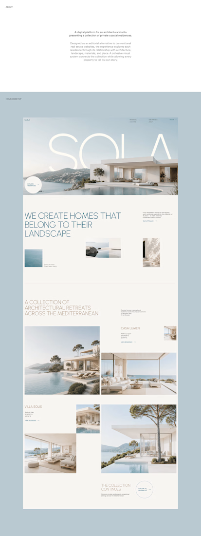
A luxury property deserves a presentation that does it justice.
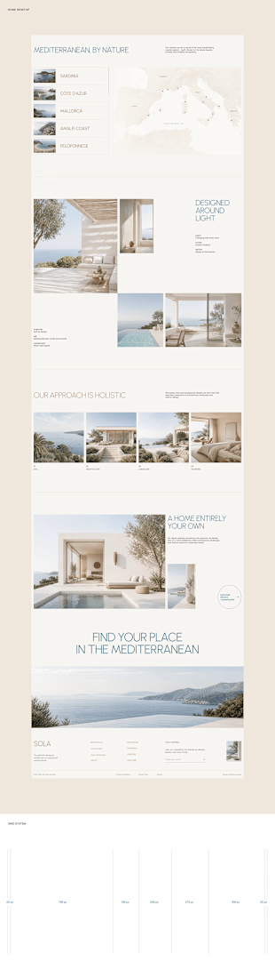
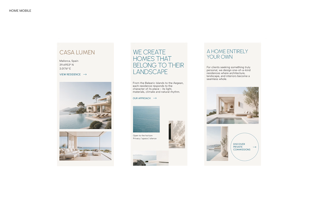

With SOLA – Architecture Studio & Luxury Real Estate, I wanted to bring the beauty of modern coastal architecture into the website itself.
From the large property images and soft blue tones to the clean layout across desktop and mobile, every part of the design helps create a calm, premium feel while making the homes the centre of attention.
I like how the website brings architecture and digital design together, giving visitors a chance to explore the properties before making an enquiry.
If you were looking for a luxury home, would a website like this make you more interested in the property?
#WebDesign #Architecture #LuxuryRealEstate

Incredible work, you transformed SOLA into a premium property brand.


Another set of mockups for Bakedwell


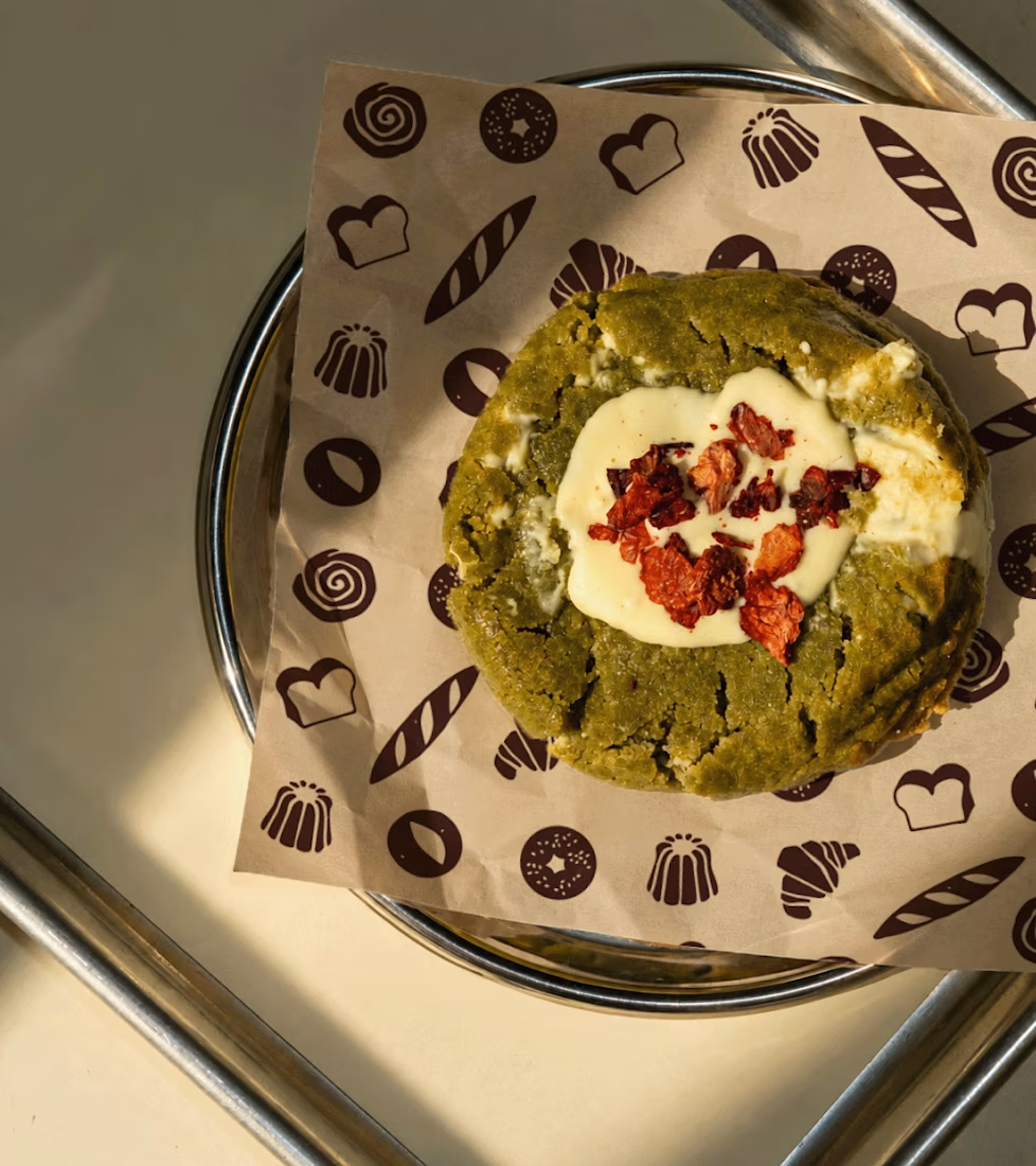
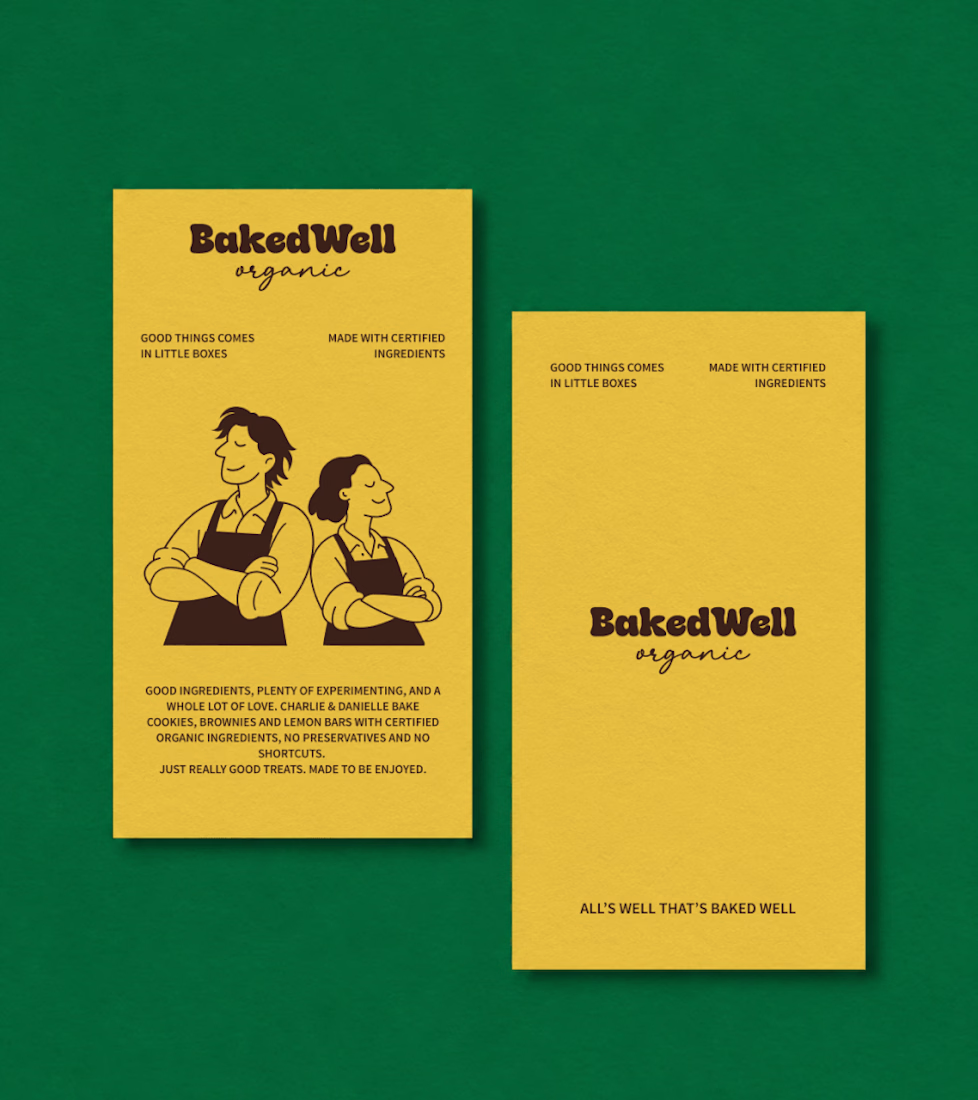
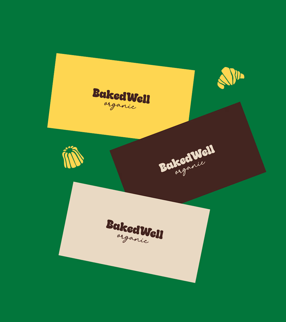
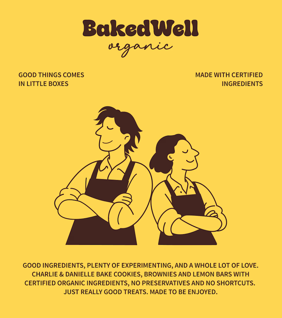

Forest green and mustard with the two bakers in flat illustration is a warm, confident pairing, and the cards read clearly. Contrarian take: the illustrated pair is the strongest asset here, stronger than the wordmark. If I owned BakedWell, I would put those two on the bag and the window and let the logo go smaller.