The network for creativity
Join 1.25M professional creatives like you
Connect with clients, get discovered, and run your business 100% commission-free
Creatives on Contra have earned over $150M and we are just getting started
Back to feedPost

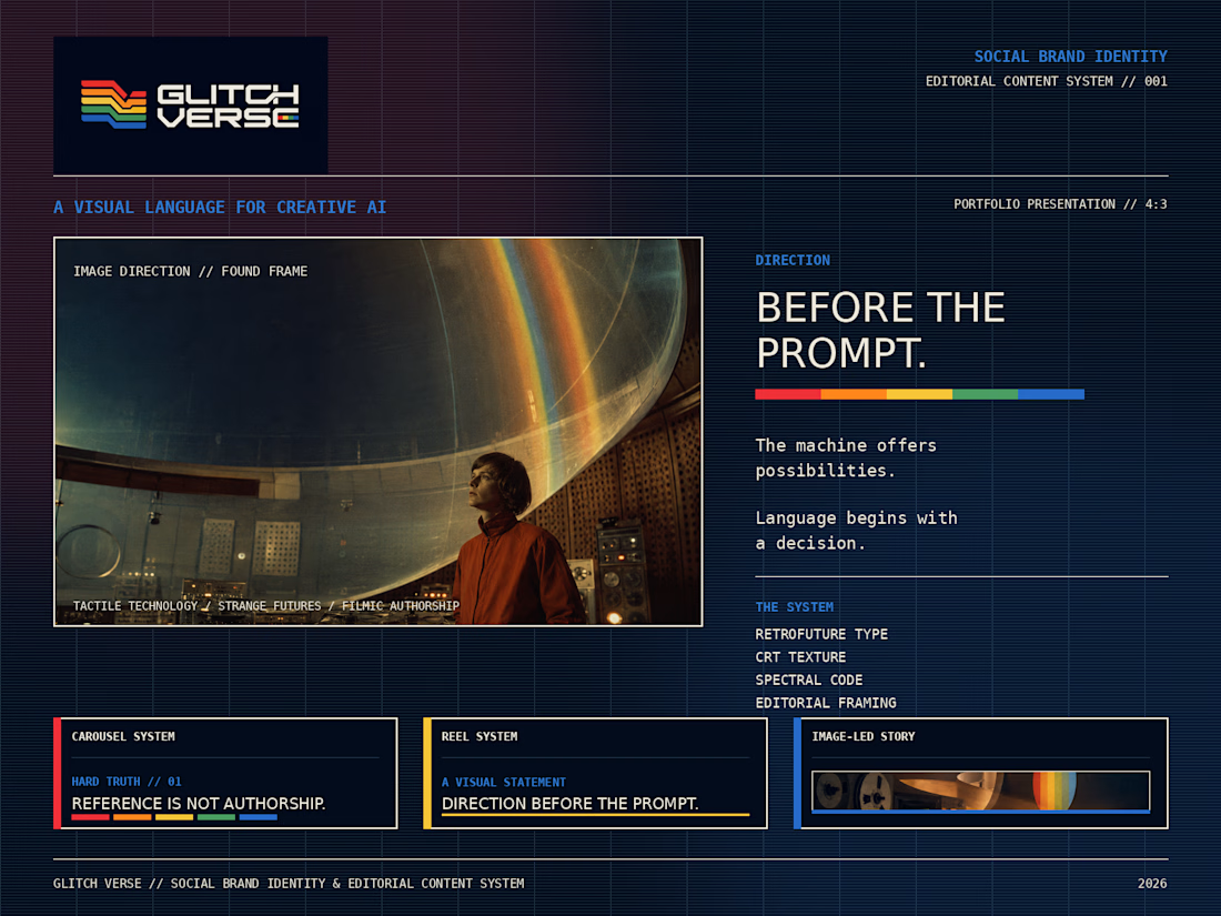
GLITCH VERSE
Social Brand Identity & Editorial Content System
Glitch Verse is an editorial platform exploring artificial intelligence through audiovisual creation, visual culture, VFX, sound, authorship, and creative direction.
More than a social media identity, the project was developed as a complete communication system—combining concept, visual language, art direction, typography, color palette, analog textures, editorial layouts, and adaptable content formats.
Its central statement, “Direction Before the Prompt,” expresses the brand’s core belief: AI can expand creative possibilities, but intention, authorship, visual knowledge, and human decision-making remain essential.
The visual identity draws from unconventional 1960s and 1970s science fiction, analog technology, CRT screens, archival imagery, spectral color, and cinematic composition. The result is a visual universe that feels like a recovered fragment from a film that may never have existed.
The system was designed to work across carousels, static posts, Reels, video content, manifestos, educational pieces, critical analysis, and visual experiments—maintaining consistency while allowing each format to serve a different editorial purpose.
Glitch Verse does not present AI as a shortcut to create faster. It presents AI as one part of a broader creative process, where direction gives meaning to possibility.
The machine generates possibilities.
The author decides what deserves to exist.


The network for creativity
Join 1.25M professional creatives like you
Connect with clients, get discovered, and run your business 100% commission-free
Creatives on Contra have earned over $150M and we are just getting started

Challenges
View all


Related posts


You spend 6 figures on a brand tracking agency. They spend three months "running the wave." You get a 100-page slide deck that tells you what happened in Q2 while you’re already halfway through Q3.
That’s a post-mortem, not a strategy.
We built the identity and product framing for Timelaps to represent the opposite: continuous visibility.
Research-grade data from 4,000+ consumers, flowing in real-time. No "waves", no dusty decks, just an always on dashboard that shows you if your marketing is actually landing before the budget is gone.
If you’re still waiting 90 days to see if your brand is growing, you’re flying blind.


I have to say, You leave an ipression everytime you appear in my feed. You have got great taste Daniel💪

I created Menmi a while ago as a brand mascot for a ramen bar, and it quickly became a client favorite. Eventually, I archived the project from my public showcase.
Recently, while scrolling through Pinterest, I stumbled upon a logo design with a remarkably similar character concept the same spiky hair silhouette, face shape, and ramen element! Seeing that was an instant sign that this concept still resonates and holds great creative value.
I’m unarchiving Menmi to give this character a second life in my portfolio. Never let your solid work hide in the dark just because time has passed!
How do you handle your older, hidden designs when you see similar trends popping up?


Beautiful work 😍

A new challenge arose before us, what style should we move into? More reserved, or, as we call it, "Glamour" 😁
15 voted
43%

20 voted
57%

35 votes
Closed

Option2, but it depends on what kind of brand this is.