The network for creativity
Join 1.25M professional creatives like you
Connect with clients, get discovered, and run your business 100% commission-free
Creatives on Contra have earned over $150M and we are just getting started
Back to feedPost

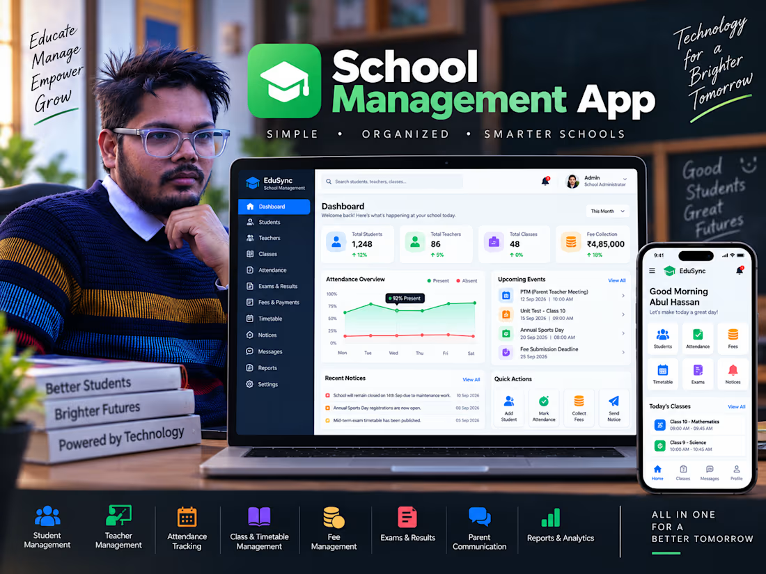
School Management System | Full-Stack Web Application
Full-stack school management system for managing students, teachers, attendance, classes, timetables, fees, exams, results, notices, and parent communication.


The network for creativity
Join 1.25M professional creatives like you
Connect with clients, get discovered, and run your business 100% commission-free
Creatives on Contra have earned over $150M and we are just getting started

Challenges
View all


Related posts

Working on the homepage for Still Blooming, a wedding and floral studio, I explored two different layout directions for the hero section. Same brand, same copy, just a different structure and visual rhythm.
Option 1 : Left Aligned. Text sits on the left with supporting content beside it, giving an editorial, asymmetrical feel.
Option 2 : Centered. Everything is stacked and centered, giving a clean, balanced, more classic hero layout.
Would love your honest UX/UI take which direction feels more elegant, functional, and true to a wedding/floral brand, and why?
22 voted
41%
32 voted
59%
54 votes
Closed

Great Design :)

Back in 2016 I made a lot of cinemagraphs for HBO.
They took a surprising amount of work. Masking footage, finding the right loop, freezing parts of the frame and getting everything to transition cleanly.
I’ve had an idea for a simpler cinemagraph tool kicking around in my head ever since.
About a month ago I built another small tool using Toolcraft as the starting point, so yesterday I wanted to see if it could handle this idea too.
A few hours later I had a working cinemagraph editor.
Drop in a video → find your loop → choose how it loops → paint the areas you want to keep still → export.
Basically the workflow I used 10 years ago, condensed into a few controls.
Still rough around the edges, but kind of wild to finally build a tool I’ve been thinking about for a decade.


The masking-and-looping history is exactly why a simpler cinemagraph workflow feels valuable; the tricky part is preserving a seamless transition without making the tool feel like a timeline editor. Curious direction for an AI-assisted app.

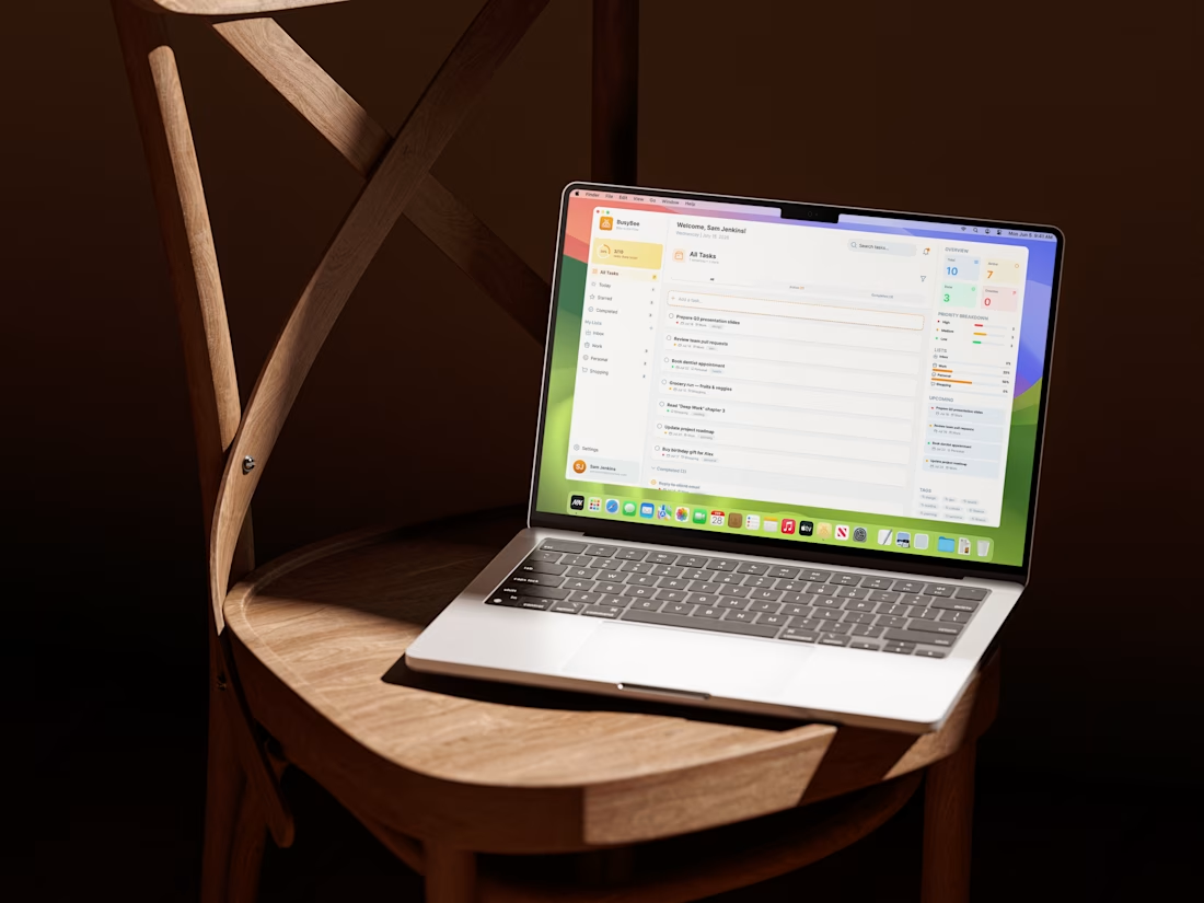
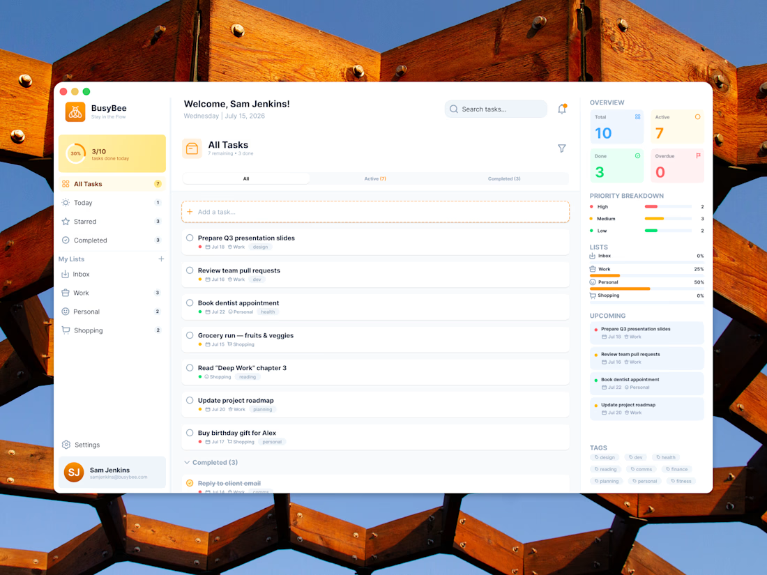
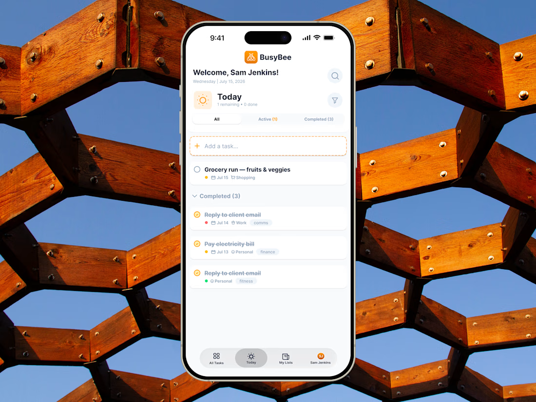
BusyBee is a product design and brand system project built around responsive UI, information hierarchy, and intuitive task management across desktop and mobile.
#shareyourwork #dashboard #uiuxdesign