The network for creativity
Join 1.25M professional creatives like you
Connect with clients, get discovered, and run your business 100% commission-free
Creatives on Contra have earned over $150M and we are just getting started
Back to feedPost

Timroom is a furniture and wall-lighting e-commerce website. The client provided the complete design in Figma, and we translated the designs into a fully functional Shopify storefront.
We handled the complete store setup, including all the required pages, homepage, product pages, collection pages, header, footer, and additional supporting pages based on the client's requirements.
The implementation focused on maintaining the Figma design accurately while ensuring the storefront was responsive, user-friendly, and optimized for both desktop and mobile devices.


The network for creativity
Join 1.25M professional creatives like you
Connect with clients, get discovered, and run your business 100% commission-free
Creatives on Contra have earned over $150M and we are just getting started











Related posts


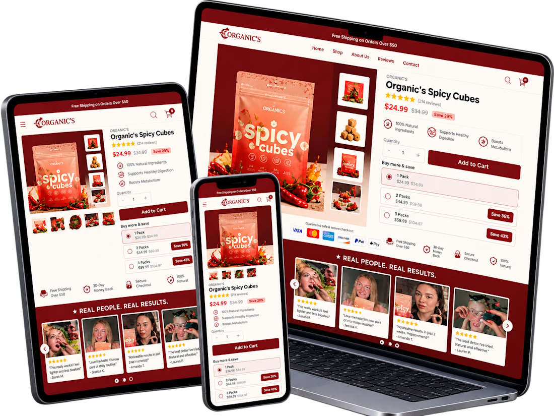
A conversion-focused Shopify product page featuring a clean, modern layout and an intuitive shopping experience.
The page brings together an engaging product gallery, bundle selection, clear Add to Cart actions, customer testimonials, product education, comparison tables, and FAQs.
The design emphasizes visual hierarchy, product discovery, purchase clarity, and trust-building elements to help shoppers make informed decisions.
Focus: Shopify UI/UX, product page design, and conversion rate optimization.


Clean layout. Keeping the bundle options, comparison table and FAQs on the same page really helps buyers decide without extra clicks. Great work on the product page structure.


This UI was really great nice job Piotr🔥🔥🔥

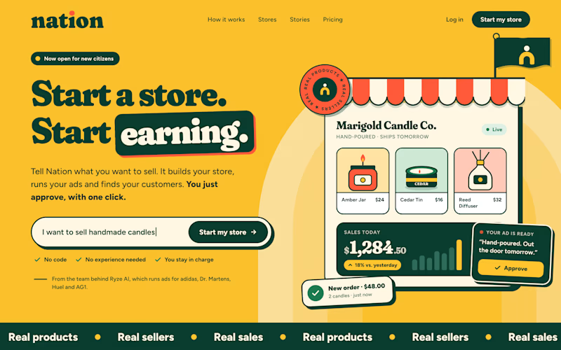
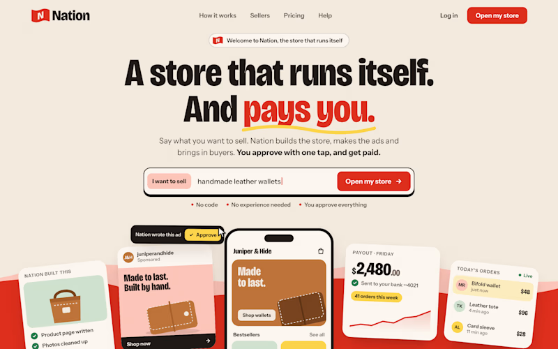
Two visual directions for the same brief. Which do you prefer?
2 voted
29%
5 voted
71%
7 votes
Closed
Direction A is more better to me it feels modern professional cartoony style that's impressive ❤️❤️
Great job Ayoub🔥🔥