The network for creativity
Join 1.25M professional creatives like you
Connect with clients, get discovered, and run your business 100% commission-free
Creatives on Contra have earned over $150M and we are just getting started
Back to feedPost
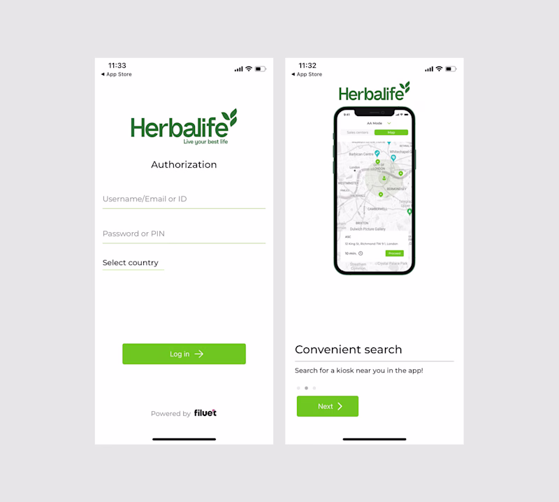
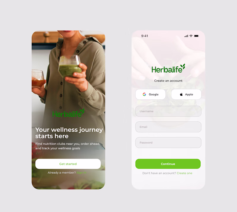
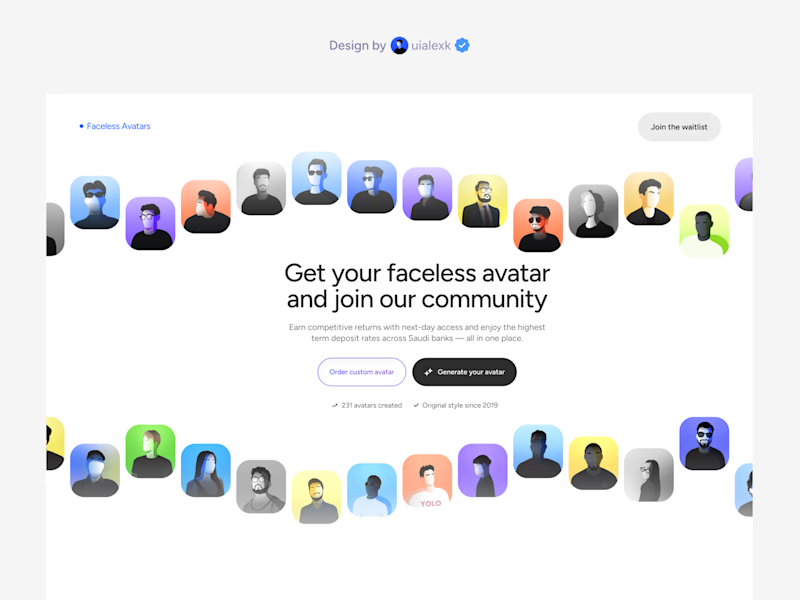
Taste Test
Redesigned this herbalife mobile app onboarding for @herbalife and I think the difference speaks for itself. Curious, which option feels best to you ?
9 voted
14%
54 voted
86%
63 votes
Closed

After is cool

after is calming

This is well aligned

Look aesthetic..🔥

The design is cool and classic

This is clean

after

The after version feels so much more welcoming. Great improvement on the onboarding flow!

Thank you

After


Nice work Akinkunmi
Thank you for the feedback

After

This is solid work.

This is incredible work


Clean work!

After adds a premium feeling & human connection, and of course a better design!
Thank you for the feedback

Cool design 🤍

Amazing redesign.

Nailed it

The after brings in such great brand narrative and feel, as well as the convenient option of the SSO options - but I can't help but notice the color contrast issues in that first screen on the redesign especially the Herbalife logo seems to completely disappear as does the "Sign...
Thank you for the feedback

Huge changes, looks much professional now!
thank you

after looks so premium and cool
thank you

After looks more modern

great work amazing


Nice design man

This is clean

I love the human touch you added in the after shot, it makes it more relatable
thank you

Looks premium!

I think the After is in fact friendlier and more suited. Well done.
But! The logo in green on the left screen should be 'knocked out' (white).
This will help both legibility and help anchor that screen nicely.
thank you for the feedback

cool
The network for creativity
Join 1.25M professional creatives like you
Connect with clients, get discovered, and run your business 100% commission-free
Creatives on Contra have earned over $150M and we are just getting started
Related posts


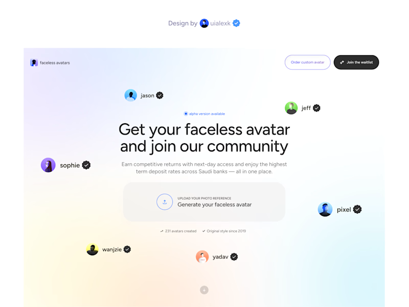

version 2


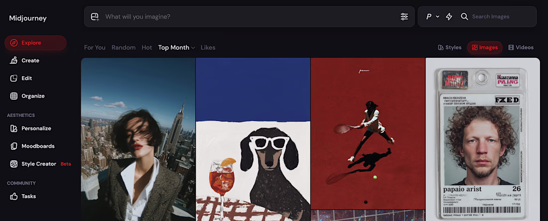
@Midjourney still feels like the best tool for visuals/stock generation out there. Anyone have different experience?


This is impressive and shows a lot of potential. It makes me wonder—what’s the next level for you after this?


Trending


FLORA
Reusable workflows are replacing one-off prompts in creative AI. Share what you're building in FLORA.
Contra University
Learn from expert creatives how to earn more using next-gen AI tools.
creativeaiflow
Creative AI workflows are evolving. What tools do you use, and what are their strengths and weaknesses?
portfolioreview
The best portfolios tell a story, not just show a grid. Share yours for feedback.
freelancerlife
Freelancer life is wins, pivots, and everything in between. What’s yours right now?