The network for creativity
Join 1.25M professional creatives like you
Connect with clients, get discovered, and run your business 100% commission-free
Creatives on Contra have earned over $150M and we are just getting started
Back to feedPost

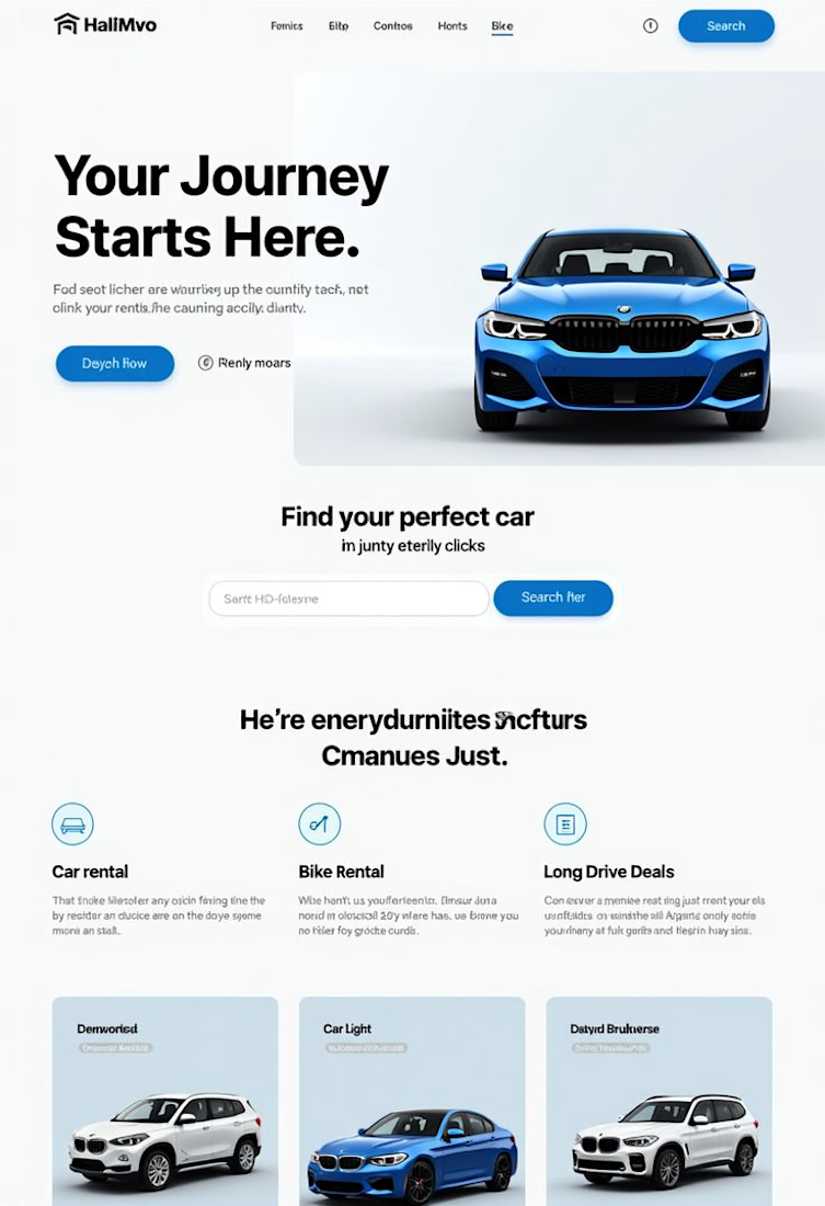
I designed and developed a sleek, user-friendly, and conversion-focused car rental website using Wix Studio. The goal was to help the business showcase available vehicles, simplify bookings, and increase reservations

The network for creativity
Join 1.25M professional creatives like you
Connect with clients, get discovered, and run your business 100% commission-free
Creatives on Contra have earned over $150M and we are just getting started





Related posts


Marlowe Mobile Detailing
Solo-owner mobile car detailer, Austin, TX (serving Round Rock, Cedar Park, and Lakeway)
Marlowe Mobile Detailing was losing about 1 in 5 bookings to no-shows and running behind on nearly every job. This build replaces a vague "can you detail my car?" text with a fully scoped, weather-aware booking flow that sets an accurate time and price upfront, captures access instructions before he arrives, and automates rain-day rescheduling so he never has to chase a customer again.
He works alone and travels to the customer. Rain cancels outdoor jobs. Customers under-describe how dirty their cars are, so jobs run long. About 20% of bookings were no-shows because people forgot he was coming to them.





🔥 🔥


Which Kajabi pricing section would you ship?
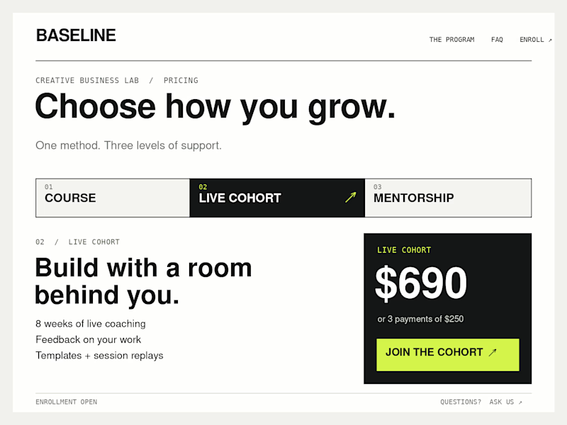
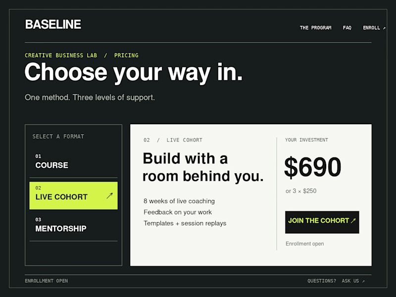
Creative Business Lab has three paths: Course, Live Cohort, and Mentorship. Both designs show the same $690 Live Cohort with the same benefits. Only the presentation changes.
Vote Horizontal tabs or Side tabs, then tell me the one thing you’d improve before launch. Have a stronger third approach? Show it in the replies.

21 voted
50%
21 voted
50%
42 votes
Closed

Horizontal. side tabs read as nav, people skip them. though the stronger third option is no tabs at all, three cards side by side. both of these hide two prices behind a click and comparison is the one job a pricing section has.