The network for creativity
Join 1.25M professional creatives like you
Connect with clients, get discovered, and run your business 100% commission-free
Creatives on Contra have earned over $150M and we are just getting started
Back to feedPost
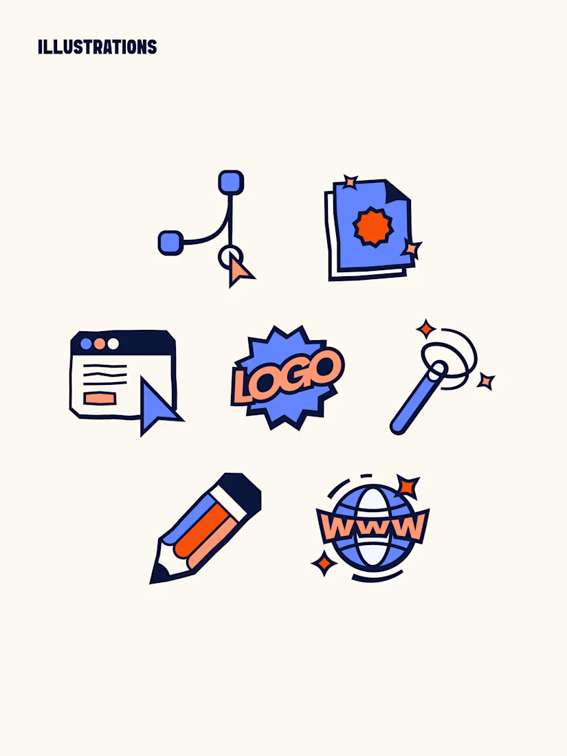
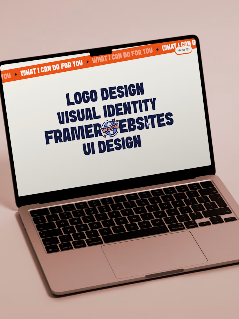
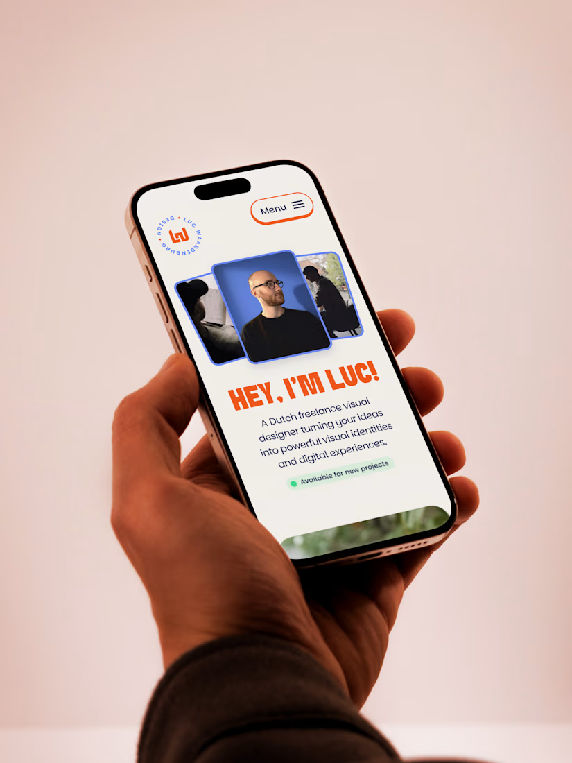
The last few months I have been investing time in building my own visual identity and website. A bold, simple and colorful style that matches the brands and style I love to build.
Website built in Framer. Check it out here!



Very playful and fun! Love where you landed 😍

Thank you Alex!🙌

Loving the icons, great work!
Thanks a lot!


truly love everything about your brand and website! Just had a super fun scroll through your website🙌🏽
That's so cool! Thanks Serena!

Hey Luc! Dikke site! Lookin' super fresh! Love the Reismol identity.
Thanks Mischa!🙌

Amazing!
Thank you!

Great work on the rebrand! The illustration style is super punchy and adds so much personality to the portfolio👍
Thanks a lot!

good work
Thank you!


Very cool branding - considering how hard it is for designers to brand themselves - you have done an amazing job!
How long did it take you to get to the stage where you were happy with it?
Haha yes it's probably the most difficult thing there is as a designer. Just have to accept the fact that you'll never be completely happy with your own branding. Your mind will always give you new ideas. But I got to a point where I am really happy with it so I'm going with it...
haha this is the mindset that could help a lot of designers not to overthink and reduce perfectionism.
I'm sure your brand will attract the exact right attention for the type of work you want to do 🙌


Love the colors you used here man!! great combo!
Thanks man!


nice stuff;
Thanks!!

The vibe is super fun, Luc!
Thanks, that's what I was aiming for ;)

Wow, this is amazing work! Perfect color combinations, and all the details are very impressive. You’ve maintained a clear and well-structured hierarchy throughout the website 😍😍
Thank you!

This looks sick! I love the colours and icons you created.
Thank you Julia!

this was built with purpose
Thank you!

Great Work 👏
Thank you!

Great work. I specially like the illustrations style and color scheme!
Thank you Carlos!

looks cool man!
Thanks a lot!

nice color choice bro
Thank you!

I love the style sooo much!

nice

looks nice 🙌
Thank you!

I love the style
Thanks!!

Looks great, love it's unique style!
Thanks Marc!

This was really pleasing to go through, love the overall style and the motion was super nice!
Thanks a lot!

Great Color Combination 👍
Thank you!

really great work Luc
Thank you Taylor!

This is damn good! Love it
Thank you Jayesh!

Thanks man!

Nice work, good colors.
Thank you!

The colors and visuals are so vibrant! Awesome work
Thanks!!
The network for creativity
Join 1.25M professional creatives like you
Connect with clients, get discovered, and run your business 100% commission-free
Creatives on Contra have earned over $150M and we are just getting started

Challenges
View all


Related posts


This card stack transition combining the SVG of each card to the sticky position is giving my brain really satisfying scratches 😘👌
--
I've been doing a lot more Framer developments lately where I don't do the design, I think one of the big advantages of having a strong background in design is that I can see the designers vision to translate it into the web obsessing over the details.
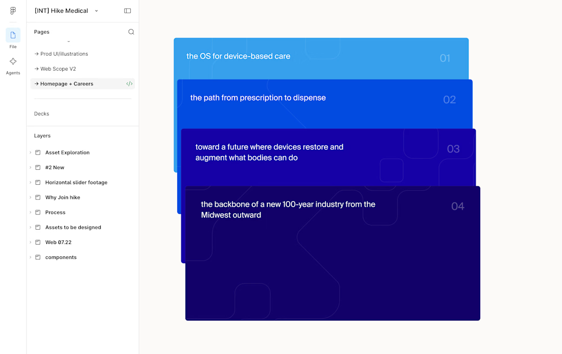
I.e. see Figma design screenshot in the comments how each card had the same SVG but in irregular placements, I saw it as an opportunity to perfectly align them on scroll and add a bit of a transparency reveal at the end. It feels way more intentional and ties everything together.
Design by @Iverson developed by me
Figma design handoff

Fresh Framer Template drop!
Simple, monochrome, studio template
Template includes a design-system skill and page and instructions on how to use it.

this looks incredible!


what does a full website for an ai agent need?
parley has workflow pages, pricing with a comparison table, a cms blog, contact and waitlist. all free
2,262 remixes in the last 3 months

Excellent card hovers & layout! 🙌