The network for creativity
Join 1.25M professional creatives like you
Connect with clients, get discovered, and run your business 100% commission-free
Creatives on Contra have earned over $150M and we are just getting started
Back to feedPost

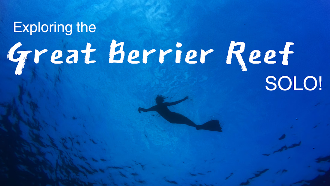
Travel & Adventure Thumbnail Design
Designed a travel-focused YouTube thumbnail that uses scale, color, and composition to emphasize the experience of exploring the Great Barrier Reef alone. The isolated diver and bold typography work together to communicate adventure, curiosity, and the unique perspective of solo travel.

The network for creativity
Join 1.25M professional creatives like you
Connect with clients, get discovered, and run your business 100% commission-free
Creatives on Contra have earned over $150M and we are just getting started





Related posts

Very well looking composition, good sinergy

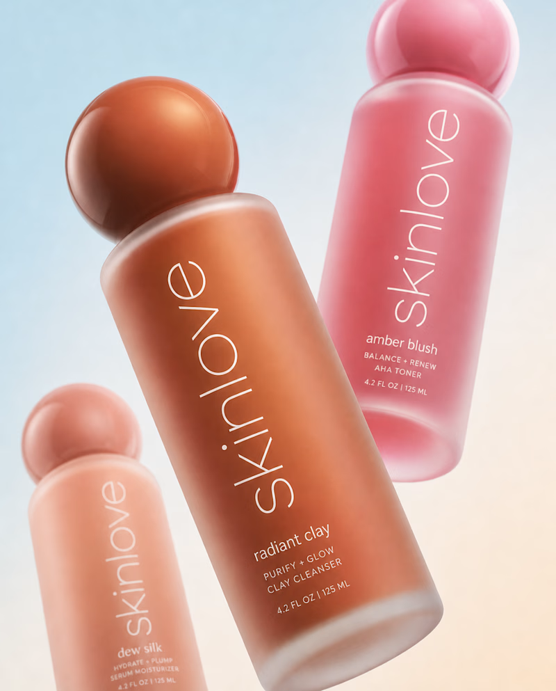
Safe or bold, which one actually makes you stop scrolling? 🤔
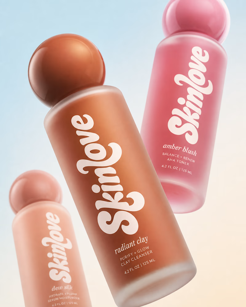
Sans: the serif, tight tracking, one accent color playbook every skincare brand is running right now.
Bold: the same idea, redesigned with attitude. 💅
25 voted
32%
53 voted
68%
78 votes
Closed


I’m so excited to finally share this one and hear what you all think.
When Team Cook approached me to create their branding and logo, I knew I wanted to really push the concept and build something that felt bold, playful, and instantly recognisable.
What do you think?
P.s. their badges and tags have all my 🫶