The network for creativity
Join 1.25M professional creatives like you
Connect with clients, get discovered, and run your business 100% commission-free
Creatives on Contra have earned over $150M and we are just getting started
Back to feedPost

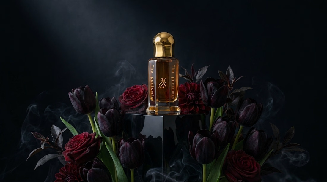
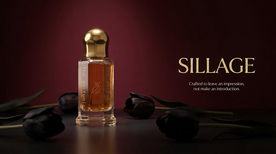
What if perfume wasn't meant to get attention?
Crafted to leave an impression, not make an introduction.
The network for creativity
Join 1.25M professional creatives like you
Connect with clients, get discovered, and run your business 100% commission-free
Creatives on Contra have earned over $150M and we are just getting started

Challenges
View all


Related posts

True

Manual work is always better than ai slop you can use ai for some clips but full video made with ai is unprofessional and a waste of money and resources

good one

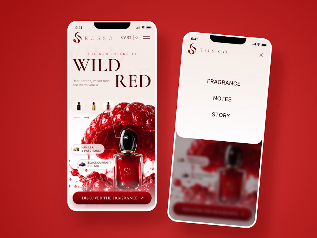
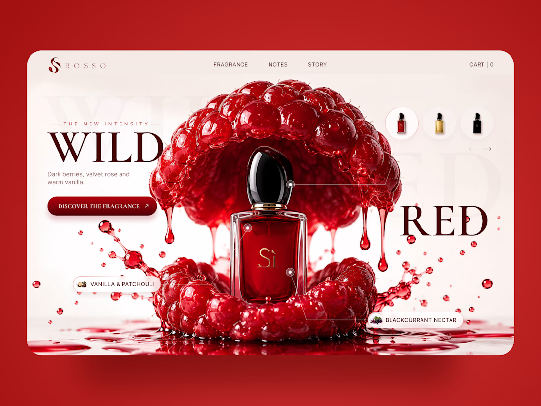
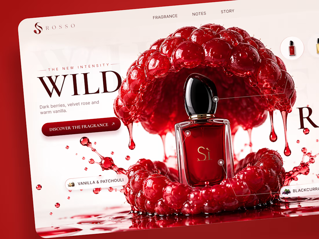
ROSSO — Wild Red Perfume Landing Page 🍒❤️
A bold fragrance landing page concept inspired by rich red berries, sensual notes, and luxury perfume aesthetics
The design combines deep red tones, oversized editorial typography, glossy fruit visuals, and elegant product presentation to create a rich and memorable experience
Special attention was given to:
• Bold product-first composition
• Rich red color palette
• Elegant editorial typography
• Fragrance notes and ingredient highlights
• Product variations and navigation
• Responsive mobile experience
The result is a vibrant, luxurious landing page that brings the fragrance to life through color, texture, and strong visual storytelling ✨
Looking to create a standout website for a beauty, fragrance, or luxury brand? Let’s connect



Just wrapped up a new cinematic sci-fi short focusing on grounded human emotion, practical miniature aesthetics, and analog cinematography. This 90-second sequence follows two engineers fighting for survival through a dense asteroid belt on their cargo run to the diamond exoplanet 55 Cancri e.
Produced utilizing a full-pipeline generative AI and digital motion design workflow. Check it out and let me know your thoughts: [Link / Portfolio Link] 🚀🎬
#SciFi #DigitalCinema #MotionDesign #AIArt #VFX #IndependentFilm


practical miniatures inside an ai pipeline is such a good combo. the analog look sells every frame