The network for creativity
Join 1.25M professional creatives like you
Connect with clients, get discovered, and run your business 100% commission-free
Creatives on Contra have earned over $150M and we are just getting started
Back to feedPost

Stop building the slow way. ⚡️
I specialize in WordPress Web Architecture and AI Solutions for founders who need to move fast. From complex CMS builds to custom AI integrations that save your team hours, I build tech that works for you—not the other way around.
Currently available for:
1. WordPress Theme Architecture & Performance
2. Custom AI Solutions & Workflow Automation
3. Full-stack Web App Prototypes
Check out my projects in my profile or Send an Inquiry to start a conversation.
The network for creativity
Join 1.25M professional creatives like you
Connect with clients, get discovered, and run your business 100% commission-free
Creatives on Contra have earned over $150M and we are just getting started




Related posts

I've spent years obsessing over the stuff nobody notices on a website. Until it's missing.
AI can now build a whole site in an afternoon. I think that's great.
But it still can't decide what feels right.
I don't think AI is the problem. It just stops at "it works". The last part, the spacing, the type, the way things move when you scroll, still needs someone who cares about it.
That's the part I've always loved doing. So I made a small thing around it: you bring the site AI built, I finish it in Webflow.
It's called Verdikt https://verdikt.studio


Agreed. AI gets you a working layout fast, but spacing and type rhythm are where it still feels off. I'd add forms and mobile checks to that list too. What's the most common fix people bring you?

The painter’s house is always the last one on the street to get painted.
For 4 years, that was me.
80+ Webflow sites for clients. Zero for me.
In 2019 I was learning HTML and CSS with a plan: examples first, portfolio next, clients after. In 2022 I moved to Webflow and made the same plan.
The clients came first. And there was always one more project that needed the time more than my own site did.
Last month I finally shipped it.
It’s built the way I build for clients:
→ Your team clicks any text, changes it and hits Publish. No developer needed.
→ Prices are right on the page. Pick a service, drag the pages, see the number.
Both are in the video. Try them yourself, link in the comments 👇


Great job!

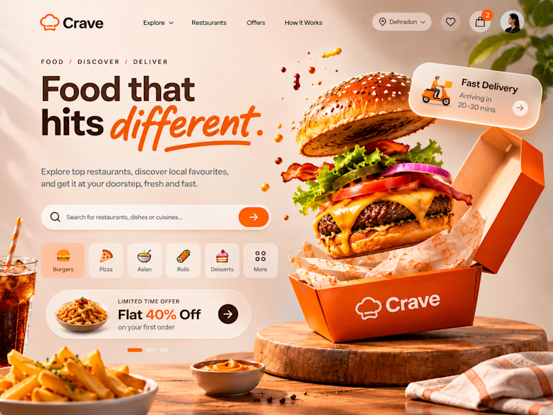
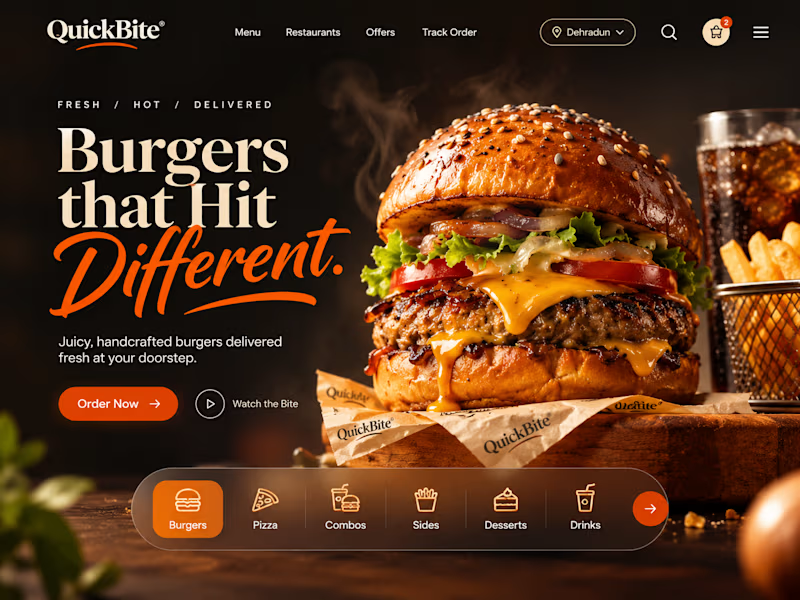
ONE CRAVING. TWO VERY DIFFERENT EXPERIENCES. 🍔
What if the same food-delivery industry could tell two completely different visual stories?
🍊 CRAVE — Made to Tempt
Warm tones, expressive typography, vibrant food photography and playful 3D elements. Designed to make food discovery feel exciting, inviting and full of personality.
🖤 QUICKBITE — Made to Indulge
A darker, richer visual direction with cinematic burger photography, bold editorial typography and immersive layouts. Designed to put the food front and centre and make every interaction feel intentional.
Two brands. Two moods. Two approaches to the same experience.
Now I'm curious:
Which direction would make YOU stop scrolling and place an order?
Drop your pick below. I'd love to hear the reasoning behind it!
2 voted
29%
5 voted
71%
7 votes
Closed

QuickBite is unique in a good way!