The network for creativity
Join 1.25M professional creatives like you
Connect with clients, get discovered, and run your business 100% commission-free
Creatives on Contra have earned over $150M and we are just getting started
Back to feedPost

The #SwitchToGreen campaign for Vodafone UK was developed by Superunion as a motion-led piece designed to communicate the brand’s sustainability message in a clear and engaging way. The project focused on translating Vodafone’s environmental ambitions into a visually compelling narrative, using dynamic motion graphics and bold storytelling to bring the campaign to life. With contributions from a multidisciplinary creative team—including direction, storyboarding, and motion design—the final output demonstrates how strategic branding and animation can effectively deliver complex ideas in a simple, impactful format tailored for digital audiences.


The network for creativity
Join 1.25M professional creatives like you
Connect with clients, get discovered, and run your business 100% commission-free
Creatives on Contra have earned over $150M and we are just getting started





Related posts

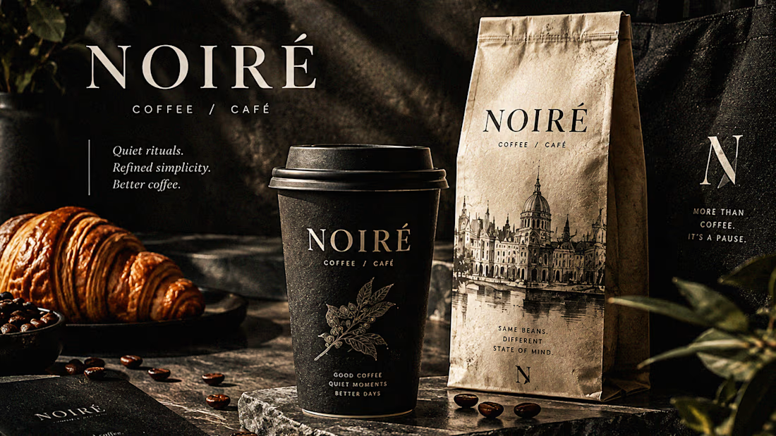
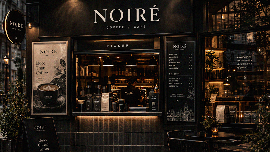
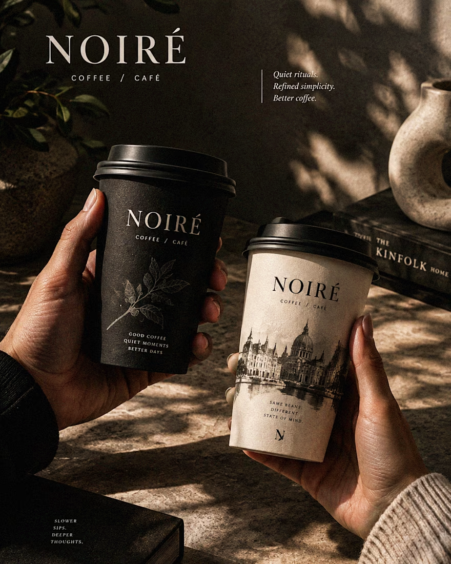
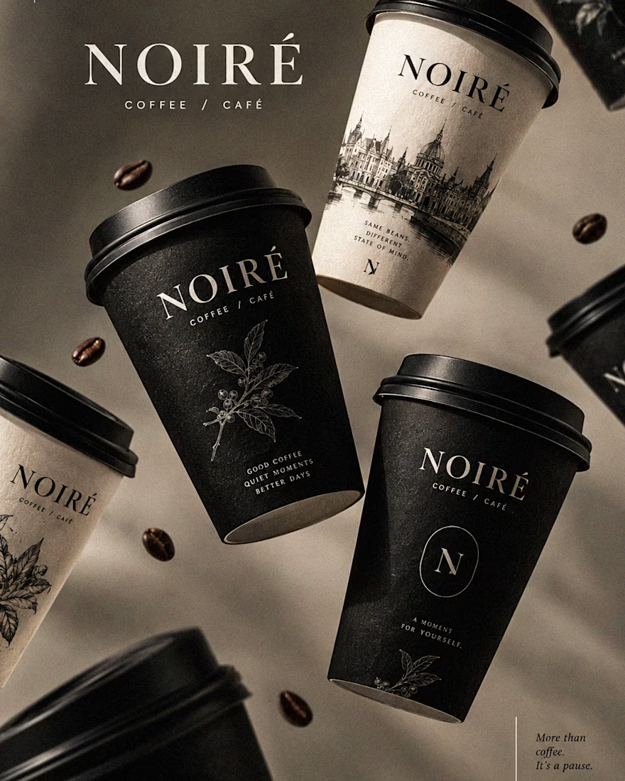
I Just Created NOIRÉ 🔥
A Coffee Brand Built Around the Pause.
NOIRÉ is a premium café brand built around a simple idea:
Great coffee should feel like a moment of pause, not another part of the
routine.
The project explores a complete visual identity, packaging
system, takeaway cups, coffee bags, tote bags, menu design, café applications and lifestyle campaign direction.
Instead of relying on the usual loud coffee aesthetics, I
built NOIRÉ around deep charcoal, warm ivory, soft graphite, refined
typography, subtle botanical illustrations and quiet editorial compositions.
The visual language is intentionally dark, tactile, and understated - giving every touchpoint the feeling of a slow morning, a quiet table, and coffee worth taking your time with.
From the cup in your hand to the café around you, every detail was designed to make the brand feel like a ritual.
Waiting for your thoughts in the comments 🙌🔥
branddesignertastetestBrand DesignGraphic DesignPackaging DesignAdobe IllustratorAdobe InDesignAdobe Photoshop




Bring back mascot logo's 🙌
Ram logo 'Stagepaid'.



cool work! love mascot logos :D

Hi Contra 👋
I'm Alia, founder of Slick Prjct , my small brand strategy and design studio based in Brussels. I've been doing this for 10+ years, both in-house and freelancers side.
I've spent the last few years mostly on Upwork, so starting a profile here from zero feels a bit... strange? In a good way :)
So how is it here?
What do you wish someone had told you in your first month?

Go ahead. I think you will get your desire clients.