The network for creativity
Join 1.25M professional creatives like you
Connect with clients, get discovered, and run your business 100% commission-free
Creatives on Contra have earned over $150M and we are just getting started
Back to feedPost

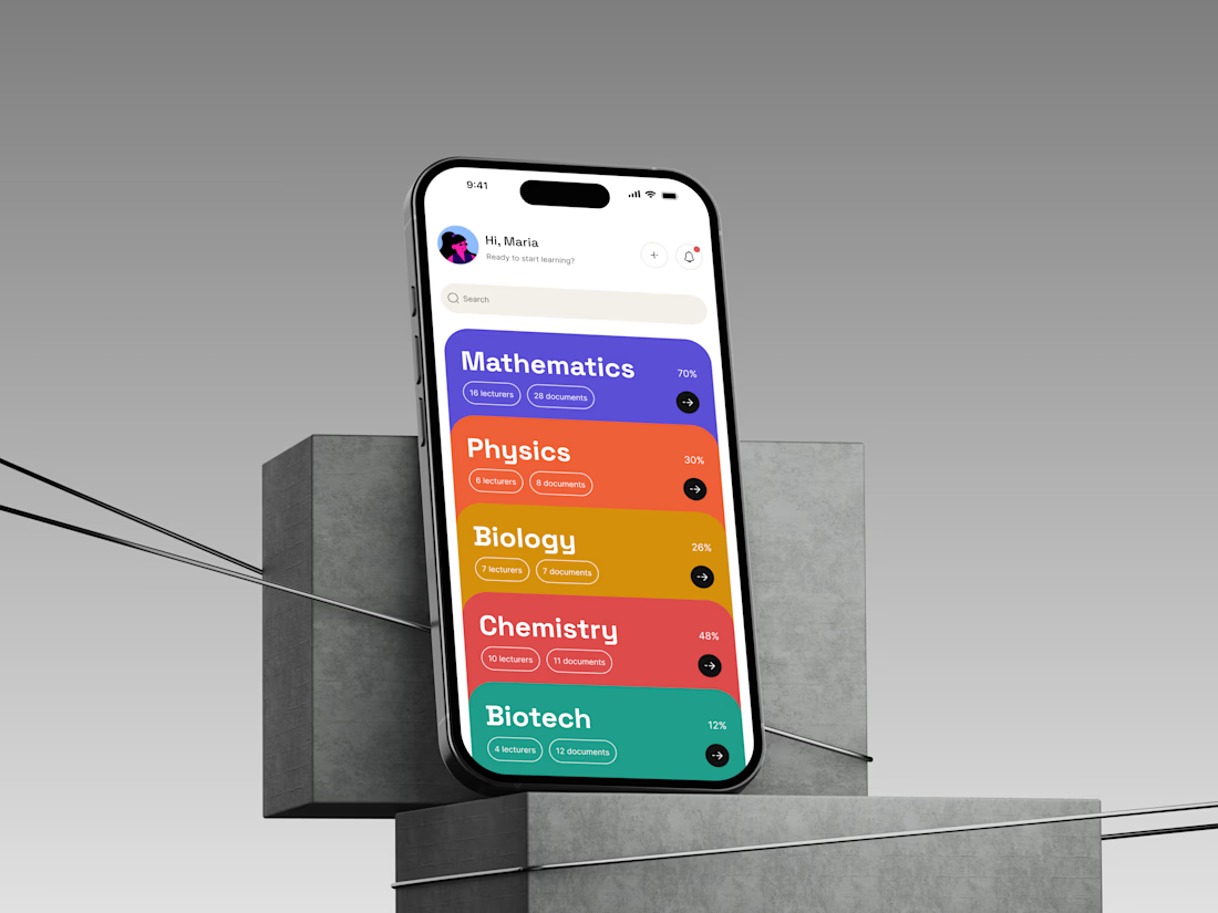
Why color instead of just better labels? That's the real question behind a screen like this, not what's on it, but the thinking underneath it.
Reading takes effort every single time. Recognizing a color someone's seen before takes almost none. So on a screen someone's going to open constantly, not once, I'd rather train their eyes to recognize a category at a glance than ask them to read the same word for the fortieth time. The color isn't there to look good. It's there to stop being noticed as a color and start being noticed as an answer.
Same reasoning shaped the progress indicator. Hiding someone's progress behind a tap turns "which one do I continue" into a small research project. Put it in view instead, and the decision about what to open next basically makes itself before they've committed to anything.
A lot of screens get treated as a place to arrange information neatly. I'd rather treat them as a bet on what a person's eyes are going to do the tenth time they open the app, not the first. That's the actual design work, deciding what earns a full reading and what only needs to be recognized.
Product designer based in Lagos. This is the kind of reasoning I put behind a screen before I call it finished.

The network for creativity
Join 1.25M professional creatives like you
Connect with clients, get discovered, and run your business 100% commission-free
Creatives on Contra have earned over $150M and we are just getting started
Trending
retrofuturism
Share your favorite designs from the past exploring the distant future. Or your own take on the aesthetic 🚀
halftone
Dots. Texture. Grain. Let's see your designs using the halftone technique.

Midjourney
Creatives are showing off what they're making with Midjourney.
colorgrade
Video editors sound off: How do you enhance the mood of your video in color grading?
Related posts

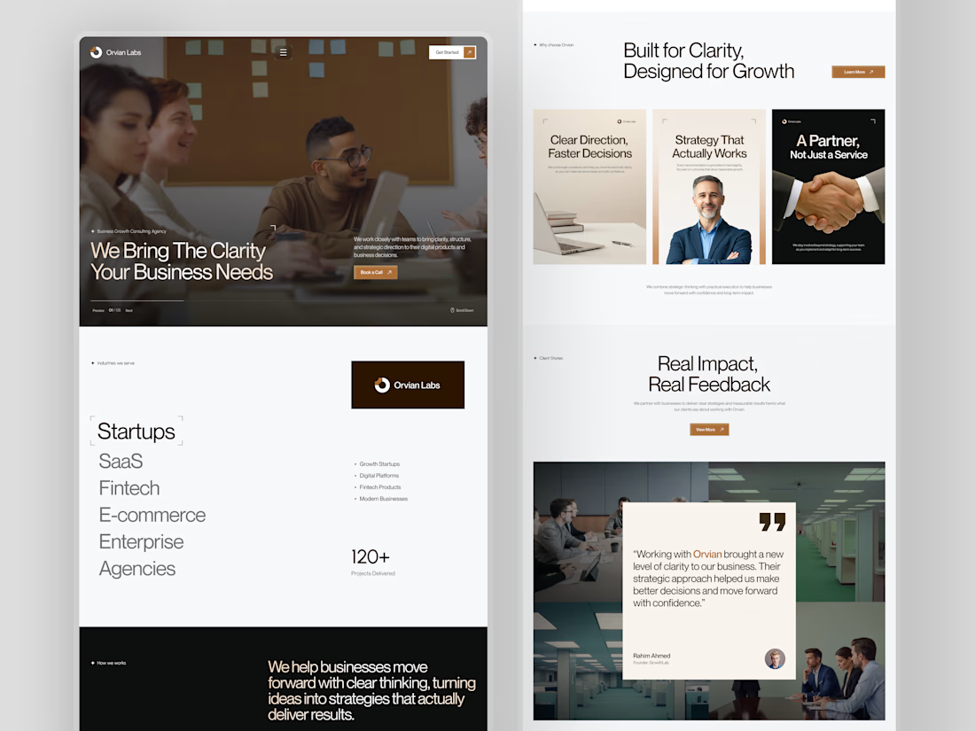
When designing a consulting agency website, most people lead with services.
We usually do too. It feels like the logical starting point.
But when we worked on Orvian Labs, we tried something different.
Instead of opening with what they do, we led with what the client actually needs to feel before they read anything clarity and trust.
The hero doesn't list services. It just says "We Bring The Clarity Your Business Needs." And the rest of the page builds the case quietly a scrolling industry list, a three-card value section, 120+ projects as a single trust signal, and a dark manifesto block that finally tells you who they are.
The testimonial comes last. By that point, the visitor already believes it.
What we noticed was that leading with feeling before features made the layout decisions much easier. Every section had a clear emotional job to do, not just an informational one.
This was one of our website layouts to work through. Hope you like it.
#web design # ui-ux design

Premium quality work.

Branding & Hero Animation for Newly.app — AI App Builder
End-to-end branding and hero section design concept for an AI platform that turns ideas into native iOS and Android apps without writing a single line of code.
What we did:
→ Brand Identity: Visual language, color palette, and typography system.
→ Hero Section: Animation concept built around the metaphor of [insert your metaphor, e.g., "ideas transforming into live products"].
→ Motion & UX: Micro-interactions, transitions, and scroll behavior.
The Challenge:
Visually conveying the speed and "magic" of AI while maintaining a professional, tech-forward, and trustworthy image for founders and entrepreneurs.
The Result:
A high-impact hero animation that explains the product's core value proposition in under 3 seconds—capturing the feeling of [insert emotion, e.g., "turning a raw idea into a shipped product with total control"].
Tools: Figma, After Effects, Cinema 4D
Client: Newly


That hero animation is really clean. Love how quickly it shows what the product does.

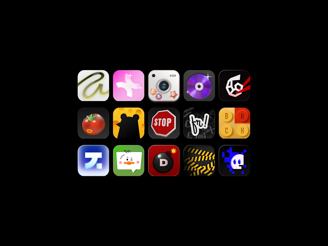
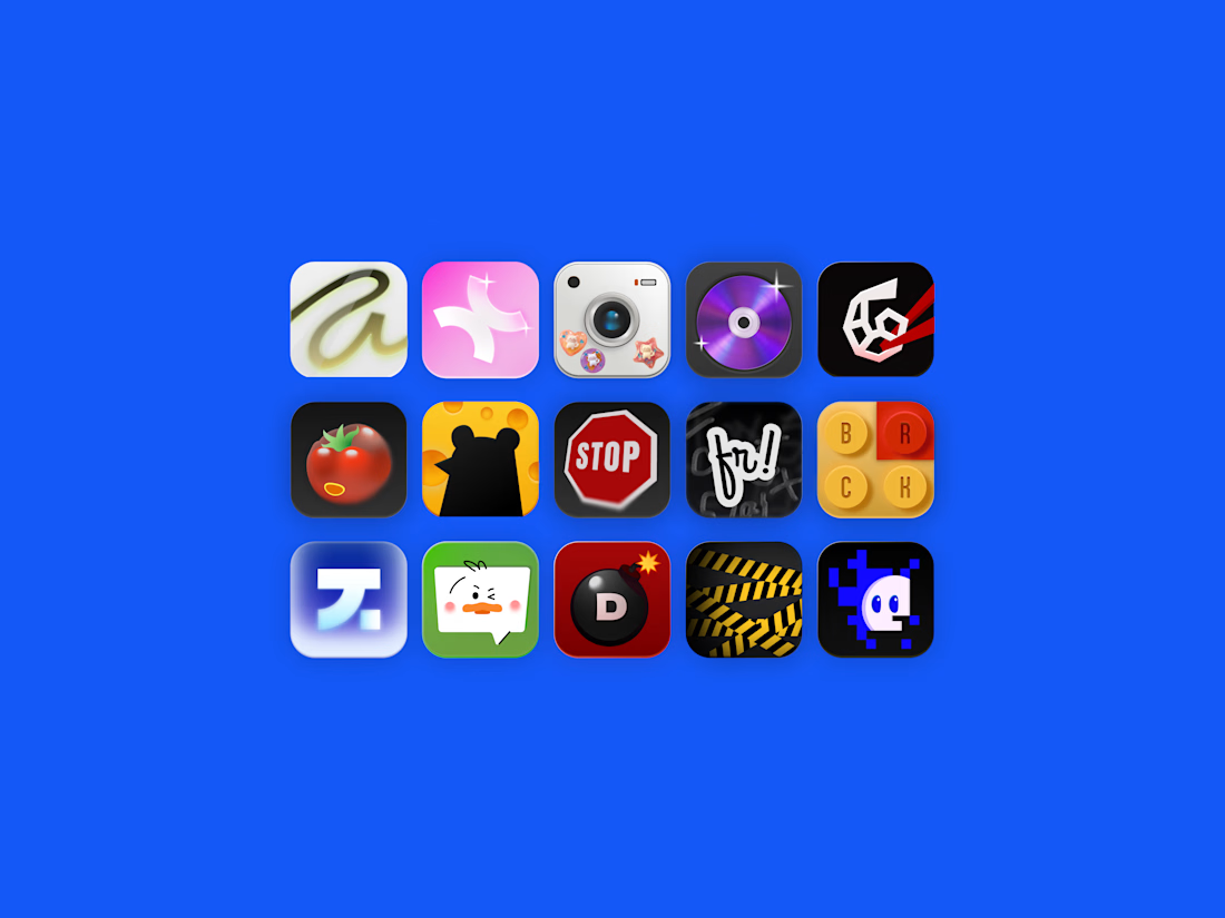
A set of mobile app icons exploring various visual styles from Y2K aesthetic and 3D skeuomorphism to retro pixel art and vector mascots.
Special thanks to Dana for helping out with one of the logos for the icons! 🙌

I'm so excited to be part of such an awesome project! Watch out for the bomb, Marho!🔥