The network for creativity
Join 1.25M professional creatives like you
Connect with clients, get discovered, and run your business 100% commission-free
Creatives on Contra have earned over $150M and we are just getting started
Back to feedPost
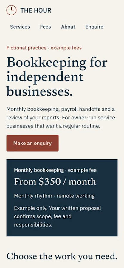
A service website should make the first enquiry more specific.
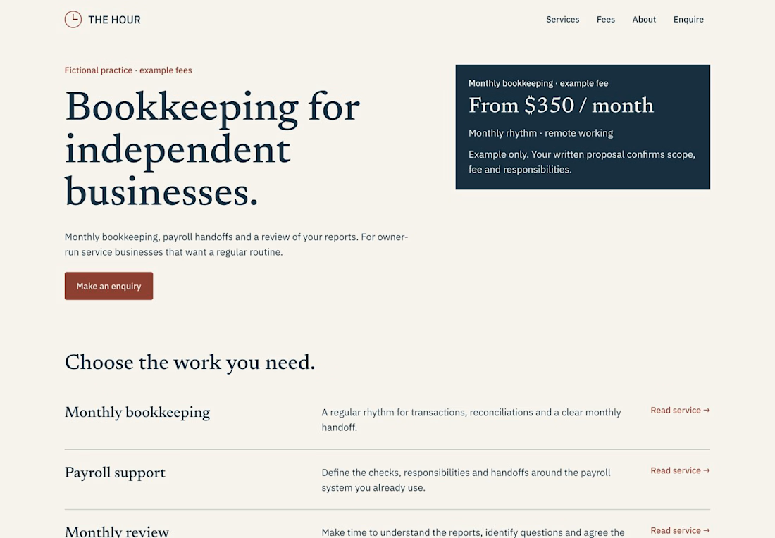
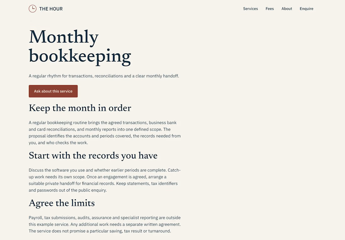
For THE HOUR, an accounting-practice Framer template, I gave three questions their own place:
• What work is included? A Services CMS with individual scope and preparation pages.
• How is the fee framed? A separate fees page with clearly labelled fictional examples.
• What happens next? Getting Started, a native enquiry form and an owner guide that maps the actual editing controls.
The handoff includes nine page types, Services + FAQ CMS, responsive layouts, a 404, credits and a changelog. Optional service images collapse when empty, with a separate alt-text field.
THE HOUR is $39 once for one end project; Framer hosting is separate. It does not include booking, payment collection or a client portal. The practice, fees and claims in the demo are fictional examples to replace.
Demo and template: https://www.framer.com/marketplace/templates/the-hour/
Made by KamnevApps. If you later use our remix and choose a paid Framer plan, we may earn a referral commission at no extra cost to you.



Thanks, Dev. The owner guide is public so the editing and launch steps can be checked before buying: https://understanding-sunflower-071198.framer.app/guide
Replace the demo practice details and sample fees, update Services and FAQ, set the enquiry recipient, then test delivery...
The network for creativity
Join 1.25M professional creatives like you
Connect with clients, get discovered, and run your business 100% commission-free
Creatives on Contra have earned over $150M and we are just getting started
Related posts

Made some project page fixes on my Framer template in progress and made the project index page responsive before going to bed tonight.
To keep the UX feeling nice I added a scroll snapping effect to the project video panes so that they never appear only partially, but one pane at a time is always fully on screen as the user scrolls. 🔧


Really inspiring work! 😁

New on Contra, not new to design.
I draw logos by hand, then build everything around them: the brand, the website, the store. Lately I also make product films and ads with AI.
Recent work: an RY monogram and site for a Koreatown law firm, a winged W for a defense firm, and my family's golf eyewear brand, from the mascot to Shopify.
Starting a brand, or have one that doesn't feel like you yet? Show me what you're building.

The logo-led system reads tight because the wordmark sits clean in the negative space instead of fighting the emblem — when a brand has that kind of restraint, the Shopify store usually carries the same hierarchy into the product grid and checkout without inventing new rules....


